
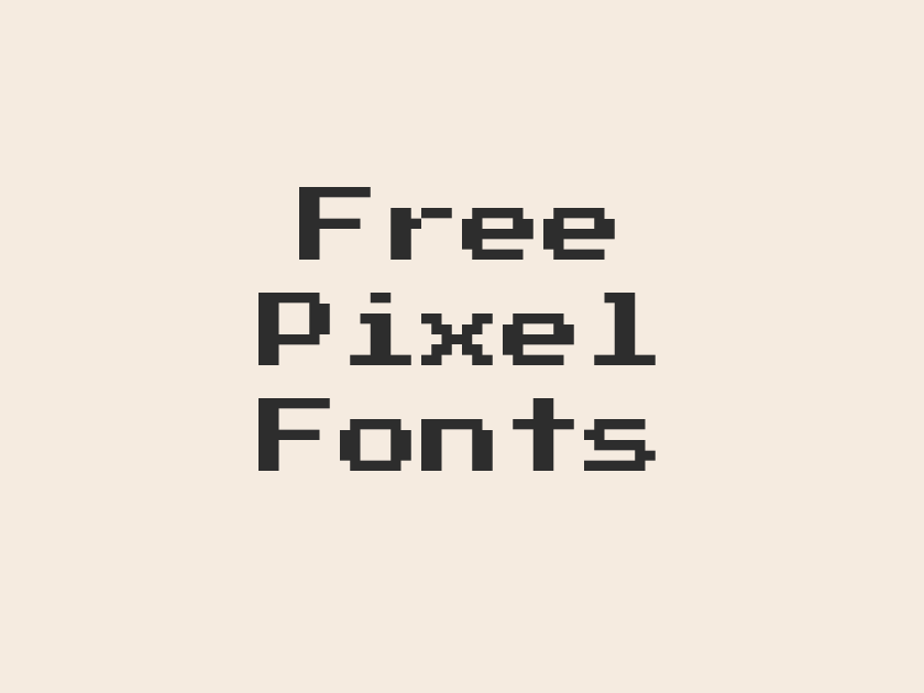
28 Best Free Pixel Fonts
Pixel fonts occupy a strange and wonderful corner of type design: they trade the smooth curves of traditional letterforms for the blocky, stair-stepped geometry of early computer screens, arcade cabinets, and 8-bit game consoles. That constraint is exactly the appeal. A well-made pixel or bitmap font can instantly summon a specific era of computing nostalgia, sell a retro gaming brand, or give a UI a playful, low-fi personality that polished sans-serifs simply cannot fake.
Free pixel fonts for games, badges, and retro web design are more plentiful on Google Fonts than most people realize, ranging from faithful 8-bit revivals to newer variable families built specifically to emulate bitmap grids at any size. The selection below covers arcade classics, scoreboard numerals, glitch effects, and LED-style counters, so there is a genuine match whether the project is a game jam title screen or a nostalgic portfolio site.
-
Press Start 2P
Insert coin to continue the adventure
Press Start 2P
No list of pixel fonts gets far without this one. Press Start 2P is modeled directly on the 8-bit arcade typefaces of the late 1970s and early 1980s, right down to the uneven, hand-drawn irregularity of the original bitmap grids.
It reads as instantly, unmistakably “video game,” which makes it perfect for splash screens, achievement badges, and game-jam branding. Keep it to short bursts of text; at long lengths or small sizes it turns into a wall of jagged blocks that fights the reader.
- Language support: Latin, Latin Extended, Cyrillic, Cyrillic Extended, Greek
- Styles: 1 weight (Regular)
-
VT323
Loading level data from cartridge memory
VT323
VT323 channels the glow of an old DEC VT320 computer terminal rather than a game console, and that lineage shows in its slightly rounded, scanline-friendly strokes. It is monospaced, narrow, and surprisingly legible even at body-text sizes, which sets it apart from most bitmap fonts built purely for headlines.
Designers reach for it constantly for hacker-movie interfaces, command-line themed portfolios, and code-adjacent branding where a full 8-bit arcade look would be too cartoonish.
- Language support: Latin, Latin Extended, Vietnamese
- Styles: 1 weight (Regular)
-
Silkscreen
High score achieved on level three
Silkscreen
Silkscreen has been a staple of pixel web design since long before variable fonts existed, and it still holds up. Every letter sits on a tight, almost square bitmap grid, giving it a stamped, screen-printed quality that feels more like a hardware label than a typeface.
It comes in both regular and bold weights, so it can carry a full interface rather than just a logotype. Use it for buttons, badges, and short UI labels; body copy set in Silkscreen quickly turns dense and hard to scan.
- Language support: Latin, Latin Extended
- Styles: 2 weights (Regular, Bold)
-
Pixelify Sans
Friendly pixels for playful app interfaces
Pixelify Sans
Pixelify Sans softens the usual pixel-font harshness with rounder terminals and a friendlier rhythm, making it feel more like a mobile game mascot than an arcade cabinet. It comes in a genuine weight range from regular through bold, which is rare for this category and makes it far more versatile for actual interface work.
It pairs nicely with a plain sans for body copy, reserving its charm for headings, buttons, and onboarding screens.
- Language support: Latin, Latin Extended, Cyrillic
- Styles: 4 weights (Regular to Bold)
-
DotGothic16
Retro arcade signage glowing in Akihabara
DotGothic16
Born from Japanese dot-matrix signage and early digital displays, DotGothic16 carries a distinctly different flavor from the American 8-bit look, closer to a train station departure board or a retro Japanese arcade marquee. Its Latin and Japanese glyphs share the same tight dot grid, which makes it a smart pick for bilingual retro-tech projects.
- Language support: Latin, Latin Extended, Cyrillic, Japanese
- Styles: 1 weight (Regular)
-
Tiny5
Tiny sprites, mighty eight bit charm
Tiny5
Tiny5 lives up to its name: an extremely compact bitmap face meant for the smallest UI text a pixel game can throw at it, like inventory labels or status readouts. It stays crisp at sizes where most display pixel fonts collapse into mush, though its charm is really limited to those tiny, utilitarian moments rather than headlines.
- Language support: Latin, Latin Extended, Cyrillic, Cyrillic Extended, Greek
- Styles: 1 weight (Regular)
-
Micro 5
Every pixel counts in this world
Micro 5
Micro 5 is built around a genuinely tiny pixel grid, giving it a dense, almost circuit-board texture at small sizes. It suits HUD overlays, timestamp readouts, and other places where a game interface needs to whisper information rather than shout it.
- Language support: Latin, Latin Extended
- Styles: 1 weight (Regular)
-
Micro 5 Charted
Plot your next move on graph paper
Micro 5 Charted
This is Micro 5 redrawn against a visible graph-paper grid, and the effect is unexpectedly charming: every letterform looks like it was plotted by hand on engineering paper before being digitized. It works well for anything with a “under construction” or dev-diary feel, sketchbooks, prototype UI mockups, or indie devlog headers.
- Language support: Latin, Latin Extended
- Styles: 1 weight (Regular)
-
Jersey 10
Number seven takes the winning shot
Jersey 10
The Jersey family was designed around sports jersey and scoreboard numerals, and Jersey 10 is its chunkiest, lowest-resolution member. Big blocky digits and sturdy letterforms make it read clearly from a distance, exactly the job it was built for on a stadium screen.
- Language support: Latin, Latin Extended
- Styles: 1 weight (Regular)
-
Jersey 10 Charted
Scoreboard numbers sketched on grid paper
Jersey 10 Charted
Same bold numeral shapes as Jersey 10, but set against a faint background grid that gives it a technical, hand-drafted look useful for mockups and sports-adjacent branding that wants a bit more texture than a flat bitmap face.
- Language support: Latin, Latin Extended
- Styles: 1 weight (Regular)
-
Jersey 15
Home team leads by twelve points
Jersey 15
Jersey 15 steps up the resolution slightly from its sibling, trading a little of that blocky punch for cleaner, more readable letterforms. It is a good middle ground for team branding, fantasy sports apps, or any project that wants a scoreboard feel without looking quite so low-fi.
- Language support: Latin, Latin Extended
- Styles: 1 weight (Regular)
-
Jersey 20
Championship game clock ticks down
Jersey 20
Refined further still, Jersey 20 keeps the sporty numeral personality of the family while smoothing out enough of the pixel stepping to work comfortably in headlines and short paragraphs, not just single digits.
- Language support: Latin, Latin Extended
- Styles: 1 weight (Regular)
-
Jersey 25
Final score displayed on the board
Jersey 25
Jersey 25 is the finest-grained, most legible member of the set, closer to a condensed display sans with a nod to its pixel origins than a true bitmap face. It is the one to reach for when the jersey-numeral personality is wanted but actual reading comfort still matters.
- Language support: Latin, Latin Extended
- Styles: 1 weight (Regular)
-
Jersey 15 Charted
Varsity numbers drafted on graph paper
Jersey 15 Charted
Jersey 15’s letterforms over a graph-paper backdrop, handy for team merchandise mockups or retro locker-room graphics that want a sketched, in-progress feel.
- Language support: Latin, Latin Extended
- Styles: 1 weight (Regular)
-
Jersey 20 Charted
Team roster sketched before game day
Jersey 20 Charted
The charted companion to Jersey 20, useful anywhere a scoreboard aesthetic needs to sit comfortably next to hand-drawn diagrams or technical illustrations.
- Language support: Latin, Latin Extended
- Styles: 1 weight (Regular)
-
Jersey 25 Charted
Fine tuned digits on a grid
Jersey 25 Charted
The most refined numerals in the family, paired with a subtle grid texture; a good choice for a polished sports app that still wants a whisper of graph-paper authenticity in its display type.
- Language support: Latin, Latin Extended
- Styles: 1 weight (Regular)
-
Handjet
Digital counter ticking toward game over
Handjet
Handjet is a variable font built around a segmented, dot-matrix structure closer to an old digital clock or calculator display than a game sprite sheet. Its elongation axis can be pushed to make the segments read almost like LED bars, which makes it a strong choice for countdown timers, retro dashboards, and sci-fi interface mockups.
- Language support: Latin, Latin Extended, Arabic, Armenian, Cyrillic, Cyrillic Extended, Greek, Hebrew, Vietnamese
- Styles: 9 weights (Thin to Black)
-
Workbench
Blueprint grids for building pixel worlds
Workbench
Workbench takes a more experimental route, built around a technical grid concept closer to graph paper or drafting tools than an arcade screen. It sits at the edgier end of the pixel-adjacent category, better suited to abstract, engineering-flavored branding than a straightforward retro-game project.
- Language support: Latin
- Styles: 1 weight (Regular)
-
Rubik Glitch
Signal breaking up, screen glitching wildly
Rubik Glitch
Part of Google’s expansive Rubik family, Rubik Glitch layers a broken, corrupted-signal texture onto a blocky base structure, evoking a dying CRT or a corrupted game cartridge. It is a strong pick for horror-game titles, cyberpunk branding, or anything that wants a sense of digital decay rather than clean 8-bit charm.
- Language support: Latin, Latin Extended, Cyrillic, Cyrillic Extended, Hebrew
- Styles: 1 weight (Regular)
-
Rubik Glitch Pop
Static bursts across the neon screen
Rubik Glitch Pop
A brighter, more colorful cousin of Rubik Glitch, this variant leans into a poppier, arcade-neon energy rather than pure signal corruption. It suits event posters and game logos that want glitch texture without tipping into horror territory.
- Language support: Latin, Latin Extended, Cyrillic, Cyrillic Extended, Hebrew
- Styles: 1 weight (Regular)
-
Monofett
Chunky blocks stacked like game tiles
Monofett
Monofett takes the idea of a monospace font and inflates it into thick, fat, almost architectural blocks that read like stacked game tiles. It is unapologetically heavy and works best in very short bursts, a wordmark or a single stat callout rather than a paragraph.
- Language support: Latin, Latin Extended
- Styles: 1 weight (Regular)
-
Sixtyfour
LED display counting down to launch
Sixtyfour
Sixtyfour draws from LED and seven-segment display technology rather than sprite-sheet pixel art, giving it a digital-clock or calculator-readout feel. Its variable axes allow subtle distortion, which is a nice touch for sci-fi dashboards and countdown graphics that want a slightly unstable, digital-glitch edge.
- Language support: Latin, Latin Extended
- Styles: 1 weight (Regular)
-
Sixtyfour Convergence
Digits melting across the scoreboard display
Sixtyfour Convergence
The more experimental sibling of Sixtyfour, this version pushes its variable axes further, letting the segmented digits bend and distort as if the display itself is malfunctioning. It is a fun effect for a hero graphic but far too unstable-looking for anything that needs to be read quickly.
- Language support: Latin, Latin Extended
- Styles: 1 weight (Regular)
-
Bitcount Prop Single
Counting pixels one bit at a time
Bitcount Prop Single
Bitcount is a newer variable superfamily built specifically to emulate bitmap counting displays, and the Prop Single cut uses proportional spacing with single-storey letterforms for a cleaner, more app-friendly read. It is one of the more flexible entries here, genuinely usable in real interface text rather than just display headlines.
- Language support: Latin, Latin Extended
- Styles: 9 weights (Thin to Black)
-
Bitcount Prop Double
Double storey digits for retro dashboards
Bitcount Prop Double
Same proportional spacing as its sibling, but with double-storey letterforms that give certain characters a slightly more traditional, less blocky silhouette. A good option when a pixel dashboard needs to stay legible over longer stretches of text.
- Language support: Latin, Latin Extended
- Styles: 9 weights (Thin to Black)
-
Bitcount Single
Fixed width bits for terminal readouts
Bitcount Single
This cut locks Bitcount into fixed-width spacing, closer to a true monospaced terminal font, which makes it well suited to code snippets, data readouts, and anything that wants to feel like a retro computer console.
- Language support: Latin, Latin Extended
- Styles: 9 weights (Thin to Black)
-
Bitcount Grid Single
Gridlocked glyphs for pixel perfect layouts
Bitcount Grid Single
Bitcount Grid Single snaps its letterforms to a strict underlying grid, giving it the most literally “pixel perfect” look in the entire family. It shines in interface mockups where the grid itself is part of the visual story.
- Language support: Latin, Latin Extended
- Styles: 9 weights (Thin to Black)
-
Bitcount Grid Double
Structured bits across an even grid
Bitcount Grid Double
The double-storey grid-locked cut rounds out the Bitcount collection, offering a slightly softer alternative to Grid Single while keeping that same rigorous, snapped-to-grid discipline. Useful for design systems that want one consistent pixel language across several weights and widths.
- Language support: Latin, Latin Extended
- Styles: 9 weights (Thin to Black)
Pairing and Using Pixel Fonts Well
Most bitmap and pixel fonts are display faces first. Save them for headlines, badges, buttons, and short callouts, and pair them with a clean, highly legible sans or serif for body copy.
Scale matters more with pixel fonts than almost any other category. Because their shapes are built on a fixed grid, they tend to look sharp only at specific sizes and can turn blurry or muddy when scaled arbitrarily in a browser.
Test at the exact pixel sizes the design will actually use, and avoid anti-aliasing or smoothing on these faces wherever possible; the jagged edges are the point.
For longer interface text, consider one of the newer variable options like Bitcount or Jersey 25, which trade a little bit of retro grit for real-world readability.
These free Google Fonts cover a wide range of retro computing moods, from arcade cabinets and scoreboards to glitching CRTs and LED counters. Picking the right one is mostly a matter of matching the era and texture to the story a project is trying to tell.