74 Best Free Fonts for Gaming
Gaming culture has its own visual language: pixelated nostalgia, neon-lit sci-fi, chrome-plated esports logos, and the gothic lettering of fantasy loot screens. Whether you are designing a Twitch overlay, a game’s title screen, a Discord server banner, or a tournament bracket, the right typeface does a lot of the storytelling before a single word is read. Every option below is free on Google Fonts, so you can build a full brand kit for a stream, studio, or indie release without spending a cent on licensing.
The list spans retro arcade bitmap faces, futuristic HUD lettering, bold display fonts built for logos and title cards, fantasy and horror scripts for RPGs and survival games, and a handful of technical monospace fonts for scoreboards and code-adjacent UI.
-
Press Start 2P
Press Start to begin your quest
Press Start 2P
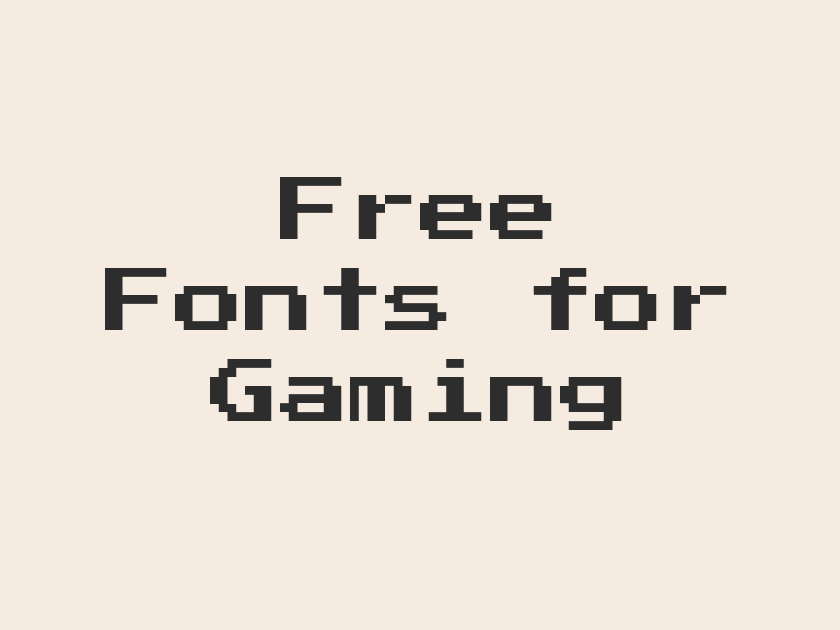
This is the font that everyone pictures when they hear “video game typeface.” Built from the actual 8-bit character grid of early arcade cabinets, its blocky glyphs read as instantly nostalgic, evoking coin-op cabinets and NES cartridges.
Because it is so literal about its pixel origins, it works best in short bursts: titles, score counters, achievement badges. At paragraph length it becomes exhausting to read, so save it for headlines and let a cleaner font carry body copy.
- Language support: Latin, Latin Extended, Cyrillic, Cyrillic Extended, Greek
- Styles: 1 weight (Regular)
-
VT323
System online, loading save file
VT323
A monospaced terminal font styled after old CRT monitors, VT323 gives menus and dialogue boxes that green-phosphor, command-line feel without tipping into full pixel-art territory. It stays legible at small sizes better than most retro fonts, making it a solid pick for in-game console text.
- Language support: Latin, Latin Extended, Vietnamese
- Styles: 1 weight (Regular)
-
Silkscreen
High score, insert coin to continue
Silkscreen
Crisp and geometric, Silkscreen renders each letter on a tight bitmap grid with a slightly friendlier rhythm than Press Start 2P. It suits indie pixel-art games, itch.io project pages, and stream graphics that want an arcade feel without looking quite so aggressively retro.
- Language support: Latin, Latin Extended
- Styles: 2 weights (Regular, Bold)
-
Pixelify Sans
New quest available in the tavern
Pixelify Sans
Pixelify Sans softens the bitmap concept into something more readable in longer stretches, with rounded pixel edges that feel closer to a modern indie game’s UI than a 1980s cabinet. It pairs naturally with cozy pixel-art titles, farming sims, and dialogue-heavy adventure games.
- Language support: Latin, Latin Extended, Cyrillic
- Styles: 4 weights (Regular to Bold)
-
Jersey 10
Player two has entered the game
Jersey 10
Jersey 10 borrows its DNA from scoreboards and jersey numbering, giving it a chunky, slightly irregular pixel texture that feels handmade rather than machine-perfect. It has a scrappy charm suited to fan-made game jams and arcade sports titles.
- Language support: Latin, Latin Extended
- Styles: 1 weight (Regular)
-
Jersey 15
Team spirit, championship level unlocked
Jersey 15
A slightly heavier sibling in the same pixel-sport family, Jersey 15 leans further into the varsity-numeral feel, which makes it a fun choice for sports games, fantasy leagues, and tournament bracket graphics.
- Language support: Latin, Latin Extended
- Styles: 1 weight (Regular)
-
Micro 5
Debug mode activated, proceed carefully
Micro 5
Micro 5 is a tiny, dense bitmap face that looks like it was pulled straight from a handheld console’s low-resolution screen. Use it sparingly, as a decorative accent or HUD label, since its scale and texture were built for glancing, not reading paragraphs.
- Language support: Latin, Latin Extended
- Styles: 1 weight (Regular)
-
DotGothic16
Data stream detected, initiating scan
DotGothic16
Originally designed for Japanese digital signage, DotGothic16 has a dot-matrix precision that reads as both retro tech and modern kanji-friendly UI, which makes it a strong fit for games with a Japanese arcade or cyberpunk aesthetic.
- Language support: Latin, Latin Extended, Cyrillic, Japanese
- Styles: 1 weight (Regular)
-
Tiny5
Achievement unlocked, rare item found
Tiny5
Tiny5 packs a full pixel alphabet into an extremely compact footprint, ideal for the tiny stat readouts and inventory labels tucked into a game’s corner UI where every pixel of screen space matters.
- Language support: Latin, Latin Extended, Cyrillic, Cyrillic Extended, Greek
- Styles: 1 weight (Regular)
-
Monoton
Neon arcade, welcome back player one
Monoton
Monoton is pure electric marquee lighting rendered in type, all looping tubes and glowing outlines. It belongs on retro arcade branding, synthwave game titles, and anything that wants to look like it is lit up in neon over a dark background.
- Language support: Latin, Latin Extended
- Styles: 1 weight (Regular)
-
Orbitron
Initiating launch sequence, all systems go
Orbitron
Orbitron is the default shorthand for sci-fi gaming typography, all geometric precision and widened counters that suggest spacecraft dashboards and far-future interfaces. It has appeared on countless game logos, esports team branding, and tech startup sites, which means it reads as instantly futuristic to almost any audience.
It works best in all caps at large display sizes, where its architectural structure really shows. At small sizes or lowercase it can feel a bit stiff, so reserve it for logos, title screens, and short UI labels rather than long-form text.
- Language support: Latin
- Styles: 6 weights (Regular to Black)
-
Audiowide
Enter the grid, race begins now
Audiowide
Wide, rounded, and slightly chrome-looking, Audiowide has a racing-game and motorsport energy that suits speed-focused titles and esports event graphics. It carries a retro-futurism reminiscent of 1980s video game arcades reimagined for a widescreen era.
- Language support: Latin, Latin Extended
- Styles: 1 weight (Regular)
-
Aldrich
Coordinates locked, target acquired
Aldrich
Aldrich has the clean, slightly rounded geometry of a spacecraft control panel, making it a dependable choice for HUD overlays, sci-fi logos, and mission briefing screens where clarity matters as much as mood.
- Language support: Latin
- Styles: 1 weight (Regular)
-
Electrolize
Shields at full power, engage
Electrolize
A narrower, more technical cousin to fonts like Aldrich, Electrolize suits dense readouts, dashboard labels, and secondary UI text in sci-fi and mecha-themed games where you need a futuristic feel that still stays legible in small doses.
- Language support: Latin
- Styles: 1 weight (Regular)
-
Michroma
Signal detected, decrypting transmission now
Michroma
Michroma has heavy, evenly weighted letterforms with a subtle stencil quality, giving it an industrial, almost NASA-mission-patch look. It reads well as a logotype for space exploration or tech-thriller games.
- Language support: Latin, Latin Extended
- Styles: 1 weight (Regular)
-
Exo 2
Explore the galaxy, claim new worlds
Exo 2
Exo 2 is a flexible, well-rounded sci-fi family with a huge weight range, so it can handle everything from a bold game logo to readable body copy on a lore page. That versatility makes it one of the more practical futuristic fonts on this list, useful well beyond a single splash screen.
- Language support: Latin, Latin Extended, Cyrillic, Cyrillic Extended, Vietnamese
- Styles: 18 styles (9 weights plus italics)
-
Rajdhani
Rank up, prepare for battle
Rajdhani
Rajdhani’s squared-off, slightly condensed letterforms give it a technical, militaristic edge that suits esports scoreboards, tactical shooters, and stat-heavy dashboards. It stays crisp at small sizes, which is not something every display-leaning gaming font can claim.
- Language support: Latin, Latin Extended, Devanagari
- Styles: 5 weights (Light to Bold)
-
Teko
Countdown initiated, thirty seconds remain
Teko
Teko is tall, narrow, and efficient, built for headlines that need to say a lot of words in a small horizontal space. It shows up often in sports and gaming dashboards where scoreboard numbers and match stats need to stay tight and legible.
- Language support: Latin, Latin Extended, Devanagari
- Styles: 5 weights (Light to Bold)
-
Wallpoet
Restricted zone, access denied
Wallpoet
Stenciled and military in feel, Wallpoet looks like it was spray-painted through a template onto a spaceship hull or a black-ops crate. It fits tactical shooters, survival games, and dystopian branding that wants a rough, utilitarian edge.
- Language support: Latin
- Styles: 1 weight (Regular)
-
Zen Dots
Portal activated, prepare to jump
Zen Dots
Zen Dots has rounded, dot-punctuated letterforms that feel like a retro-futuristic dashboard readout. It is distinctive enough to work as a logo font for a sci-fi or puzzle game without needing much extra styling.
- Language support: Latin, Latin Extended
- Styles: 1 weight (Regular)
-
Syncopate
Combo streak, keep the momentum going
Syncopate
Syncopate’s geometric, slightly staggered caps give it a rhythmic, machine-cut look well suited to esports branding and tech-forward game titles that want a modern, minimal edge over an overtly retro one.
- Language support: Latin, Latin Extended
- Styles: 2 weights (Regular, Bold)
-
Quantico
Mission briefing, objectives updated
Quantico
Quantico is a squared, military-adjacent sans with a name that practically announces its use case. It handles UI labels and briefing text with a no-nonsense clarity that fits tactical and strategy games particularly well.
- Language support: Latin
- Styles: 4 styles (2 weights plus italics)
-
Chakra Petch
Firmware update, restart to apply
Chakra Petch
Chakra Petch mixes a technical, slightly angular structure with genuinely comfortable readability, which makes it useful for both display headlines and the smaller interface text sitting underneath them in a sci-fi game’s UI.
- Language support: Latin, Latin Extended, Thai, Vietnamese
- Styles: 10 styles (5 weights plus italics)
-
Jura
Encrypted files recovered, access granted
Jura
Jura is understated for a sci-fi font, with clean, wide letterforms that lean more corporate-future than blaster-and-spaceship. It works well for tech company style game studio branding or UI text that needs a futuristic tone without shouting about it.
- Language support: Latin, Latin Extended, Cyrillic, Cyrillic Extended, Greek, Greek Extended, Kayah Li, Vietnamese
- Styles: 5 weights (Light to Bold)
-
Genos
Power core stable, systems nominal
Genos
Genos offers a large weight range in a slightly rounded, technical sans, giving designers room to move from a bold sci-fi headline down to readable paragraph text within a single consistent family.
- Language support: Latin, Latin Extended, Cherokee, Vietnamese
- Styles: 18 styles (9 weights plus italics)
-
Iceland
Frozen wasteland, survival mode engaged
Iceland
Iceland’s tall, narrow, faceted letterforms look carved from ice or cut by a laser, which makes it an apt choice for survival games, arctic settings, or any HUD that wants a crystalline, slightly alien texture.
- Language support: Latin
- Styles: 1 weight (Regular)
-
Nova Square
Grid loading, welcome to the arena
Nova Square
Nova Square has a boxy, pixel-adjacent geometry that splits the difference between retro computing and modern sci-fi display type, useful for logos and short titles that want a digital, gridded feel.
- Language support: Latin, Latin Extended
- Styles: 1 weight (Regular)
-
Share Tech Mono
root access granted, command executed
Share Tech Mono
A true monospace with a lightly technical texture, Share Tech Mono is a natural pick for in-game terminals, code snippets, hacking mini-games, and any UI that wants to look like a live command line.
- Language support: Latin
- Styles: 1 weight (Regular)
-
Share Tech
Network stable, connection established
Share Tech
The proportional companion to Share Tech Mono, this one keeps the same clean, faintly technical character but reads more comfortably in running UI text and menu labels.
- Language support: Latin
- Styles: 1 weight (Regular)
-
Major Mono Display
Loading sequence: seven, eight, nine
Major Mono Display
Major Mono Display is unapologetically strange, with lowercase letters built from geometric, almost alien shapes. It is not a font for body text; it is a font for a single striking word on a splash screen or loading page.
- Language support: Latin, Latin Extended, Vietnamese
- Styles: 1 weight (Regular)
-
Space Mono
Save file corrupted, attempting recovery
Space Mono
Space Mono brings a quirky, slightly retro-computing personality to a genuinely practical monospace, making it a good fit for developer-facing tools, in-game consoles, and any indie game that wants a coded, DIY aesthetic without sacrificing legibility.
- Language support: Latin, Latin Extended, Vietnamese
- Styles: 4 styles (2 weights plus italics)
-
Handjet
Battery low, recharge station nearby
Handjet
Handjet’s variable design can flex from a clean sans down into a segmented, calculator-display style, which makes it a versatile choice for scoreboards, timers, and digital readouts inside a game’s HUD.
- Language support: Latin, Latin Extended, Arabic, Armenian, Cyrillic, Cyrillic Extended, Greek, Hebrew, Vietnamese
- Styles: 9 weights (Thin to Black)
-
Titillium Web
Tournament schedule, matches begin soon
Titillium Web
Titillium Web has a technical, slightly aerospace-inspired feel without tipping into full sci-fi costume design, which is exactly why it shows up so often in esports branding and tech-adjacent gaming sites. It reads cleanly at body text sizes, so it pairs naturally as the workhorse font underneath a louder display headline.
- Language support: Latin, Latin Extended
- Styles: 11 styles (6 weights plus italics)
-
Bebas Neue
Champions rise, glory awaits below
Bebas Neue
Bebas Neue is a go-to condensed caps font for a reason: it is bold, tall, and endlessly punchy in headlines, event posters, and esports team logos. Its all-caps-only design means it should be reserved for short, shouty statements rather than sentences, but for a tournament bracket title or a stream banner it rarely misses.
- Language support: Latin, Latin Extended
- Styles: 1 weight (Regular)
-
Anton
Level up, no limits ahead
Anton
Anton is heavier and blockier than Bebas Neue, with a poster-weight boldness that dominates any layout it appears in. It suits big, aggressive game titles and merch designs that want maximum visual weight from a single word.
- Language support: Latin, Latin Extended, Vietnamese
- Styles: 1 weight (Regular)
-
Archivo Black
Server down, respawn in progress
Archivo Black
Archivo Black trades condensed drama for a sturdy, slightly friendlier boldness that still commands attention. It works well as a headline font for gaming news sites, patch notes pages, and UI callouts that need to feel confident without looking shouty.
- Language support: Latin, Latin Extended
- Styles: 1 weight (Regular)
-
Passion One
Enter the tournament, prove yourself
Passion One
Passion One’s rounded, heavy weight gives it a comic-book energy that suits fighting games, sports titles, and any branding that wants bold confidence with a slightly friendlier edge than a razor-sharp sans.
- Language support: Latin, Latin Extended
- Styles: 3 weights (Regular, Bold, Black)
-
Russo One
Boss incoming, brace for impact
Russo One
Russo One has thick, slightly rounded strokes with a mechanical, almost robotic rhythm, making it a favorite for gaming logos, YouTube channel branding, and esports team wordmarks that want to feel sturdy and modern at once.
- Language support: Latin, Latin Extended, Cyrillic
- Styles: 1 weight (Regular)
-
Fjalla One
Objective complete, moving to next stage
Fjalla One
Fjalla One is condensed but far calmer than most gaming display fonts, which makes it a dependable pick for subheadings, patch notes, and UI labels that sit quietly beneath a louder title font.
- Language support: Latin, Latin Extended, Cyrillic Extended, Vietnamese
- Styles: 1 weight (Regular)
-
Oswald
Ready player one, begin countdown
Oswald
Oswald’s tall, condensed structure has become a workhorse across gaming sites and stream overlays because it fits a lot of text into tight header space while staying perfectly legible. It is versatile enough to anchor an entire brand’s headline system.
- Language support: Latin, Latin Extended, Cyrillic, Cyrillic Extended, Vietnamese
- Styles: 6 weights (Extra-Light to Bold)
-
Staatliches
Final round, winner takes all
Staatliches
Staatliches has a slightly rough, poster-stencil quality in its condensed caps, giving it a scrappy, tournament-flyer energy well suited to indie game jams and community esports events.
- Language support: Latin, Latin Extended
- Styles: 1 weight (Regular)
-
Bowlby One
Power up, extra life earned
Bowlby One
Bowlby One is thick, rounded, and cheerful, closer to a comic sound effect than a sober display face. It is a strong match for arcade games, mobile titles, and any branding that wants a bouncy, high-energy first impression.
- Language support: Latin
- Styles: 1 weight (Regular)
-
Alfa Slab One
Loot drop, legendary item found
Alfa Slab One
Alfa Slab One’s heavy slab serifs give it a chunky, carved-in-stone weight that reads as both retro arcade and modern meme culture, useful for badge-style logos and achievement graphics.
- Language support: Latin, Latin Extended, Vietnamese
- Styles: 1 weight (Regular)
-
Titan One
Boss defeated, treasure chest opens
Titan One
Titan One is rounded, inflated, and full of cartoon energy, the kind of lettering you would expect on a mobile game’s app icon or a kid-friendly platformer’s title screen.
- Language support: Latin, Latin Extended
- Styles: 1 weight (Regular)
-
Black Ops One
Mission accepted, deploy at dawn
Black Ops One
True to its name, Black Ops One channels military stencil lettering with a bold, tactical weight, making it an obvious fit for shooters, war games, and covert-ops branding.
- Language support: Latin, Latin Extended, Cyrillic Extended, Vietnamese
- Styles: 1 weight (Regular)
-
Bungee
Game on, press any button
Bungee
Bungee has a bold, urban sign-painting quality, thick and slightly playful, that works well for arcade branding, game jam posters, and anything that wants to feel like a hand-painted marquee.
- Language support: Latin, Latin Extended, Vietnamese
- Styles: 1 weight (Regular)
-
Bungee Inline
Combo multiplier, keep the streak alive
Bungee Inline
The inline variant keeps Bungee’s chunky sign-painter attitude but adds a striped outline effect, giving it extra texture that suits neon arcade branding and retro game posters.
- Language support: Latin, Latin Extended, Vietnamese
- Styles: 1 weight (Regular)
-
Racing Sans One
Start your engines, race begins
Racing Sans One
Racing Sans One leans hard into motorsport styling, with slanted, aerodynamic letterforms that fit racing games, speed-based challenges, and any branding that wants forward momentum baked into the type itself.
- Language support: Latin, Latin Extended
- Styles: 1 weight (Regular)
-
Squada One
Full throttle, checkpoint reached
Squada One
Squada One is bold and rounded with a sporty confidence, a reliable choice for game logos and app icons that need to read clearly even at the tiny scale of a phone screen.
- Language support: Latin
- Styles: 1 weight (Regular)
-
Turret Road
Lap complete, new record set
Turret Road
Turret Road has a technical, slightly industrial condensed structure that suits racing HUDs, vehicle stat panels, and dashboard-style UI in driving and combat games.
- Language support: Latin, Latin Extended
- Styles: 6 weights (Extra-Light to Extra-Bold)
-
Cinzel
Rise, champion of the realm
Cinzel
Cinzel draws from classical Roman inscriptions, giving it a carved, monumental elegance that suits fantasy RPGs, historical strategy games, and any title screen that wants to feel ancient and important. Its wide letterforms and even proportions hold up beautifully at large display sizes.
Because it carries such formal weight, it pairs well with a simpler serif or sans for body text, letting Cinzel handle the game’s title and major chapter headings while something quieter handles the dialogue and lore entries.
- Language support: Latin, Latin Extended
- Styles: 6 weights (Regular to Black)
-
Cinzel Decorative
The ancient prophecy has awakened
Cinzel Decorative
This flourished cousin of Cinzel adds ornamental curls to the same monumental structure, making it well suited to opening titles, legendary item names, and other moments where a game wants a flash of ceremonial grandeur.
- Language support: Latin, Latin Extended
- Styles: 3 weights (Regular, Bold, Black)
-
MedievalSharp
Enter the dungeon, sword in hand
MedievalSharp
MedievalSharp has an authentic scribe’s roughness, as if lettered by hand on parchment, which makes it a dependable shorthand for fantasy and tabletop-adjacent games. It gets muddy at small sizes, so keep it for headings and short labels rather than paragraphs of lore text.
- Language support: Latin, Latin Extended
- Styles: 1 weight (Regular)
-
Metamorphous
A curse binds this cursed land
Metamorphous
Metamorphous has a dense, gothic-adjacent weight that feels carved rather than written, giving it an ominous gravity well suited to dark fantasy titles and villain naming screens.
- Language support: Latin, Latin Extended
- Styles: 1 weight (Regular)
-
Pirata One
Set sail, treasure awaits beyond
Pirata One
Pirata One’s blackletter-inspired structure has an old-world, slightly rebellious swagger, fitting for pirate adventures, dark fantasy branding, or any game logo that wants a gothic edge without full illegibility.
- Language support: Latin, Latin Extended
- Styles: 1 weight (Regular)
-
UnifrakturMaguntia
Dark forces gather at nightfall
UnifrakturMaguntia
This is a genuine blackletter face, dense and ornate, best reserved for a game’s logotype or a single dramatic chapter heading. Its authenticity is also its limitation: read at length it becomes a strain, so it should never carry dialogue or instructions.
- Language support: Latin
- Styles: 1 weight (Regular)
-
Grenze Gotisch
The kingdom falls to shadow
Grenze Gotisch
Grenze Gotisch offers a slightly more restrained blackletter than UnifrakturMaguntia, with cleaner counters that keep it readable in short phrases while still carrying plenty of medieval atmosphere.
- Language support: Latin, Latin Extended, Vietnamese
- Styles: 9 weights (Thin to Black)
-
Uncial Antiqua
Ancient runes glow with power
Uncial Antiqua
Rounded and monastic, Uncial Antiqua looks like it belongs on an illuminated manuscript, which makes it a fitting choice for spellbook interfaces, lore codices, and puzzle games built around ancient script.
- Language support: Latin, Latin Extended
- Styles: 1 weight (Regular)
-
Almendra
The old gods still remember
Almendra
Almendra has a delicate, old-world serif calligraphy that feels more literary than aggressive, a good option for narrative-driven fantasy games that want elegance over spectacle in their text.
- Language support: Latin, Latin Extended
- Styles: 4 styles (2 weights plus italics)
-
IM Fell English
Herein lies the traveler's tale
IM Fell English
Modeled on early modern printing types, IM Fell English has an antique, storybook texture ideal for narrative games, visual novels, and lore entries that want to feel like they were printed centuries ago.
- Language support: Latin
- Styles: 2 styles (1 weight plus italics)
-
Nosifer
Something waits in the darkness
Nosifer
Nosifer drips with dread, its letterforms rendered as if oozing or decaying, making it one of the most immediately recognizable horror display fonts available for free. It is strictly a logo and title font; anything longer becomes unreadable by design.
- Language support: Latin, Latin Extended
- Styles: 1 weight (Regular)
-
Creepster
They are watching your every move
Creepster
Creepster has a wobbly, hand-scrawled horror-movie-poster energy that instantly signals dread or dark comedy depending on how it is colored and framed. It works equally well for a genuinely scary indie horror game or a tongue-in-cheek Halloween-themed event.
Keep it to titles and short warnings rather than instructions, since its irregular baseline fights against comfortable reading at length.
- Language support: Latin
- Styles: 1 weight (Regular)
-
Butcherman
Run, the monster is near
Butcherman
Butcherman has jagged, torn edges that look slashed rather than drawn, a fitting match for slasher-inspired horror games and gruesome boss reveal screens.
- Language support: Latin, Latin Extended
- Styles: 1 weight (Regular)
-
Eater
It hungers for fresh victims
Eater
Eater leans into dripping, corroded letterforms that suggest decay and infection, useful for zombie survival games or body-horror titles looking for a suitably unsettling logotype.
- Language support: Latin, Latin Extended
- Styles: 1 weight (Regular)
-
Vampiro One
Beware the creatures of the night
Vampiro One
Vampiro One has sharp, slightly gothic terminals with a comic-horror flavor, closer to a friendly Halloween mascot than genuine terror, which makes it a good fit for family-friendly spooky games.
- Language support: Latin, Latin Extended
- Styles: 1 weight (Regular)
-
Rubik Wet Paint
Blood moon rises over the ruins
Rubik Wet Paint
Part of the expressive Rubik display family, Wet Paint looks like dripping liquid lettering, an effective choice for horror game splash art or gory boss battle titles that want texture without needing custom illustration.
- Language support: Latin, Latin Extended, Cyrillic, Cyrillic Extended, Hebrew
- Styles: 1 weight (Regular)
-
Fredoka
Collect coins, unlock the next world
Fredoka
Fredoka’s rounded, friendly geometry fits casual mobile games, kids’ titles, and party game apps that want an approachable, bouncy first impression rather than an intense one.
- Language support: Latin, Latin Extended, Hebrew
- Styles: 5 weights (Light to Bold)
-
Baloo 2
Match three, watch the combo explode
Baloo 2
Baloo 2 has soft, sturdy curves and excellent readability, a dependable choice for casual puzzle games and mobile app interfaces where warmth matters more than edge.
- Language support: Latin, Latin Extended, Devanagari, Vietnamese
- Styles: 5 weights (Regular to Extra-Bold)
-
Chewy
Bounce, jump, grab the star
Chewy
Chewy looks exactly like its name suggests, thick and rounded like a cartoon logo, ideal for children’s games and playful platformers that want instant charm.
- Language support: Latin
- Styles: 1 weight (Regular)
-
Boogaloo
Party mode, everyone joins in
Boogaloo
Boogaloo has a bubbly, retro cartoon bounce that suits party games, mobile arcade titles, and any branding that wants energy without taking itself too seriously.
- Language support: Latin
- Styles: 1 weight (Regular)
-
Bangers
POW! Critical hit landed!
Bangers
Bangers is built for comic-book sound effects, all caps and irregular baselines that shout rather than speak. It is a natural fit for fighting games, superhero titles, and any UI moment that wants to feel like an explosion on the page.
- Language support: Latin, Latin Extended, Vietnamese
- Styles: 1 weight (Regular)
-
Luckiest Guy
You win, new champion crowned
Luckiest Guy
Luckiest Guy has a chunky, hand-lettered marker quality with real cartoon swagger, a favorite for casual game logos, app icons, and celebratory victory screens that want maximum friendliness.
- Language support: Latin, Latin Extended
- Styles: 1 weight (Regular)
-
Permanent Marker
Player notes scrawled in the margins
Permanent Marker
Permanent Marker looks exactly like its name, a genuine felt-tip scrawl useful for handwritten UI touches, sticky-note style tutorials, or a game character’s informal, personal voice.
- Language support: Latin
- Styles: 1 weight (Regular)
-
Kalam
Quest log: find the missing artifact
Kalam
Kalam is a relaxed, legible handwriting font with enough personality for dialogue boxes and journal entries but enough restraint to stay comfortable over longer passages of in-game text.
- Language support: Latin, Latin Extended, Devanagari
- Styles: 3 weights (Light, Regular, Bold)
Pairing these fonts for a cohesive gaming brand
A common approach is to pair one loud display font for logos and titles with one calmer sans or mono font for menus and body text. Orbitron or Bebas Neue as a headline paired with Titillium Web or Share Tech for UI copy is a reliable combination.
For fantasy titles, let a font like Cinzel or MedievalSharp carry the game’s name, then hand dialogue and lore text to something gentler like IM Fell English or a plain readable serif.
Horror and pixel fonts are best used sparingly. A single Nosifer or Press Start 2P headline can set the tone for an entire page without needing to appear anywhere else.
Always test display fonts at the actual size they will be used on screen, since many of the punchiest gaming fonts lose clarity fast once they shrink below headline size.
With this many free, genuinely game-appropriate typefaces on Google Fonts, there is rarely a reason to reach for a paid alternative. Mix a few categories, keep hierarchy simple, and the right pairing will do a lot of the visual storytelling on its own.