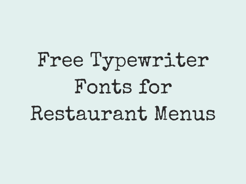
38 Best Free Typewriter Fonts for Restaurant Menus
A menu set in a typewriter face does a lot of storytelling before anyone reads a single dish description. It suggests a diner that has been slinging eggs since the sixties, a deli with a hand-stamped price list, a supper club running on nostalgia, or a coffee bar that wants its chalkboard specials to feel like a dispatch from an old newsroom. The good news for anyone designing a restaurant menu on a budget is that Google Fonts now hosts a genuinely deep bench of free typewriter and monospace fonts, from faithful Courier clones to sturdy coding fonts that happen to read beautifully on a printed page. The right one can replace a paid font like American Typewriter or Courier New without costing a cent, and pairing it correctly can carry a whole menu system from the awning sign to the takeout bag.
-
Special Elite
Corner booth, coffee, and pie
Special Elite
This is the font most people picture when they hear “typewriter menu.” The ink looks slightly uneven, the strikes look slightly off-register, and the whole effect reads like a well-loved order pad from a roadside diner. It shines on headers, daily specials, and short blurbs; at very small sizes the texture can get muddy, so keep it for display and short-form copy rather than dense paragraphs.
- Language support: Latin, Latin Extended
- Styles: 1 weight (Regular)
-
Courier Prime
Today's special: pan-seared salmon, $24
Courier Prime
Built originally for screenwriters who needed a clean, industry-standard Courier substitute, this face is far more polished than its name suggests. It has none of the distressing of Special Elite, just crisp, even strokes that hold up at body-text sizes across a full page of menu items.
Because it was engineered for long-form reading, it is one of the few typewriter-style fonts genuinely comfortable setting an entire printed menu rather than just a headline.
- Language support: Latin, Latin Extended
- Styles: 4 styles (2 weights plus italics)
-
Cutive Mono
Fresh catch, hand-cut fries, cold beer
Cutive Mono
A serif monospace with warmer, rounder letterforms than a standard Courier, giving it a softer, more handmade feel that suits a neighborhood bistro or seaside shack.
- Language support: Latin, Latin Extended
- Styles: 1 weight (Regular)
-
Cutive
House-made pasta, slow-simmered Sunday sauce
Cutive
The proportional sibling of Cutive Mono, this one drops the fixed-width grid but keeps the same gentle, vintage typewriter character. It sits comfortably in menu descriptions where a full monospace rhythm would feel too rigid.
- Language support: Latin, Latin Extended
- Styles: 1 weight (Regular)
-
Nova Mono
Two eggs, toast, hash browns, coffee
Nova Mono
Chunky and slightly rounded, Nova Mono leans playful rather than austere. It works best as a headline face for section titles like “Breakfast” or “Sides,” where its bold personality can breathe.
- Language support: Latin, Latin Extended, Greek
- Styles: 1 weight (Regular)
-
VT323
Order at the counter, we'll call you
VT323
Closer to an old CRT terminal than an actual typewriter, this pixel-edged mono still fits the retro-tech mood of a food truck or arcade bar menu. It gets rough at small sizes, so save it for prices, tags, or a “now serving” number board.
- Language support: Latin, Latin Extended, Vietnamese
- Styles: 1 weight (Regular)
-
Share Tech Mono
Wood-fired pizza, BYO wine welcome
Share Tech Mono
A clean, slightly technical mono with a faint retro-terminal glow. It reads well as a section header or price column and stays legible even when the menu design leans minimal.
- Language support: Latin
- Styles: 1 weight (Regular)
-
IBM Plex Mono
Brunch served daily until 3pm
IBM Plex Mono
Part of IBM’s sprawling Plex superfamily, this mono is disciplined, corporate in the best sense, and available in a wide range of weights that make it flexible enough for an entire menu hierarchy.
Pairing it with Plex Sans or Plex Serif for headers gives a coordinated, professional type system that still nods to the typewriter without leaning kitschy.
- Language support: Latin, Latin Extended, Cyrillic, Cyrillic Extended, Vietnamese
- Styles: 14 styles (7 weights plus italics)
-
Roboto Mono
Craft cocktails, small plates, big flavor
Roboto Mono
A dependable, neutral choice that borrows Roboto’s friendly geometry and applies it to a fixed-width grid. It is an easy match for restaurants that already use Roboto on their website or ordering app.
- Language support: Latin, Latin Extended, Cyrillic, Cyrillic Extended, Greek, Vietnamese
- Styles: 14 styles (7 weights plus italics)
-
Source Code Pro
Family style, share plates, no rush
Source Code Pro
Adobe’s workhorse coding font sets cleanly at small sizes, making it a practical pick for menus packed with ingredient lists or allergen notes.
- Language support: Latin, Latin Extended, Cyrillic, Cyrillic Extended, Greek, Greek Extended, Vietnamese
- Styles: 16 styles (8 weights plus italics)
-
Fira Mono
Espresso, pastries, and a good book
Fira Mono
Sturdy and open, with generous counters that keep it legible even in cramped café menu layouts. It has a slightly friendlier feel than most coding-derived monospace fonts.
- Language support: Latin, Latin Extended, Cyrillic, Cyrillic Extended, Greek, Greek Extended
- Styles: 3 weights (Regular, Medium, Bold)
-
Fira Code
Farm to table, door to door
Fira Code
Built from the same foundation as Fira Mono but drawn with programmers in mind, this face carries a slightly tighter rhythm in regular text. It is a solid alternative when Fira Mono feels too plain.
- Language support: Latin, Latin Extended, Cyrillic, Cyrillic Extended, Greek, Greek Extended
- Styles: 5 weights (Light to Bold)
-
Inconsolata
Grandma's recipe, updated for today
Inconsolata
One of the more refined monospace options on Google Fonts, Inconsolata has a humanist warmth that keeps it from feeling clinical. It ages well at small sizes, which makes it a safe pick for a menu with a lot of copy.
- Language support: Latin, Latin Extended, Vietnamese
- Styles: 8 weights (Extra-Light to Black)
-
PT Mono
Steak frites, house salad, red wine
PT Mono
Sturdy and even, with full Cyrillic support that makes it a strong pick for menus serving multilingual neighborhoods or Eastern European cuisine.
- Language support: Latin, Latin Extended, Cyrillic, Cyrillic Extended
- Styles: 1 weight (Regular)
-
Anonymous Pro
Tacos al pastor, extra salsa please
Anonymous Pro
Originally drawn for code editors, this face carries a distinctive slashed zero and honest, no-frills letterforms. It reads like a no-nonsense order ticket, which is exactly the point.
- Language support: Latin, Latin Extended, Cyrillic, Greek
- Styles: 4 styles (2 weights plus italics)
-
Cousine
Dine in, take out, delivery
Cousine
Metric-compatible with Courier New, Cousine is the safest possible substitute for anyone replacing a paid typewriter font without altering line breaks or layout.
- Language support: Latin, Latin Extended, Cyrillic, Cyrillic Extended, Greek, Greek Extended, Hebrew, Vietnamese
- Styles: 4 styles (2 weights plus italics)
-
Oxygen Mono
Fresh oysters shucked to order
Oxygen Mono
Squared-off and slightly technical, this KDE-linked font brings a cooler, more modern edge to a typewriter theme. It suits a minimalist raw bar or wine list more than a folksy diner.
- Language support: Latin, Latin Extended
- Styles: 1 weight (Regular)
-
Ubuntu Mono
BLT on rye, side of slaw
Ubuntu Mono
Friendly and a little rounded, Ubuntu Mono carries the same approachable warmth as the rest of the Ubuntu family. It is a comfortable choice for a casual sandwich counter menu.
- Language support: Latin, Latin Extended, Cyrillic, Cyrillic Extended, Greek, Greek Extended
- Styles: 4 styles (2 weights plus italics)
-
Noto Sans Mono
Ramen, gyoza, and cold sake
Noto Sans Mono
Part of Google’s enormous Noto project, this mono was built for exhaustive language coverage. That makes it a dependable pick for menus that mix English with Japanese, Korean, or other scripts.
- Language support: Latin, Latin Extended, Cyrillic, Cyrillic Extended, Greek, Greek Extended, Vietnamese
- Styles: 9 weights (Thin to Black)
-
B612 Mono
Prix fixe, three courses, $42
B612 Mono
Originally designed for aircraft cockpit displays, B612 Mono is engineered for maximum legibility at tiny sizes. It is an excellent choice for a dense price column or a footnote of allergen symbols.
- Language support: Latin
- Styles: 4 styles (2 weights plus italics)
-
Overpass Mono
Vegan options marked with a leaf
Overpass Mono
Descended from highway signage typefaces, this mono is wide, clear, and built to be read at a glance, which is precisely what a menu needs.
- Language support: Latin, Latin Extended, Cyrillic, Cyrillic Extended, Vietnamese
- Styles: 5 weights (Light to Bold)
-
Space Mono
Split plates welcome, no substitutions
Space Mono
Quirky, slightly bouncy letterforms give Space Mono a strong personality that suits an indie coffee shop or a brunch spot with a playful brand voice. Long paragraphs can feel a bit busy in it, so it earns its keep best in headers and short menu blurbs.
- Language support: Latin, Latin Extended, Vietnamese
- Styles: 4 styles (2 weights plus italics)
-
JetBrains Mono
Happy hour, four to six daily
JetBrains Mono
Generous x-height and open apertures make this coding font surprisingly comfortable in print. It also happens to look identical on a website, so it doubles neatly as the type for an online ordering menu.
- Language support: Latin, Latin Extended, Cyrillic, Cyrillic Extended, Greek, Vietnamese
- Styles: 16 styles (8 weights plus italics)
-
DM Mono
Homemade pie, ask about flavors
DM Mono
Understated and low-contrast, DM Mono trades typewriter texture for a cleaner, more restrained look. It suits an upscale-casual restaurant that wants a hint of retro character without leaning theatrical.
- Language support: Latin, Latin Extended
- Styles: 6 styles (3 weights plus italics)
-
Azeret Mono
Coffee refills always on the house
Azeret Mono
Rounded terminals give this face a slightly retro-futuristic edge, fun for a specialty coffee shop or a brunch menu that wants a bit of visual personality in its headers.
- Language support: Latin, Latin Extended
- Styles: 18 styles (9 weights plus italics)
-
Red Hat Mono
Blue plate special every Tuesday
Red Hat Mono
Part of the larger Red Hat type system, this mono is corporate in structure but warmer in tone than it sounds. It is a good option for a restaurant group that wants one coordinated typeface across print and digital menus.
- Language support: Latin, Latin Extended
- Styles: 10 styles (5 weights plus italics)
-
Spline Sans Mono
Catch of the day market price
Spline Sans Mono
Geometric and tidy, this companion to Spline Sans suits a modern seafood counter or a fast-casual spot going for a fresh, uncluttered look.
- Language support: Latin, Latin Extended
- Styles: 10 styles (5 weights plus italics)
-
Sometype Mono
Slow-roasted brisket, tangy barbecue sauce
Sometype Mono
A versatile middle ground between technical coding fonts and something with real character, Sometype Mono has enough warmth to anchor an entire menu without disappearing into the background.
- Language support: Latin, Latin Extended
- Styles: 8 styles (4 weights plus italics)
-
Chivo Mono
Late night menu starts at ten
Chivo Mono
Part of the Chivo superfamily, this grotesque-inspired mono has real weight and presence at bolder settings, making it a strong pick for section headers on a late-night or bar menu.
- Language support: Latin, Latin Extended, Vietnamese
- Styles: 18 styles (9 weights plus italics)
-
Martian Mono
Gluten-free crust available upon request
Martian Mono
Chunky and unapologetically retro-computer in feel, Martian Mono suits a playful pizzeria or an arcade bar leaning hard into eighties nostalgia. It is too heavy and idiosyncratic for body copy, so reserve it for a headline or logotype.
- Language support: Latin, Latin Extended, Cyrillic, Cyrillic Extended
- Styles: 8 weights (Thin to Extra-Bold)
-
Geist Mono
Cash only, tips always appreciated
Geist Mono
Designed with a Scandinavian sense of restraint, Geist Mono is crisp and modern rather than nostalgic. It fits a stripped-back, design-forward menu that wants only a whisper of typewriter DNA.
- Language support: Latin, Latin Extended, Cyrillic, Cyrillic Extended, Vietnamese
- Styles: 18 styles (9 weights plus italics)
-
Kode Mono
Seasonal menu, printed fresh weekly
Kode Mono
A variable coding font with a bit more warmth than most, Kode Mono flexes across a range of weights, which makes it flexible enough to run an entire menu hierarchy on its own.
- Language support: Latin, Latin Extended
- Styles: 4 weights (Regular to Bold)
-
Reddit Mono
Chef's tasting menu, five courses, $85
Reddit Mono
The monospace companion to Reddit Sans, this face is contemporary and approachable, a good fit for a casual eatery that wants matching type across its website, app, and printed menu.
- Language support: Latin, Latin Extended, Vietnamese
- Styles: 8 weights (Extra-Light to Black)
-
Fragment Mono
Ask your server about tonight's specials
Fragment Mono
A serif-inflected monospace that genuinely recalls a typewriter ribbon running a little low on ink at lighter weights. It brings real character to a specials board without tipping into full distressed-type territory.
- Language support: Latin, Latin Extended, Cyrillic Extended
- Styles: 2 styles (1 weight plus italics)
-
Xanh Mono
Reservations recommended, walk-ins always welcome
Xanh Mono
A slab-serif monospace with soft, rounded edges, Xanh Mono is warmer and less clinical than most coding-derived alternatives, making it a distinctive option for a menu that wants personality without cliche.
- Language support: Latin, Latin Extended, Vietnamese
- Styles: 2 styles (1 weight plus italics)
-
Victor Mono
Locally sourced, seasonally rotated, always fresh
Victor Mono
Its built-in cursive italic is the real draw here, useful for a handwritten-feeling “chef’s note” or aside dropped into an otherwise typewritten menu.
- Language support: Latin, Latin Extended, Cyrillic, Cyrillic Extended, Greek, Vietnamese
- Styles: 14 styles (7 weights plus italics)
-
Major Mono Display
Soup of the day, changes daily
Major Mono Display
Lowercase-only and geometric, with unusually rounded, almost bubble-like letterforms. It is strictly a display font for a short headline like “Today’s Menu,” since it turns illegible fast at body-text sizes.
- Language support: Latin, Latin Extended, Vietnamese
- Styles: 1 weight (Regular)
-
Syne Mono
Wood-fired flatbread, blistered and smoky
Syne Mono
Experimental and a little eccentric, Syne Mono is best kept to a single headline or section title where its unusual shapes can act as a design accent rather than carry any real reading load.
- Language support: Latin, Latin Extended
- Styles: 1 weight (Regular)
Pairing and Using Typewriter Fonts on a Menu
Most typewriter and monospace fonts are built for short bursts of text, not entire paragraphs. Reserve the boldest, most decorative options for headers and prices, and lean on cleaner faces like Courier Prime or IBM Plex Mono for the dish descriptions themselves.
Fixed-width letterforms take up more horizontal space than a standard text font, so give menu columns extra room or drop the size slightly to avoid awkward line breaks.
For a cohesive system, pick one monospace font for the whole menu rather than mixing several distinct typewriter styles on the same page. Save a second, more decorative face for the restaurant’s logo or cover only.
Test the chosen font at the actual print size before finalizing a design. Some of the more textured options look charming at 18pt and turn to mush at 9pt.
Whether the goal is a full retro-diner effect or just a subtle nod to an old order pad, there is a free Google Fonts option here for nearly every kind of restaurant, from the corner deli to the candlelit bistro.