
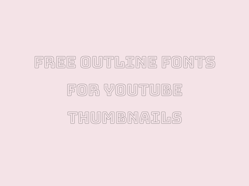
57 Best Free Outline Fonts for YouTube Thumbnails
ARTICLE TITLE: Best Free Outline Fonts for YouTube Thumbnails
Thumbnail text has one job: stop the scroll in a tiny square while a video is still loading its preview. That usually means huge, chunky letterforms with a heavy stroke or outline wrapped around them, so the words stay legible over busy footage, bright backgrounds, or a face taking up half the frame. Some of the fonts below are genuine outline or inline designs straight out of the box, with hollow or line-filled letterforms built right into the typeface. Others are the thick, confident display and sans faces that thumbnail creators reach for specifically because they hold a stroke or outline effect beautifully once you add one in Canva, Photoshop, or your editing software of choice. All of them are free to download on Google Fonts, and all of them were chosen because they genuinely earn a spot in a YouTube creator’s toolkit rather than filling out a list.
-
Bungee Outline
NEW VIDEO EVERY FRIDAY NIGHT
Bungee Outline
Built as the hollow sibling of the popular urban-sign face Bungee, this one arrives outlined by design, so there is no extra stroke effect to apply in your editor. The thick, evenly weighted lines read clearly even when shrunk down to a thumbnail’s tiny preview size on a phone screen. It layers especially well over a bright color fill or a photo, since the open counters let background color peek through for a poster-like effect.
- Language support: Latin, Latin Extended, Vietnamese
- Styles: 1 weight (Regular)
-
Bungee Inline
SUBSCRIBE FOR WEEKLY GAMING CONTENT
Bungee Inline
A second line running through each bold letterform gives Bungee Inline a layered, almost 3D feel without any extra editing work. It sits nicely next to Bungee Outline for a two-tone thumbnail treatment, one word solid and one word inline.
- Language support: Latin, Latin Extended, Vietnamese
- Styles: 1 weight (Regular)
-
Bungee Hairline
TOP 10 MOMENTS YOU MISSED
Bungee Hairline
This is the thinnest member of the Bungee family, its letters reduced to a delicate single-weight outline. It struggles at very small sizes, so save it for larger headline text or a secondary line rather than a cramped thumbnail corner.
- Language support: Latin, Latin Extended, Vietnamese
- Styles: 1 weight (Regular)
-
Bungee Shade
LIVE REACTION WATCH PARTY TONIGHT
Bungee Shade
Bungee Shade fakes dimension with a hard drop shadow baked into the letterforms, giving flat thumbnail text an extruded, sign-painted look. It pairs naturally with the outline and inline versions from the same family if you want a cohesive set of headline treatments across a channel.
- Language support: Latin, Latin Extended, Vietnamese
- Styles: 1 weight (Regular)
-
Bungee
WATCH BEFORE THIS GETS DELETED
Bungee
The solid original behind the whole family, Bungee is dense and upright with almost no whitespace between strokes, which makes it an excellent base for a heavy outline added in post. It has the confident, slightly retro feel of city transit signage, useful for vlogs, travel, and city-life content.
- Language support: Latin, Latin Extended, Vietnamese
- Styles: 1 weight (Regular)
-
Big Shoulders Inline
BREAKING NEWS YOU NEED NOW
Big Shoulders Inline
Chicago’s civic architecture inspired this condensed workhorse, and the inline cut carves a thin channel through each heavy stroke for a stamped, industrial outline effect. Its narrow proportions let you cram a long headline across a thumbnail without shrinking the type into mush.
- Language support: Latin, Latin Extended, Vietnamese
- Styles: 9 weights (Thin to Black)
-
Fascinate Inline
SPOOKY STORIES FOR HALLOWEEN NIGHT
Fascinate Inline
Fascinate Inline mixes art deco angles with a hollow center line, giving it a mysterious, slightly theatrical mood that suits horror, true crime, or mystery channels. It is a display font meant for a handful of words, not a caption.
- Language support: Latin, Latin Extended
- Styles: 1 weight (Regular)
-
Fascinate
UNLOCK THE SECRET NOBODY TELLS YOU
Fascinate
The solid partner to Fascinate Inline, this one keeps the same jagged, ceremonial letterforms without the hollow center. Use the two together on a channel that wants a consistent, slightly ominous brand voice.
- Language support: Latin, Latin Extended
- Styles: 1 weight (Regular)
-
Nabla
LEVEL UP YOUR THUMBNAIL GAME
Nabla
Google’s variable color font Nabla renders letters with a genuine extruded, three-dimensional outline that shifts depth and shadow depending on the settings applied. It looks spectacular at large thumbnail-headline sizes, chunky and toy-like, though it needs a modern browser or export tool that supports color fonts to show its full effect.
- Language support: Latin, Latin Extended, Cyrillic Extended, Vietnamese
- Styles: 1 weight (Regular)
-
Rubik Lines
THE TRUTH BEHIND THIS TREND
Rubik Lines
Fine parallel lines fill each letterform here instead of a solid color, giving Rubik Lines a woodcut or engraved texture rather than a clean outline. It works best as a stylistic accent word rather than a full headline, since the linework can blur at small sizes.
- Language support: Latin, Latin Extended, Cyrillic, Cyrillic Extended, Hebrew
- Styles: 1 weight (Regular)
-
Rubik Iso
INSIDE THE BUILD YOU REQUESTED
Rubik Iso
This one fakes an isometric, block-letter extrusion, giving flat text real dimensional presence without any 3D software. It suits tech, gaming, and DIY build channels that want a slightly playful, toy-brick aesthetic.
- Language support: Latin, Latin Extended, Cyrillic, Cyrillic Extended, Hebrew
- Styles: 1 weight (Regular)
-
Rubik Doodle Shadow
WHAT REALLY HAPPENED THIS WEEK
Rubik Doodle Shadow
A hand-doodled shadow trails behind each rounded letter, giving this face a scrappy, sketched-in-a-notebook energy. It suits comedy, commentary, and vlog content that wants to feel handmade rather than corporate.
- Language support: Latin, Latin Extended, Cyrillic, Cyrillic Extended, Hebrew
- Styles: 1 weight (Regular)
-
Rubik Distressed
RAW UNCUT FOOTAGE INSIDE
Rubik Distressed
Cracks and texture break up the strokes of this face, so it reads a little worn and lived-in even before you add any effects. Grunge, punk, and DIY repair channels tend to reach for something like this.
- Language support: Latin, Latin Extended, Cyrillic, Cyrillic Extended, Hebrew
- Styles: 1 weight (Regular)
-
Anton
THIS CHANGES EVERYTHING YOU KNOW
Anton
Anton is close to a house style for YouTube thumbnails at this point, and for good reason. Its strokes are almost impossibly thick and its counters tight, so a black or white outline traced around the letters barely has to fight for space, and the text stays punchy even shrunk to a suggested-video size.
Because it is so heavily used across the platform, leaning on Anton alone can make a thumbnail blend into a sea of similar-looking videos, so consider it a reliable default rather than a signature look.
- Language support: Latin, Latin Extended, Vietnamese
- Styles: 1 weight (Regular)
-
Bebas Neue
YOU WON'T BELIEVE THIS ENDING
Bebas Neue
Tall, narrow, and all caps only, Bebas Neue trades width for height, letting you fit a long headline across a widescreen thumbnail without wrapping to a second line. It takes an outline stroke cleanly thanks to its simple geometric shapes.
- Language support: Latin, Latin Extended
- Styles: 1 weight (Regular)
-
Archivo Black
EVERY DETAIL YOU MISSED EXPLAINED
Archivo Black
A grotesque sans built at maximum weight, Archivo Black has a slightly wider, friendlier stance than Anton or Bebas Neue, which softens the aggressive feel some thumbnails lean into. It reads well in both title case and all caps.
- Language support: Latin, Latin Extended
- Styles: 1 weight (Regular)
-
Alfa Slab One
BEFORE AND AFTER RESULTS SHOWN
Alfa Slab One
Heavy slab serifs give this face a stamped, official-looking weight that suits reaction, review, and comparison content. The slabs themselves create natural thick-and-thin contrast, so even a thin outline traced around the letters adds noticeable definition.
- Language support: Latin, Latin Extended, Vietnamese
- Styles: 1 weight (Regular)
-
Titan One
BIGGEST FAILS OF THE YEAR
Titan One
Rounded and inflated like a balloon letter, Titan One already looks like it has been outlined by hand, with a soft white highlight built into its default styling. It fits comedy, kids, and gaming content that wants a bouncy, cartoonish energy.
- Language support: Latin, Latin Extended
- Styles: 1 weight (Regular)
-
Luckiest Guy
THIS PRANK WENT SO WRONG
Luckiest Guy
Few free fonts scream comic-book marquee quite like Luckiest Guy, with its wobbly baseline and thick, friendly strokes. Add a bold outline in your editor and it looks straight off a cereal box, which makes it a favorite for prank, challenge, and family-vlog thumbnails.
- Language support: Latin, Latin Extended
- Styles: 1 weight (Regular)
-
Bangers
EPIC FAIL COMPILATION PART TWO
Bangers
Modeled on vintage comic lettering, Bangers leans into rough edges and exaggerated proportions that suit loud, high-energy titles. It gets muddy in long sentences, so keep it to a short punchy phrase.
- Language support: Latin, Latin Extended, Vietnamese
- Styles: 1 weight (Regular)
-
Righteous
THE ULTIMATE SPEEDRUN CHALLENGE BEGINS
Righteous
Righteous has a retro, rounded-square geometry reminiscent of 1970s branding, confident without being as aggressive as the heaviest impact fonts. It suits music, lifestyle, and pop-culture channels aiming for a warm, nostalgic mood.
- Language support: Latin, Latin Extended
- Styles: 1 weight (Regular)
-
Chewy
SLIME MAKING GONE HORRIBLY WRONG
Chewy
Bubbly and food-inspired, Chewy already carries a built-in outline shadow that gives it a puffy, edible quality. It is a natural fit for kids’ content, cooking, and unboxing videos with a playful tone.
- Language support: Latin
- Styles: 1 weight (Regular)
-
Boogaloo
DANCE CHALLENGE RESULTS ARE IN
Boogaloo
This one swings between rounded and angular within the same letterform, giving it a loose, hand-lettered energy that suits dance, music, and entertainment thumbnails. It holds a thick outline well thanks to its generous stroke width.
- Language support: Latin
- Styles: 1 weight (Regular)
-
Fredoka
FAMILY VLOG TURNS INTO CHAOS
Fredoka
Rounded terminals and soft curves make Fredoka feel approachable and friendly rather than aggressive, a good pick for family, lifestyle, and educational channels that still want bold, readable thumbnail text. Its variable weight axis lets you dial in exactly how heavy the outline treatment can go.
- Language support: Latin, Latin Extended, Hebrew
- Styles: 5 weights (Light to Bold)
-
Baloo 2
COOKING DISASTER YOU HAVE TO SEE
Baloo 2
Baloo 2 carries the rounded warmth of Indian display lettering traditions into a clean, modern sans. It reads comfortably at both small and large sizes, which makes it forgiving for creators who reuse the same title text across a thumbnail and an on-screen lower third.
- Language support: Latin, Latin Extended, Devanagari, Vietnamese
- Styles: 5 weights (Regular to Extra-Bold)
-
Rammetto One
THIS TRICK ACTUALLY WORKS EVERY TIME
Rammetto One
Chunky, rounded, and slightly inflated, Rammetto One has a friendly cartoon weight that suits how-to and lifehack content aiming for an approachable rather than shouty tone.
- Language support: Latin, Latin Extended
- Styles: 1 weight (Regular)
-
Bowlby One
MYSTERY BOX UNBOXING GONE RIGHT
Bowlby One
Extremely bold and slightly condensed, Bowlby One packs a lot of visual weight into a small footprint, useful when a headline needs to compete against a busy photo background.
- Language support: Latin
- Styles: 1 weight (Regular)
-
Bowlby One SC
RANKED WORST TO BEST TODAY
Bowlby One SC
The small-caps version of Bowlby One trades lowercase letters for smaller capital forms, giving titles a tidy, uniform block shape that lines up neatly when stacked over two rows on a thumbnail.
- Language support: Latin, Latin Extended
- Styles: 1 weight (Regular)
-
Paytone One
HONEST REVIEW AFTER ONE MONTH
Paytone One
Rounded and evenly weighted, Paytone One sits comfortably between friendly and authoritative, which suits review and tech-explainer channels that want bold text without looking like a cartoon.
- Language support: Latin, Latin Extended, Vietnamese
- Styles: 1 weight (Regular)
-
Fjalla One
FIVE THINGS NOBODY TELLS YOU
Fjalla One
A narrower, more restrained alternative to the loudest fonts on this list, Fjalla One works well for a secondary line of text or a subtitle sitting beneath a bigger, bolder headline word.
- Language support: Latin, Latin Extended, Cyrillic Extended, Vietnamese
- Styles: 1 weight (Regular)
-
Staatliches
GAME NIGHT GOES OFF THE RAILS
Staatliches
Condensed and slightly rough around the edges, Staatliches has the feel of a hand-stamped poster rather than a polished corporate sans, which suits gaming, sports, and event-recap thumbnails.
- Language support: Latin, Latin Extended
- Styles: 1 weight (Regular)
-
Bevan
RESTORING THIS ABANDONED HOUSE COMPLETELY
Bevan
A slab serif with real heft, Bevan brings a rugged, workshop feel that fits restoration, woodworking, and before-and-after renovation content particularly well.
- Language support: Latin, Latin Extended, Vietnamese
- Styles: 2 styles (1 weight plus italics)
-
Ultra
THE HEAVIEST WORKOUT CHALLENGE EVER
Ultra
Ultra is a slab serif turned up to maximum density, its serifs almost as thick as the stems they connect to. It looks striking as a single word blown up large across a thumbnail.
- Language support: Latin, Latin Extended
- Styles: 1 weight (Regular)
-
Shrikhand
SPICIEST FOOD CHALLENGE IN INDIA
Shrikhand
Inspired by South Asian sign painting, Shrikhand has a bold, wavy rhythm that instantly signals festival, food, or travel content with a specific cultural flavor. It carries a heavy stroke width that stands up to an outline effect without losing shape.
- Language support: Latin, Latin Extended, Gujarati
- Styles: 1 weight (Regular)
-
Black Ops One
MISSION BRIEFING STARTS RIGHT NOW
Black Ops One
Stenciled and military in feel, Black Ops One is the reflexive choice for shooter and tactical gaming thumbnails, and it earns that reputation with sharp, no-nonsense letterforms that read instantly even in a small preview.
- Language support: Latin, Latin Extended, Cyrillic Extended, Vietnamese
- Styles: 1 weight (Regular)
-
Patua One
TOP FIVE TRAVEL DESTINATIONS RANKED
Patua One
A dependable slab with rounded corners, Patua One reads as sturdy and trustworthy rather than flashy, a solid choice for informational or list-style videos.
- Language support: Latin
- Styles: 1 weight (Regular)
-
Changa One
BUILT THIS IN JUST 24 HOURS
Changa One
Slightly condensed with a confident lean in its italic cut, Changa One suits build logs, timelapse projects, and challenge videos that want momentum baked into the letterforms.
- Language support: Latin
- Styles: 2 styles (1 weight plus italics)
-
Sigmar One
ULTIMATE BOSS FIGHT NO DAMAGE
Sigmar One
Rounded and inflated to near-bubble proportions, Sigmar One already looks outlined thanks to its thick, uniform strokes, making it a natural fit for gaming thumbnails that want maximum visual weight in a short word.
- Language support: Latin, Latin Extended, Vietnamese
- Styles: 1 weight (Regular)
-
Modak
STREET FOOD TOUR AROUND MUMBAI
Modak
Designed around the Devanagari script tradition, Modak’s Latin cut keeps that same rounded, syrupy weight, giving it a distinct, food-and-festival warmth that few other bold display fonts share.
- Language support: Latin, Latin Extended, Devanagari
- Styles: 1 weight (Regular)
-
Gluten
BAKING FAILS YOU HAVE TO SEE
Gluten
True to its name, Gluten stretches and puffs its letterforms into a soft, doughy shape, an easy pick for baking, cooking, and dessert-focused thumbnails.
- Language support: Latin, Latin Extended, Vietnamese
- Styles: 9 weights (Thin to Black)
-
Grandstander
SUBSCRIBE FOR MORE WEEKLY UPLOADS
Grandstander
A bouncy, slightly wobbly variable font, Grandstander feels handmade and energetic without tipping into chaos. Its variable weight axis makes it easy to match the exact heaviness needed before adding an outline.
- Language support: Latin, Latin Extended, Vietnamese
- Styles: 18 styles (9 weights plus italics)
-
League Gothic
THE FULL STORY FINALLY REVEALED
League Gothic
A tall, condensed workhorse revived from early twentieth-century American type, League Gothic fits long headlines into narrow thumbnail space without losing authority.
- Language support: Latin, Latin Extended, Vietnamese
- Styles: 1 weight (Regular)
-
Teko
RACE DAY RESULTS AND HIGHLIGHTS
Teko
Extremely narrow and tall, Teko was built for headline density, letting a long sentence sit across a single line where a wider font would have to wrap.
- Language support: Latin, Latin Extended, Devanagari
- Styles: 5 weights (Light to Bold)
-
Barlow Condensed
COMMUTER BUILD FINAL SPEC REVEAL
Barlow Condensed
Clean, engineered, and quietly confident, Barlow Condensed brings an automotive-inspired precision to thumbnail headlines that suit tech, cars, and product-review content.
- Language support: Latin, Latin Extended, Vietnamese
- Styles: 18 styles (9 weights plus italics)
-
Kanit
STARTUP LAUNCH DAY FULL RECAP
Kanit
A geometric sans with Thai-influenced structure, Kanit at its boldest weight feels modern and slightly futuristic, a good fit for business, tech, and startup content.
- Language support: Latin, Latin Extended, Thai, Vietnamese
- Styles: 18 styles (9 weights plus italics)
-
Rubik Mono One
PIXEL ART TUTORIAL FOR BEGINNERS
Rubik Mono One
Monospaced and boxy, Rubik Mono One has a code-editor, retro-computing feel that suits programming, retro gaming, and pixel-art channels specifically.
- Language support: Latin, Latin Extended, Cyrillic
- Styles: 1 weight (Regular)
-
Bagel Fat One
CANDY TASTE TEST WORLD EDITION
Bagel Fat One
Round, plump, and cheerful, Bagel Fat One reads like a sticker on a lunchbox, which makes it a strong pick for kids’ content and sweet-treat food videos.
- Language support: Latin, Latin Extended, Korean
- Styles: 1 weight (Regular)
-
Bubblegum Sans
MILK TEA REVIEW AND RANKING
Bubblegum Sans
Playful and rounded with soft, bubble-like curves, Bubblegum Sans brings a bouncy, cheerful energy that suits drink reviews and lighthearted lifestyle content perfectly.
- Language support: Latin, Latin Extended
- Styles: 1 weight (Regular)
-
Vast Shadow
OLD WEST TREASURE HUNT BEGINS
Vast Shadow
A slab serif with a heavy built-in shadow, Vast Shadow already has dimensional depth before any editing, giving it a saloon-sign, western feel suited to history and adventure content.
- Language support: Latin
- Styles: 1 weight (Regular)
-
Krona One
MINIMALIST DESK SETUP TOUR TODAY
Krona One
Geometric and evenly weighted with a distinctly Scandinavian restraint, Krona One suits tech and minimalist lifestyle channels that want bold text without any decorative flourish.
- Language support: Latin, Latin Extended
- Styles: 1 weight (Regular)
-
Big Shoulders Stencil
CONSTRUCTION SITE TOUR AND UPDATE
Big Shoulders Stencil
The stencil cut of the Big Shoulders family leaves natural gaps in each letter, mimicking spray-painted warehouse lettering, a strong match for construction, industrial, and military content.
- Language support: Latin, Latin Extended, Vietnamese
- Styles: 9 weights (Thin to Black)
-
Stardos Stencil
SURVIVAL CHALLENGE DAY THREE UPDATE
Stardos Stencil
Rounder and friendlier than most stencil faces, Stardos Stencil keeps the cutout gaps of a spray-paint template while softening the corners, useful when a channel wants a rugged look without full military intensity.
- Language support: Latin
- Styles: 2 weights (Regular, Bold)
-
Monoton
NEON NIGHTS IN THE CITY
Monoton
Built from continuous overlapping lines that mimic bent neon tubing, Monoton is one of the most distinctive display fonts on Google Fonts, though it only really works at large sizes since the interwoven strokes turn illegible once shrunk down. Save it for a short, glowing headline word rather than a full sentence, ideally against a dark thumbnail background where the neon illusion actually reads.
- Language support: Latin, Latin Extended
- Styles: 1 weight (Regular)
-
Wallpoet
RETRO ARCADE HIGH SCORE ATTEMPT
Wallpoet
Blocky and slightly futuristic, Wallpoet has the feel of an old stencil sign crossed with early computer typography, a fun match for retro gaming and synthwave-themed channels.
- Language support: Latin
- Styles: 1 weight (Regular)
-
Racing Sans One
ZERO TO SIXTY IN SECONDS
Racing Sans One
Leaning forward with a built-in sense of speed, Racing Sans One was practically made for automotive, motorsport, and racing-game thumbnails that want motion baked into the letterforms themselves.
- Language support: Latin, Latin Extended
- Styles: 1 weight (Regular)
-
Passion One
PART TWO IS FINALLY HERE
Passion One
At its heaviest black weight, Passion One turns rounded and dense, closer to a bubble letter than a standard sans. It is a reliable, slightly softer alternative to Anton when a thumbnail needs impact without quite so much visual aggression.
- Language support: Latin, Latin Extended
- Styles: 3 weights (Regular, Bold, Black)
-
Baloo Bhaijaan 2
STREET MARKET FOOD TOUR ADVENTURE
Baloo Bhaijaan 2
Warm and rounded with roots in Arabic-script display lettering traditions extended to Latin, Baloo Bhaijaan 2 brings a friendly, global feel that suits travel and cultural-food content especially well.
- Language support: Latin, Latin Extended, Arabic, Vietnamese
- Styles: 5 weights (Regular to Extra-Bold)
Getting the outline effect right on your thumbnails
A handful of the fonts above are outline or inline by design, which means the hollow effect is already built into the letterforms and needs no extra work.
For everything else, the outline look comes from adding a stroke around bold, simple letter shapes in your editing software. Thick, low-contrast fonts like Anton, Bebas Neue, and Archivo Black hold that stroke cleanly because their counters stay open even with several extra pixels of outline added.
Keep the stroke color high-contrast against both the text fill and the thumbnail background, usually a dark outline on light text or the reverse. Test the result at actual thumbnail size, since a stroke that looks crisp at full screen can clog into a blur once it shrinks to a suggested-video preview.
Limit a single thumbnail to one or two typefaces at most. Pair a loud display font for the main hook with a plainer condensed sans for a smaller supporting line, so the eye knows exactly where to land first.
Between the genuine outline and inline faces and the heavy display fonts built to take a stroke well, there is enough range here to give any channel, from gaming to cooking to commentary, a thumbnail style that feels distinct rather than borrowed. All of these are free downloads from Google Fonts, ready to drop straight into whatever thumbnail template or editor a creator already uses.