
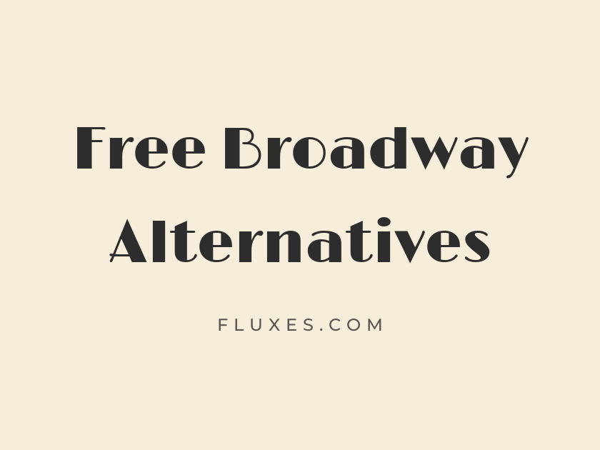
15 Best Free Fonts Alternatives to Broadway
Broadway has that unmistakable 1920s marquee energy: thick verticals, delicate hairline shading, and a swagger that belongs on a vaudeville poster or a jazz age playbill. Because it is a licensed classic rather than a free download, designers looking to capture that same theatrical, Art Deco spirit for free often turn to Google Fonts for display faces with the same period charm, geometric bones, or showbiz confidence. Some of the options here lean closer to the original’s ornate detailing, while others simply borrow its bold, spotlight-ready attitude.
-
Limelight
Now playing: tonight's dazzling revue
Limelight
Of everything on this list, Limelight comes closest to channeling Broadway’s actual marquee spirit. Its rounded, slightly theatrical letterforms look like they were pulled straight off a 1930s cinema sign, which makes it the obvious first stop for anyone chasing that exact mood in a free font.
- Language support: Latin, Latin Extended
- Styles: 1 weight (Regular)
-
Fascinate
Step right up to the grand marquee
Fascinate
Fascinate is a genuine Art Deco display face, built from the same geometric logic that shaped Broadway and its contemporaries. The letters feel carved rather than drawn, with angular joins that give headlines a stagey, gilded-poster quality.
- Language support: Latin, Latin Extended
- Styles: 1 weight (Regular)
-
Fascinate Inline
Curtain rises on the season premiere
Fascinate Inline
This is the outlined companion to Fascinate, and it earns its own place because it opens up so much design flexibility. Use it layered over a solid color or paired with its filled sibling for a two-tone marquee effect that reads as pure vintage theater signage.
- Language support: Latin, Latin Extended
- Styles: 1 weight (Regular)
-
Monoton
Neon lights blaze above the theatre
Monoton
Monoton trades hairline elegance for pure spectacle. Its overlapping strokes were built to mimic neon tube lettering, so it works best at large sizes on posters, title cards, or anywhere you want the glow of an old cinema sign rather than subtlety; at small sizes it turns to visual noise fast.
- Language support: Latin, Latin Extended
- Styles: 1 weight (Regular)
-
Cinzel Decorative
An ornate curtain call for opening night
Cinzel Decorative
Cinzel Decorative carries a carved, monumental quality borrowed from Roman inscriptions, then dresses it up with flourished serifs that feel right at home on a gala invitation or a period drama’s title sequence. It reads as more classical than Art Deco, but the ornamentation gives it the same sense of occasion Broadway trades on.
- Language support: Latin, Latin Extended
- Styles: 3 weights (Regular, Bold, Black)
-
Poiret One
Elegant lines for a jazz age soiree
Poiret One
Where Broadway is heavy and declarative, Poiret One is its featherweight cousin. This is a genuine 1920s geometric sans, all thin uniform strokes and perfect circles, and it suits refined invitations, fashion branding, or any headline that wants deco glamour without the shout.
- Language support: Latin, Latin Extended, Cyrillic
- Styles: 1 weight (Regular)
-
Rozha One
Velvet curtains rise on opening night
Rozha One
Rozha One is a display serif with unexpected drama in its contrast, thick shoulders tapering into fine hairlines that catch the eye in a title or pull quote. It has more literary weight than most fonts here, so it pairs nicely with editorial layouts covering theater history or film retrospectives.
- Language support: Latin, Latin Extended, Devanagari
- Styles: 1 weight (Regular)
-
Abril Fatface
Headline news from the Great White Way
Abril Fatface
Abril Fatface brings the same exaggerated thick-thin contrast that made Broadway famous, just filtered through a more classical didone structure. It is a dependable choice for oversized headlines and magazine mastheads, and it stays legible even where Broadway itself starts to feel fussy.
- Language support: Latin, Latin Extended
- Styles: 1 weight (Regular)
-
Ultra
Bold billing for the season's biggest hit
Ultra
Ultra is blunt, heavy, and unapologetically vintage, the kind of slab that looks lifted from an old circus handbill. It has none of Broadway’s delicate shading, but it shares the same appetite for attention, making it a solid pick when you want bold poster typography over period accuracy.
- Language support: Latin, Latin Extended
- Styles: 1 weight (Regular)
-
Alfa Slab One
Sold out show, standing ovation nightly
Alfa Slab One
This one is built for impact rather than nuance. Alfa Slab One’s chunky, rounded slabs hold up beautifully at billboard scale, though it can feel a little blunt in longer headlines, so it earns its keep in short, punchy show titles and ticket badges.
- Language support: Latin, Latin Extended, Vietnamese
- Styles: 1 weight (Regular)
-
Bungee
Bright lights, big city, live tonight
Bungee
Bungee was designed with urban signage in mind, and that same bold, geometric confidence translates well to theater branding. It has a more contemporary, street-sign energy than Broadway’s soft Art Deco curves, which makes it a good option for a modern revival poster rather than a period-accurate one.
- Language support: Latin, Latin Extended, Vietnamese
- Styles: 1 weight (Regular)
-
Vast Shadow
A vaudeville poster from decades past
Vast Shadow
Vast Shadow bakes a drop shadow directly into its letterforms, giving it a dimensional, hand-painted quality reminiscent of old vaudeville bills. It is inherently a display-only font, so keep it to titles and short phrases rather than body copy.
- Language support: Latin
- Styles: 1 weight (Regular)
-
Rye
Saloon doors swing for the matinee
Rye
Rye leans more Old West than Art Deco, but its thick-thin construction and decorative serifs give it the same vintage showmanship that Broadway carries. It suits playbills for period pieces, western-themed productions, or anything wanting a slightly rowdier, saloon-door charm.
- Language support: Latin, Latin Extended
- Styles: 1 weight (Regular)
-
Trade Winds
Swashbuckling script for a period drama
Trade Winds
Trade Winds mixes a slight slab structure with swashy, adventurous curves that feel pulled from an old travel poster or serial-film title card. It is a good option when a project needs vintage flavor with a bit more informality than the stiffer deco faces on this list.
- Language support: Latin
- Styles: 1 weight (Regular)
-
Geostar Fill
Geometric glamour for a deco poster
Geostar Fill
Built entirely from circles, straight lines, and sharp angles, Geostar Fill has the rigid geometry that defines so much Art Deco design work. It reads best as a display accent, a logotype, or a single striking word rather than a full headline, since its strict construction can slow down longer reading.
- Language support: Latin
- Styles: 1 weight (Regular)
Pairing and Usage Tips
Most of these faces are display-only, so reserve them for headlines, titles, and short marquee-style phrases.
For body copy, pair them with a calm, well-spaced serif or sans like EB Garamond or Work Sans to keep long passages readable.
If you want maximum Art Deco authenticity, combine Fascinate or Poiret One for display type with a geometric sans for supporting text.
Test any of the heavier options, like Ultra or Alfa Slab One, at your actual target size before committing; some designs that look bold at 72px can feel clumsy shrunk down to a subheading.
Broadway’s swagger is hard to replicate exactly, but between the deco geometry of Fascinate, the marquee glow of Limelight, and the dramatic contrast of Abril Fatface, there is enough range here to bring genuine vintage theatrical character to a project without spending a cent.