
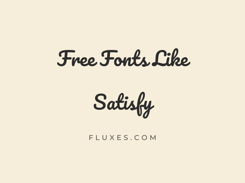
14 Best Free Fonts Similar to Satisfy
Satisfy has become a go-to choice for anyone who needs a casual script that feels handwritten but still reads cleanly on screen, which is exactly why so many designers search for free fonts similar to Satisfy when they want variety without losing that relaxed, brush-pen energy. The style sits in a specific niche: looser than a formal calligraphy script, friendlier than a marker font, and versatile enough for greeting cards, social graphics, packaging labels, and logo work. The alternatives below cover that same casual-script territory, from bouncy brush scripts to looped handwriting styles, all free to download on Google Fonts.
-
Pacifico
Sunny afternoons call for iced coffee
Pacifico
Pacifico is the font most people picture when they think of a rounded, retro surf-shop script, and it shares Satisfy’s friendly, bouncy rhythm almost letter for letter. Originally drawn for a soda brand, it still carries that sense of casual American nostalgia, making it a natural fit for cafe branding, product labels, and playful headlines.
- Language support: Latin, Latin Extended, Cyrillic, Cyrillic Extended, Vietnamese
- Styles: 1 weight (Regular)
-
Dancing Script
Handwritten notes for every celebration
Dancing Script
Dancing Script leans a touch more elegant than Satisfy, with sweeping connections between letters that feel closer to formal invitation calligraphy. At bolder weights it holds up beautifully on posters and packaging, though at small sizes the loops can blur together, so reserve it for display use.
- Language support: Latin, Latin Extended, Vietnamese
- Styles: 4 weights (Regular to Bold)
-
Kalam
Quick sketches and casual weekend plans
Kalam
Kalam reads like a fast, confident hand rather than a polished script, which makes it a good pick when Satisfy feels a little too smooth for the mood you’re after. It was built for multilingual handwriting projects, so it carries a natural, unforced looseness that works well in comment bubbles, sticky-note graphics, and casual UI copy.
- Language support: Latin, Latin Extended, Devanagari
- Styles: 3 weights (Light, Regular, Bold)
-
Caveat
Sticky notes, doodles, and small reminders
Caveat
Caveat is one of the most downloaded handwriting fonts on Google Fonts, and for good reason: it feels genuinely personal without tipping into messy. Pair it with a clean sans serif body font for a warm, human contrast in blog headers or lifestyle branding.
- Language support: Latin, Latin Extended, Cyrillic, Cyrillic Extended
- Styles: 4 weights (Regular to Bold)
-
Courgette
Fresh baked bread every single morning
Courgette
Courgette has a soft, rounded brush quality that sits between Satisfy and a hand-lettered logotype. Its consistent stroke weight keeps it legible even in smaller headline sizes, which is a genuine advantage over lighter, thinner scripts in this category.
- Language support: Latin, Latin Extended
- Styles: 1 weight (Regular)
-
Yellowtail
Sweet treats made with love daily
Yellowtail
Yellowtail brings a retro, mid-century advertising feel, with tall ascenders and a confident forward slant that gives it real presence in short bursts of text. It works best as a single word or short phrase rather than long copy, since the connected strokes start to fight each other in longer sentences.
- Language support: Latin, Latin Extended
- Styles: 1 weight (Regular)
-
Permanent Marker
Bold statements written in thick ink
Permanent Marker
Permanent Marker trades Satisfy’s flowing connections for the blunt, felt-tip texture of a marker pen, making it a strong choice whenever a project needs energy and a bit of grit. Think concert flyers, skate brand logos, or callout badges where a softer script would feel too polite.
- Language support: Latin
- Styles: 1 weight (Regular)
-
Handlee
Friendly reminders in a casual voice
Handlee
Handlee is unassuming and legible, closer to everyday cursive handwriting than performance calligraphy. It works quietly in the background of a design, which makes it a solid choice for form labels, annotations, or supporting text that needs a human touch without drawing attention away from a headline.
- Language support: Latin
- Styles: 1 weight (Regular)
-
Marck Script
Elegant greetings for special occasions
Marck Script
Marck Script has a refined, old-fashioned quality, as if it were lifted from a vintage letterpress invitation. It suits wedding stationery and formal announcements better than casual social content, giving you a more dressed-up option within this same script family.
- Language support: Latin, Latin Extended, Cyrillic
- Styles: 1 weight (Regular)
-
Sacramento
Delicate lettering for wedding invitations
Sacramento
Sacramento is thinner and more delicate than Satisfy, with a monoline structure that gives it a light, airy feel. It photographs beautifully on printed cards and packaging but needs generous letter-spacing and a larger size to stay readable, since its fine strokes can thin out to nearly invisible on low-resolution screens.
- Language support: Latin, Latin Extended
- Styles: 1 weight (Regular)
-
Homemade Apple
A little note just for you
Homemade Apple
Homemade Apple looks exactly like ballpoint pen handwriting, uneven pressure and all, which gives it a diary-entry intimacy that few other Google Fonts scripts match. Use it sparingly, in short phrases, since its irregular baseline makes long paragraphs genuinely tiring to read.
- Language support: Latin
- Styles: 1 weight (Regular)
-
Grand Hotel
Classic charm for your storefront sign
Grand Hotel
Grand Hotel carries an art-deco, hand-painted-sign quality that suits vintage branding, cafe signage, and label design. It feels a little more theatrical than Satisfy, so it works best when a project wants a hint of old-world glamour rather than casual friendliness.
- Language support: Latin, Latin Extended
- Styles: 1 weight (Regular)
-
Playball
Play ball at the summer festival
Playball
Playball has thick, confident curves reminiscent of vintage sports branding and old baseball signage. It is a strong single-word display option for logos and badges, though it was never designed for running text and starts to feel heavy beyond a short headline.
- Language support: Latin, Latin Extended, Vietnamese
- Styles: 1 weight (Regular)
-
Shadows Into Light
Everyday thoughts jotted down casually
Shadows Into Light
Shadows Into Light feels like a quick note scrawled with a felt pen, light on its feet and slightly irregular in a way that reads as genuine rather than decorative. It pairs nicely with a plain sans serif for blog headers or personal branding where warmth matters more than formality.
- Language support: Latin, Latin Extended
- Styles: 1 weight (Regular)
Pairing and usage tips
Most casual scripts like these work best as accents rather than body text. Reserve them for headlines, logos, or short callouts, and let a clean sans serif or serif carry the paragraphs.
Keep an eye on size. Scripts with fine strokes or heavy connections, such as Sacramento or Dancing Script, need larger point sizes to stay crisp on screen.
When building a free font pairing, aim for contrast rather than similarity. A geometric sans like Poppins or a workhorse serif like Lora will let any of these scripts stand out instead of competing for attention.
Test your chosen script at the exact size it will appear in the final design, since casual handwriting styles can shift dramatically in personality between a business card and a billboard.
Each of these fonts offers its own take on the loose, handwritten warmth that made Satisfy popular, and all of them are free to download and use through Google Fonts. Try a few side by side in your own project before committing, since the right amount of casual charm depends entirely on the tone you are trying to strike.







