
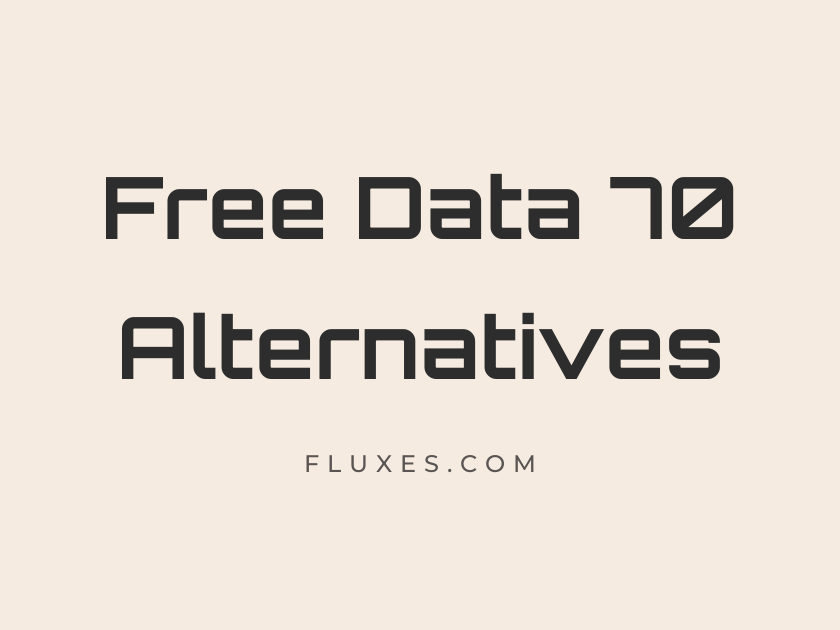
15 Best Free Fonts Alternatives to Data 70
Data 70 has been a go-to for retro-futuristic branding since its days as a Letraset dry-transfer sheet: that clipped, segmented, almost circuit-board geometry still shows up on synth panels, sci-fi posters, and tech packaging that wants to feel like a 1970s vision of the future. Since Data 70 itself isn’t available as a free desktop or web font, designers looking for a similar readout-style, digital, technical feel often turn to Google Fonts for a legally free substitute they can drop straight into a website or app. The fonts gathered here lean into that same computer terminal, LCD display, and geometric sci-fi territory, so you can match the mood of Data 70 without licensing headaches.
-
Orbitron
Initiating system diagnostics, all channels nominal
Orbitron
Orbitron is probably the closest match in spirit to Data 70’s confident, geometric squareness. Its wide, angular caps were built for the same kind of sci-fi dashboards and product logos, and at large display sizes it reads as instantly futuristic. It gets muddy in long paragraphs, so keep it for headlines, badges, and short technical labels.
- Language support: Latin
- Styles: 6 weights (Regular to Black)
-
Audiowide
Booting the mainframe at maximum velocity
Audiowide
There’s a chunky, video-game-cabinet energy to Audiowide that makes it a natural pick for anything wanting to feel loud and mechanical. It carries rounded corners rather than sharp segments, which softens the retro-tech vibe just slightly while keeping the display-only impact intact. Pair it with a plain grotesque body text so the personality stays contained to headlines.
- Language support: Latin, Latin Extended
- Styles: 1 weight (Regular)
-
Michroma
Encrypted transmission received from deep space
Michroma
Michroma feels like it was drawn with a ruler and a circuit diagram in mind, every letter built from clean rectangular strokes. It has a calmer, more corporate tone than some of its sci-fi cousins, which makes it useful for tech branding that wants futuristic without tipping into arcade kitsch. Use it sparingly, since its wide spacing eats up horizontal space fast.
- Language support: Latin, Latin Extended
- Styles: 1 weight (Regular)
-
Aldrich
Coordinates locked, engaging navigation sequence
Aldrich
Aldrich carries a stripped-down, almost stencil-adjacent geometry that echoes the mechanical typewriter-meets-computer look Data 70 popularized. It’s a single-weight font, so its best role is as a distinctive display face rather than a workhorse across a whole layout. Designers building retro sci-fi posters or synthwave album art tend to reach for it first.
- Language support: Latin
- Styles: 1 weight (Regular)
-
Electrolize
Signal boost required, rerouting auxiliary power
Electrolize
Electrolize leans narrower and more condensed than Orbitron or Michroma, giving it a slightly more understated technical feel that works well in interface mockups and dashboard headers. It shares that squared-off construction typical of digital display fonts but reads a touch friendlier at small sizes. It’s a solid choice when you want the genre without the font shouting for attention.
- Language support: Latin
- Styles: 1 weight (Regular)
-
Share Tech
Data stream stable, awaiting further instructions
Share Tech
Share Tech is a quieter cousin in this family, closer to a clean sans than a novelty display face, but it still carries the geometric, slightly mechanical bones that tie it to the Data 70 aesthetic. That restraint makes it genuinely usable as body copy alongside a louder display font from this list. It’s an easy way to keep a tech-themed layout legible without abandoning the theme entirely.
- Language support: Latin
- Styles: 1 weight (Regular)
-
Share Tech Mono
C: RUN DIAGNOSTIC.EXE STATUS: OK
Share Tech Mono
The monospaced sibling to Share Tech, this one nails the command-line, green-screen terminal look that pairs naturally with Data 70’s digital ancestry. Every character sits in its own fixed-width box, which makes it ideal for code snippets, countdown timers, or any interface element pretending to be a retro computer readout. It’s not meant for long-form reading, but for short technical strings it’s hard to beat.
- Language support: Latin
- Styles: 1 weight (Regular)
-
VT323
LOADING... PRESS ANY KEY TO CONTINUE
VT323
VT323 is pure pixel-terminal nostalgia, modeled on old cathode-ray tube displays rather than segmented LCD numerals, but it lands in the same retro-computing mood. It’s best used at the sizes it was designed for, since scaling it up too far reveals its blocky, low-resolution roots (which, depending on the project, might be exactly the point). Great for game UI, hacker-themed sites, or anything wanting a DOS-era wink.
- Language support: Latin, Latin Extended, Vietnamese
- Styles: 1 weight (Regular)
-
Nova Mono
Frequency locked at 70.7 megahertz
Nova Mono
Nova Mono has an offbeat, slightly wobbly monospace rhythm that feels less polished and more experimental than the others here. That rougher edge gives it character for zines, indie game branding, or any project that wants a hand-built, analog-computer feeling rather than a slick corporate one. It’s a font that rewards a bit of letter-spacing to let its odd proportions breathe.
- Language support: Latin, Latin Extended, Greek
- Styles: 1 weight (Regular)
-
Oxanium
Powering up the exosuit reactor core
Oxanium
Oxanium was built with gaming and esports branding in mind, and its angular, slightly stretched letterforms sit comfortably next to Data 70 in a lineup of futuristic display faces. It comes in a wider weight range than most fonts on this list, so it can flex from a bold hero headline down to a semi-bold subhead without losing its identity. That versatility makes it one of the more practical picks here for a full digital product interface.
- Language support: Latin, Latin Extended
- Styles: 7 weights (Extra-Light to Extra-Bold)
-
Chakra Petch
Rendering interface, please stand by
Chakra Petch
Chakra Petch mixes geometric precision with just enough humanist warmth to keep it from feeling cold, which makes it more comfortable in UI copy than most fonts on this list. Its squared bowls and clipped corners nod toward the same technical alphabet tradition Data 70 comes from. It’s a good candidate when you need a tech-inspired font that still has to carry paragraphs of interface text.
- Language support: Latin, Latin Extended, Thai, Vietnamese
- Styles: 10 styles (5 weights plus italics)
-
Iceberg
Descending to sector seven, hull integrity stable
Iceberg
Iceberg has a distinctly chilly, mechanical rigidity, all straight lines and sharp terminals with almost no curve softening the letters. It’s a narrower, more condensed alternative for logos and headers where space is tight but the sci-fi tone still needs to come through. Because it’s so graphic, it works best in all caps and short bursts rather than sentence-length copy.
- Language support: Latin
- Styles: 1 weight (Regular)
-
Wallpoet
Broadcast signal originating from station zero
Wallpoet
Wallpoet reads like stencil lettering crossed with an old airport departure board, and it brings a rougher, more industrial energy than the cleaner geometric options on this list. It suits posters, album covers, and any project chasing a gritty, analog-tech mood rather than a polished software interface. Its heavy, blocky caps mean it should be reserved for short, punchy lines of text.
- Language support: Latin
- Styles: 1 weight (Regular)
-
Major Mono Display
Executing script version seven point zero
Major Mono Display
This one is unmistakably strange, with lowercase letters built from oversized geometric shapes that look more like typographic experiments than a conventional alphabet. It won’t suit every project, but for an album cover, an art installation, or a brand that wants to look like nothing else on the shelf, that strangeness is the whole appeal. Treat it as a specialty display font rather than something to lean on across a full site.
- Language support: Latin, Latin Extended, Vietnamese
- Styles: 1 weight (Regular)
-
Turret Road
Route calculated, autopilot engaged for descent
Turret Road
Turret Road brings a rounder, more approachable take on the geometric-tech genre, with soft corners replacing the sharp angles found elsewhere on this list. Its wide weight range makes it flexible enough to handle both display headlines and shorter supporting text within the same design system. It works particularly well for tech products that want a friendlier, less severe futuristic tone.
- Language support: Latin, Latin Extended
- Styles: 6 weights (Extra-Light to Extra-Bold)
Pairing and web use tips
Most of these fonts are display faces first, so it helps to pair them with a plain, highly legible sans-serif for body copy. Something like Share Tech or Chakra Petch can bridge that gap since both stay readable at smaller sizes.
Keep the loudest display choices, like Orbitron, Wallpoet, or Major Mono Display, to headlines, buttons, or short labels. Their geometry gets harder to read the smaller and denser the text becomes.
When downloading from Google Fonts, only pull in the weights you actually plan to use. Most of these families ship as a single weight anyway, which keeps page load light and the retro-tech look crisp.
Any of these free Google Fonts can stand in for Data 70 without the licensing hassle, and mixing two or three from this list, one for display, one for supporting text, is usually enough to build a convincing retro-futuristic identity.