
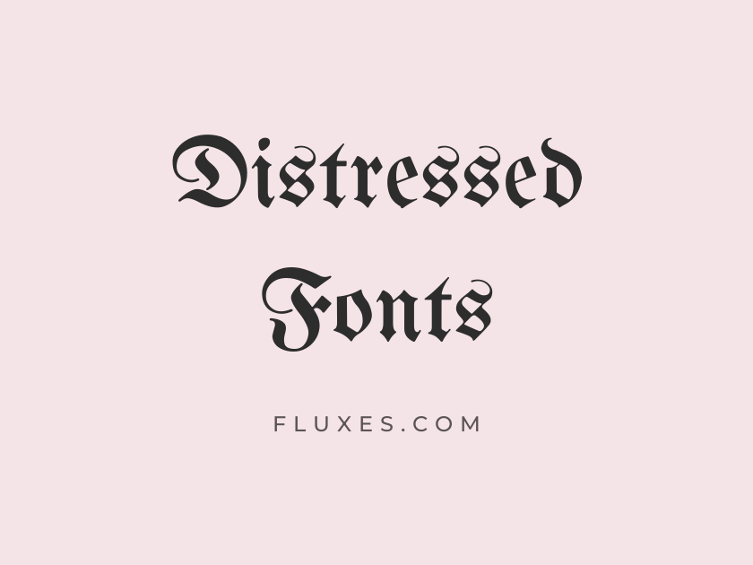
59 Best Distressed Fonts
Distressed type does a lot of emotional work in a very small space. A single worn, cracked, or ink-bled letterform can suggest decades of weather, a hundred years of history, a punk flyer stapled to a telephone pole, or a horror movie poster left curling in a basement. Because that texture has to be baked into the font itself rather than faked with a filter, choosing the right free distressed font matters more than it does for a clean sans or a tidy serif.
The options below span western woodtype, blackletter, horror drip, spray paint, stencil, marker scrawl, and hand-carved serif, all genuinely free to download from Google Fonts and easy to license for both personal and commercial work.
-
UnifrakturMaguntia
Old iron gates, rusted and weathered shut
UnifrakturMaguntia
Rooted in the German blackletter tradition, this face carries angular, broken strokes that feel closer to hammered iron than printed type. It reads best in short bursts, a band name, a single word on a poster, rather than a full sentence, since the density gets muddy at small sizes.
-
- Language support: Latin
- Styles: 1 weight (Regular)
-
UnifrakturCook
Forged letters worn by centuries of rust
UnifrakturCook
UnifrakturCook only ships in bold, and that heaviness works in its favor. The thicker strokes hold up better at smaller sizes than most gothic faces, which makes it a practical pick for badge logos and metal-band merchandise.
-
- Language support: Latin
- Styles: 1 weight (Bold)
-
Pirata One
Beware the pirate's cursed treasure map
Pirata One
Lighter and narrower than most blackletter, Pirata One trades brute weight for an engraved, slightly weathered elegance. It suits treasure-map graphics, tattoo flash, and anything wanting an old-world edge without full gothic heaviness.
-
- Language support: Latin, Latin Extended
- Styles: 1 weight (Regular)
-
Grenze Gotisch
Chiseled into crumbling stone monastery walls
Grenze Gotisch
Grenze Gotisch is a variable blackletter family, so you can dial in anything from a thin etched line to a dense, blocky weight. That range makes it one of the more flexible gothic options here, useful whether you need a delicate carved look or a heavy poster headline.
-
- Language support: Latin, Latin Extended, Vietnamese
- Styles: 9 weights (Thin to Black)
-
MedievalSharp
Sharpened blade, notched from ancient battles
MedievalSharp
MedievalSharp keeps the jagged, hand-cut energy of medieval signage without tipping into the full illegibility of true blackletter. It shows up constantly in game branding and fantasy packaging for exactly that reason.
-
- Language support: Latin, Latin Extended
- Styles: 1 weight (Regular)
-
Astloch
Cracked wood signs hung by the tavern door
Astloch
The name means “knothole,” and the letterforms live up to it, riddled with small gaps as if the type itself were worm-eaten wood. It is one of the few fonts on this list where the damage is structural rather than stylistic, so there is no need to layer on extra grunge texture.
-
- Language support: Latin
- Styles: 2 weights (Regular, Bold)
-
Fruktur
Faded ink stamped on old parchment scrolls
Fruktur
Fruktur softens the usual gothic sharpness into something more legible, which makes it a reasonable choice for longer headers on vintage document or old-recipe themed layouts.
-
- Language support: Latin, Latin Extended, Cyrillic Extended, Vietnamese
- Styles: 2 styles (1 weight plus italics)
-
Creepster
Something crawled out of the haunted attic
Creepster
Creepster is the default answer to “I need a Halloween font” for a reason. The dripping, slightly melted outlines feel unmistakably horror-adjacent, and it renders cleanly even at fairly small display sizes, which is not true of most drippy grunge fonts.
-
- Language support: Latin
- Styles: 1 weight (Regular)
-
Butcherman
Fresh cuts from the butcher's rusty cleaver
Butcherman
Blockier and more aggressive than Creepster, Butcherman leans into torn, jagged edges rather than dripping ones. It suits horror movie posters and gore-themed branding where you want weight as well as menace.
-
- Language support: Latin, Latin Extended
- Styles: 1 weight (Regular)
-
Eater
Teeth marks left in the crumbling flesh
Eater
Eater is one of the more extreme choices here, its edges look bitten and eroded away. Use it sparingly, on a single word or short title, since the heavy distortion makes longer text difficult to read.
-
- Language support: Latin, Latin Extended
- Styles: 1 weight (Regular)
-
Nosifer
Blood drips down the vampire's cracked coffin
Nosifer
Named after Nosferatu, this face drips like wet blood down every stroke. It is instantly recognizable and works best set large, where the dripping detail can actually breathe.
-
- Language support: Latin, Latin Extended
- Styles: 1 weight (Regular)
-
New Rocker
Screaming guitars and rusted amplifier stacks
New Rocker
New Rocker channels heavy metal show posters, jagged and scratchy in a way that photographs well when layered over concrete or rust textures. It pairs naturally with distressed photo overlays for gig flyers.
-
- Language support: Latin, Latin Extended
- Styles: 1 weight (Regular)
-
Metal Mania
Battle-worn armor scarred from war
Metal Mania
This one leans thrash-metal logo more than horror poster, with sharp scratchy strokes that echo hand-lettered band merch from the eighties. It is best reserved for short, punchy headlines.
-
- Language support: Latin, Latin Extended
- Styles: 1 weight (Regular)
-
Rye
Wanted: outlaw last seen at sundown
Rye
Rye has the hand-carved, slightly uneven look of an old saloon sign, and it remains one of the most dependable western-style distressed fonts on Google Fonts. It pairs beautifully with sepia photography and whiskey-label design.
-
- Language support: Latin, Latin Extended
- Styles: 1 weight (Regular)
-
Sancreek
Dusty saloon doors creak in the wind
Sancreek
Rounder and bolder than Rye, Sancreek shows up constantly on rodeo posters, barbecue branding, and craft spirit labels. It carries the same frontier woodtype spirit but with a slightly friendlier weight.
-
- Language support: Latin, Latin Extended
- Styles: 1 weight (Regular)
-
Smokum
Smoke rises from the campfire at dusk
Smokum
Smokum trades formality for a looser, smokier western script feel. It suits casual frontier or campfire-themed branding where Rye or Sancreek would feel too rigid.
-
- Language support: Latin, Latin Extended
- Styles: 1 weight (Regular)
-
Vast Shadow
Shadows stretch long across the ghost town
Vast Shadow
Vast Shadow bakes a soft, worn shadow directly into its serif letterforms, giving it an engraved, sun-faded quality without needing an added drop shadow. It works well in badge-style western logos.
-
- Language support: Latin
- Styles: 1 weight (Regular)
-
Frijole
Hand-carved letters on a weathered fence post
Frijole
Chunky and rustic, Frijole looks like it was cut into wood with a dull knife. It suits farmhouse branding, craft beer labels, and anything wanting a homemade, slightly clumsy charm.
-
- Language support: Latin
- Styles: 1 weight (Regular)
-
Kavoon
Thick ink brushed onto old canvas tents
Kavoon
Kavoon’s fat, inked strokes have a carnival-poster energy, heavy enough to feel hand-painted onto old canvas. It is distinctive enough that it works best as a display accent rather than a workhorse text face.
-
- Language support: Latin, Latin Extended
- Styles: 1 weight (Regular)
-
Special Elite
Case file stamped and forgotten in a drawer
Special Elite
Special Elite recreates the irregular ink and slightly misaligned strikes of a worn manual typewriter ribbon, and it does so convincingly enough to remain a go-to for detective, noir, and ransom-note style projects. Unlike most of the heavier display faces on this list, it is genuinely readable at body-copy sizes.
Pair it with grainy paper textures or a coffee-stain background and the vintage document effect nearly writes itself.
-
- Language support: Latin, Latin Extended
- Styles: 1 weight (Regular)
-
Permanent Marker
Scrawled warning on a cardboard sign
Permanent Marker
Permanent Marker is everywhere for a reason, its thick, confident scrawl instantly reads as handmade and urgent. It is so widely used, though, that pairing it with a genuinely rough background texture helps a design stand out from the crowd.
-
- Language support: Latin
- Styles: 1 weight (Regular)
-
Rock Salt
Scratched note left on a rusty locker
Rock Salt
Grittier and less tidy than Permanent Marker, Rock Salt looks like a ballpoint scrawl rather than a fresh marker stroke. It suits skate graphics and scrapbook-style layouts that want a rawer edge.
-
- Language support: Latin
- Styles: 1 weight (Regular)
-
Walter Turncoat
Graffiti tag sprayed under the bridge
Walter Turncoat
Walter Turncoat softens its rough marker strokes just enough to stay friendly, making it a good fit for casual streetwear labels or kids’ event flyers that still want some handmade texture.
-
- Language support: Latin
- Styles: 1 weight (Regular)
-
Sedgwick Ave Display
Chalk scrawled across the alley wall
Sedgwick Ave Display
This bolder cousin of Sedgwick Ave pushes the marker strokes thicker and messier, suiting punk show posters and DIY zine covers where legibility takes a back seat to attitude.
-
- Language support: Latin, Latin Extended, Vietnamese
- Styles: 1 weight (Regular)
-
Just Another Hand
Rushed note taped to a broken door
Just Another Hand
Condensed and shaky, Just Another Hand feels like a note scribbled in a hurry. It works well as a small handwritten caption layered over a larger distressed collage composition.
-
- Language support: Latin, Latin Extended
- Styles: 1 weight (Regular)
-
Covered By Your Grace
Faded love letter found in an old trunk
Covered By Your Grace
Softer and more nostalgic than most handwritten fonts on this list, Covered By Your Grace suits memorial pieces, vintage scrapbooks, and anything leaning sentimental rather than aggressive.
-
- Language support: Latin, Latin Extended
- Styles: 1 weight (Regular)
-
Kranky
Shaky sign nailed to a haunted fence
Kranky
The uneven baseline in Kranky makes every line look like it is about to fall over, which gives it a naturally worn, unstable charm well suited to spooky kids’ Halloween materials.
-
- Language support: Latin
- Styles: 1 weight (Regular)
-
Ranchers
Bold brand burned into the barn door
Ranchers
Chunky and rounded with rough edges, Ranchers reads almost like a stamped cattle brand. It has real presence at large sizes, making it a strong choice for rustic logos and farm-to-table packaging.
-
- Language support: Latin, Latin Extended
- Styles: 1 weight (Regular)
-
Rancho
Hand-painted sign outside the roadside diner
Rancho
Rancho keeps its brush-script roughness moderate rather than extreme, which makes it more versatile than most of the entries here for retro diner signage and roadside Americana branding.
-
- Language support: Latin
- Styles: 1 weight (Regular)
-
Cabin Sketch
Blueprint sketched by candlelight in camp
Cabin Sketch
Cabin Sketch renders every letter as if drawn in broken pencil strokes on rough paper, complete with a matching outline weight. It suits outdoor, camp, and DIY craft branding that wants a sketched rather than grimy distress.
-
- Language support: Latin
- Styles: 2 weights (Regular, Bold)
-
Londrina Sketch
Rough draft scratched onto torn notebook paper
Londrina Sketch
Bolder and scrappier than Cabin Sketch, this display face looks genuinely scribbled rather than carefully drawn. It works best set large, as a poster headline rather than running text.
-
- Language support: Latin
- Styles: 1 weight (Regular)
-
Architects Daughter
Notes scrawled in the margins of blueprints
Architects Daughter
More restrained than the rest of this list, Architects Daughter reads like handwritten annotation rather than heavy distress. It is a useful quieter counterpoint when layered as a caption over a bolder, rougher headline.
-
- Language support: Latin, Latin Extended
- Styles: 1 weight (Regular)
-
Stardos Stencil
Property stamped for military inspection only
Stardos Stencil
The gaps built into any stencil face already read as worn and utilitarian, and Stardos Stencil leans into that with slightly rounded, well-worn edges. It pairs naturally with khaki and canvas textures for army-surplus style branding.
- Language support: Latin
- Styles: 2 weights (Regular, Bold)
Big Shoulders Stencil
Warehouse crates stamped and shipped overseas
Big Shoulders Stencil
This condensed, industrial stencil comes as a variable font, so a single family can cover everything from a light shipping label to a heavy warehouse sign. Its Chicago-inspired proportions give it a slightly gritty, working-class feel.
- Language support: Latin, Latin Extended, Vietnamese
- Styles: 9 weights (Thin to Black)
Wallpoet
Faded stencil painted on the shipping container
Wallpoet
Thinner and more geometric than most stencils, Wallpoet reads like a spray-painted military marking rather than a hand-cut sign. It is a good alternative when the bulkier stencil options feel too heavy.
- Language support: Latin
- Styles: 1 weight (Regular)
Bangers
Comic panel torn from an old issue
Bangers
Bangers carries the rounded, slightly rough edges of vintage comic lettering. Set large and paired with a halftone texture, it makes a convincing torn-from-the-comic-page headline.
- Language support: Latin, Latin Extended, Vietnamese
- Styles: 1 weight (Regular)
Kablammo
Explosion ripped through the comic panel
Kablammo
A variable font built around a distortable baseline, Kablammo can bend and warp like a comic-book blast radius. It is playful and chaotic by design, best used for a single punchy word rather than a paragraph.
- Language support: Latin, Latin Extended, Cyrillic, Cyrillic Extended, Vietnamese
- Styles: 1 weight (Regular)
Rubik Distressed
Sun-bleached sign fading on the boardwalk
Rubik Distressed
Part of the wider Rubik decorative superfamily, Rubik Distressed applies a scratchy, sun-worn texture directly onto a clean geometric skeleton. The result stays surprisingly legible even with all that grime, which makes it more practical for headlines than most fully hand-drawn grunge fonts.
- Language support: Latin, Latin Extended, Cyrillic, Cyrillic Extended, Hebrew
- Styles: 1 weight (Regular)
Rubik Dirt
Mud-caked boots stomped across the sign
Rubik Dirt
Heavier and grimier than Rubik Distressed, this variant looks like it was dragged through wet soil. It suits outdoor, adventure, or off-road branding that wants texture without losing the underlying sans structure.
- Language support: Latin, Latin Extended, Cyrillic, Cyrillic Extended, Hebrew
- Styles: 1 weight (Regular)
Rubik Burned
Edges scorched by the campfire's flame
Rubik Burned
Rubik Burned gives every letter a charred, singed edge, dramatic enough for caution labels, apocalyptic themes, or anything wanting a literal “burned in” effect.
- Language support: Latin, Latin Extended, Cyrillic, Cyrillic Extended, Hebrew
- Styles: 1 weight (Regular)
Rubik Storm
Paper shredded by the hurricane's wind
Rubik Storm
The torn, ragged strokes in Rubik Storm read like paper damaged by weather rather than by hand. It fits disaster-themed graphics and extreme sports branding well.
- Language support: Latin, Latin Extended, Cyrillic, Cyrillic Extended, Hebrew
- Styles: 1 weight (Regular)
Rubik Wet Paint
Wet paint dripping down the warning sign
Rubik Wet Paint
This playful drippy variant looks like ink that has not quite dried, useful for anything themed around freshly painted signage or liquid motifs.
- Language support: Latin, Latin Extended, Cyrillic, Cyrillic Extended, Hebrew
- Styles: 1 weight (Regular)
Rubik Puddles
Ink pooling in puddles after the rain
Rubik Puddles
Rounder and more organic than Rubik Wet Paint, Rubik Puddles reads like melting ink pooling at the base of each letter. It works nicely as a secondary accent font alongside a bolder distressed headline.
- Language support: Latin, Latin Extended, Cyrillic, Cyrillic Extended, Hebrew
- Styles: 1 weight (Regular)
Rubik Spray Paint
Graffiti sprayed across the abandoned wall
Rubik Spray Paint
This one nails the texture of an actual spray can, complete with overspray and rough edges. It pairs naturally with concrete or brick photography for street art and skate branding.
- Language support: Latin, Latin Extended, Cyrillic, Cyrillic Extended, Hebrew
- Styles: 1 weight (Regular)
Rubik Broken Fax
Garbled message from a broken fax machine
Rubik Broken Fax
Rather than physical wear, Rubik Broken Fax simulates a damaged transmission, glitchy broken lines that suggest a corrupted print or scan. It is a fun option for tech-nostalgia or glitch-art projects that still want a text-based distressed feel.
- Language support: Latin, Latin Extended, Cyrillic, Cyrillic Extended, Hebrew
- Styles: 1 weight (Regular)
Rubik Scribble
Scribbled over the crossed-out old memo
Rubik Scribble
The hatched, scratchy fill in Rubik Scribble feels hand-etched rather than printed, which makes it a good match for redacted-document or crossed-out design motifs.
- Language support: Latin, Latin Extended, Cyrillic, Cyrillic Extended, Hebrew
- Styles: 1 weight (Regular)
Rubik Marker Hatch
Hatched shading sketched across the poster
Rubik Marker Hatch
Less about damage and more about handmade shading, Rubik Marker Hatch fills each letter with cross-hatched marker lines. It works well layered behind a cleaner distressed headline for added texture.
- Language support: Latin, Latin Extended, Cyrillic, Cyrillic Extended, Hebrew
- Styles: 1 weight (Regular)
Rubik Beastly
Jagged claws tore through the banner
Rubik Beastly
Torn, jagged edges give Rubik Beastly a claw-marked look, aggressive but still playful. It suits monster-themed packaging and sports team branding that wants a bit of bite.
- Language support: Latin, Latin Extended, Cyrillic, Cyrillic Extended, Hebrew
- Styles: 1 weight (Regular)
Rubik Glitch
Signal breaking up on the old television
Rubik Glitch
Where most of this list deals in physical grime, Rubik Glitch distorts digitally, more broken screen than broken paper. It is a useful pick when the brief calls for a damaged-media look rather than an analog one.
- Language support: Latin, Latin Extended, Cyrillic, Cyrillic Extended, Hebrew
- Styles: 1 weight (Regular)
Rubik 80s Fade
Faded neon sign from the old arcade
Rubik 80s Fade
The gradient fade in this variant mimics a sun-bleached print or a worn eighties poster, which makes it a natural fit for retro synthwave or nostalgic arcade branding.
- Language support: Latin, Latin Extended, Cyrillic, Cyrillic Extended, Hebrew
- Styles: 1 weight (Regular)
Irish Grover
Old pub sign creaking above the door
Irish Grover
Irish Grover’s chunky, uneven strokes have a hand-carved, pub-sign charm that suits Celtic-themed branding and St. Patrick’s Day materials without tipping into full novelty.
- Language support: Latin
- Styles: 1 weight (Regular)
Mystery Quest
Treasure map torn at the edges
Mystery Quest
Jittery and slightly uneven, Mystery Quest reads like old parchment lettering, a good match for adventure book covers or treasure-hunt themed packaging aimed at younger audiences.
- Language support: Latin, Latin Extended
- Styles: 1 weight (Regular)
Emblema One
Stamped seal pressed into old wax
Emblema One
Emblema One has the chunky, slightly rough character of a stamped wax seal, which makes it well suited to crest, badge, and heritage-brand logo work.
- Language support: Latin, Latin Extended
- Styles: 1 weight (Regular)
Stalemate
Brush-scarred banner from the losing battle
Stalemate
Stalemate is a scratchy, energetic brush script that feels genuinely fought over, aggressive enough for grunge band merchandise or combat-sport branding.
- Language support: Latin, Latin Extended
- Styles: 1 weight (Regular)
Piedra
Letters chiseled into ancient carved stone
Piedra
Built from small dotted strokes, Piedra evokes carved or engraved stone rather than ink on paper. It is a niche pick, but a striking one for archaeological, tribal, or ancient-ruins themed design.
- Language support: Latin, Latin Extended
- Styles: 1 weight (Regular)
Fondamento
Quill ink feathered across old vellum
Fondamento
A rough calligraphic chancery style, Fondamento looks like it was written with a worn quill rather than a modern pen. It pairs naturally with parchment textures and wax-seal graphics for historical document design.
- Language support: Latin, Latin Extended
- Styles: 2 styles (1 weight plus italics)
Lacquer
Fresh graffiti tag drying on brick
Lacquer
Lacquer captures the drips and rough spray edges of authentic graffiti lettering. The detail can blur at small sizes, so it is best reserved for large display headlines in street art or skate branding.
- Language support: Latin
- Styles: 1 weight (Regular)
IM Fell English
Pages yellowed in a forgotten library
IM Fell English
IM Fell English is drawn from actual worn metal type used in eighteenth-century English printing, so its irregular kerning and antique proportions come from real historical wear rather than an applied filter. That makes it one of the more quietly authentic distressed fonts on this list, better suited to old-world book, menu, or document body text than to a bold poster headline.
It pairs naturally with wax-seal graphics, deckled paper edges, and other genuinely antique visual cues.
- Language support: Latin
- Styles: 2 styles (1 weight plus italics)
Metamorphous
Runes etched into a crumbling temple wall
Metamorphous
Metamorphous carries a rough, gothic-adjacent texture in a serif that stays more legible than true blackletter. It offers a solid middle ground for fantasy or historical branding that needs a worn, stone-carved feel without sacrificing readability.
- Language support: Latin, Latin Extended
- Styles: 1 weight (Regular)
Pairing and Using Distressed Fonts
Most distressed fonts work best in headlines, badges, and short lines rather than paragraphs of body copy. Save a cleaner, quieter serif or sans for any supporting text so the page stays readable.
Layering matters as much as font choice. A grunge display face set over a plain white background loses half its effect; pair it with paper grain, concrete, rust, or halftone textures to sell the worn look.
Restraint helps too. One heavily distressed headline paired with a calm typeface underneath usually reads stronger than two competing grunge fonts fighting for attention.
Every font here is free to download from Google Fonts, so testing a handful side by side in a real layout costs nothing but a little time.
Whether the goal is a horror movie poster, a western whiskey label, a punk flyer, or a weathered vintage document, there is enough range across these families to cover the job without ever touching a paid font license.