
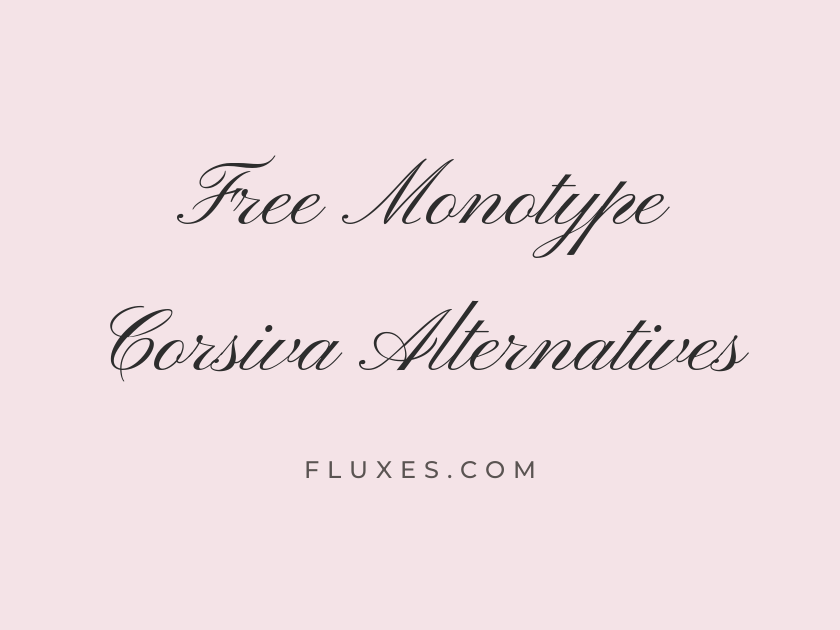
15 Best Free Fonts Alternatives to Monotype Corsiva
Monotype Corsiva has been a fixture of formal correspondence for decades, the default choice whenever someone opened a word processor and needed a script that read as handwritten but still professional. Its slanted, calligraphic letterforms made it a go-to for wedding invitations, diplomas, and signature lines, but it comes bundled with Microsoft Office rather than licensed for open web use, which leaves designers searching for a free alternative that captures the same formal, chancery-inspired elegance. Google Fonts has a strong bench of connected scripts that channel that same old-world penmanship, whether the goal is a wedding suite, a certificate, or an elegant logotype.
-
Pinyon Script
Honored to celebrate this joyful union together
Pinyon Script
Pinyon Script is probably the closest match in spirit to Monotype Corsiva that Google Fonts offers: a single elegant weight, long calligraphic swashes, and a formal chancery feel that reads beautifully on invitations. It works best set large, as a signature line or a headline, since the fine hairlines can vanish at small sizes.
- Language support: Latin, Latin Extended, Vietnamese
- Styles: 1 weight (Regular)
-
Petit Formal Script
Kindly reserve the date for our ceremony
Petit Formal Script
This one leans more upright and restrained than most wedding scripts, which makes it a genuinely practical stand-in for Corsiva’s businesslike formality. It suits letterheads, certificates, and diploma text where a script is expected but legibility still matters.
- Language support: Latin, Latin Extended
- Styles: 1 weight (Regular)
-
Tangerine
With love and gratitude, we invite you
Tangerine
Tangerine is delicate almost to a fault, so reach for the bold weight if you want it to hold its own on a printed card. Pair it with a simple serif body text and generous line spacing; it was built to be admired at display sizes, not squinted at in a paragraph.
- Language support: Latin
- Styles: 2 weights (Regular, Bold)
-
Allura
Two hearts, one beautiful new beginning
Allura
Allura has a flowing, unhurried rhythm that feels closer to a fountain pen than a formal script, making it a warmer alternative for couples who want elegance without stiffness. It has been a favorite on wedding stationery for years, which means it pairs easily with countless serif and sans companions already in circulation.
- Language support: Latin, Latin Extended, Vietnamese
- Styles: 1 weight (Regular)
-
Alex Brush
Cordially requesting the pleasure of your company
Alex Brush
Bolder and more confident than Corsiva’s thin strokes, Alex Brush trades fragility for presence. It photographs and prints well even at moderate sizes, which is worth remembering for anyone whose Corsiva alternative needs to survive a low-resolution PDF invitation.
- Language support: Latin, Latin Extended, Vietnamese
- Styles: 1 weight (Regular)
-
Parisienne
An elegant evening awaits your arrival
Parisienne
There is a softness to Parisienne’s rounded terminals that feels more French salon than English chancery, but the overall formality holds up. It sits comfortably as a headline over a clean sans-serif body, which keeps a design from tipping into overly ornate territory.
- Language support: Latin, Latin Extended
- Styles: 1 weight (Regular)
-
Mrs Saint Delafield
Sincerely yours, with warmest regards always
Mrs Saint Delafield
Mrs Saint Delafield mimics genuine cursive handwriting rather than engraved calligraphy, giving it a more personal, less institutional feel than Monotype Corsiva. It is a strong pick for signature lines, place cards, or anywhere a design wants to suggest a real hand rather than a formal engraving press.
- Language support: Latin, Latin Extended
- Styles: 1 weight (Regular)
-
Herr Von Muellerhoff
Save the date for our celebration
Herr Von Muellerhoff
This script carries dramatic loops and a fairly heavy stroke contrast, so it reads as ornamental rather than businesslike. Use it sparingly, as a single line of type rather than a heading paragraph, and it will earn its keep on save-the-dates and menu cards.
- Language support: Latin, Latin Extended
- Styles: 1 weight (Regular)
-
Italianno
Forever grateful for this beautiful moment
Italianno
Italianno’s extended, ribbon-like strokes give it a vintage engraving quality that suits monograms and short titles particularly well. Long sentences tend to overlap and blur, so it rewards restraint more than most fonts on this list.
- Language support: Latin, Latin Extended, Vietnamese
- Styles: 1 weight (Regular)
-
Marck Script
Please join us for dinner afterward
Marck Script
Marck Script sits at the casual end of the formal-script spectrum, closer to a well-practiced signature than a chancery hand, and it stays legible even in body-length text. That readability makes it a sensible substitute where Corsiva was originally used for something functional, like a printed note or a form field.
- Language support: Latin, Latin Extended, Cyrillic
- Styles: 1 weight (Regular)
-
Meddon
Warm wishes for your special day
Meddon
Meddon has a light, airy quality with slightly irregular letterforms that keep it from feeling stamped out by a machine. It reads as friendly rather than austere, a good option when a project wants a script’s grace without Corsiva’s stiffer formality.
- Language support: Latin, Latin Extended
- Styles: 1 weight (Regular)
-
Rouge Script
Yours faithfully, with sincere appreciation
Rouge Script
Rouge Script has firmer, more consistent strokes than many of its calligraphic cousins, giving it slightly better small-size legibility. It suits certificates, awards, and formal signage where the text needs to stay a script but still hold up under scrutiny.
- Language support: Latin
- Styles: 1 weight (Regular)
-
WindSong
Together forever, from this day forward
WindSong
WindSong pairs a delicate skeleton with just enough looping flourish to feel bridal without becoming illegible. It is best treated as a display accent, a name or a headline, layered over a plainer serif for supporting details.
- Language support: Latin, Latin Extended, Vietnamese
- Styles: 2 weights (Regular, Medium)
-
Beau Rivage
An intimate gathering among family and friends
Beau Rivage
There is a hand-lettered, almost brushed quality to Beau Rivage that separates it from the more mechanical engraving look of Corsiva. It brings warmth to invitation suites and place settings without sacrificing the sense of occasion.
- Language support: Latin, Latin Extended, Vietnamese
- Styles: 1 weight (Regular)
-
League Script
With deepest thanks for your presence
League Script
League Script offers a tidier, more geometric take on the calligraphic script, with strokes that stay even in weight throughout. That consistency makes it one of the more screen-friendly options here, holding up reasonably well in UI contexts and short web headlines where fussier scripts fall apart.
- Language support: Latin
- Styles: 1 weight (Regular)
Pairing and Setting Tips
Nearly every script here wants a plain, restrained companion. A simple serif like EB Garamond or a clean sans like Work Sans keeps the eye from getting overwhelmed.
Set these fonts large. Most formal scripts, including the real Monotype Corsiva, lose their charm and their legibility once they drop below body-text size.
Use generous letter spacing sparingly and only where the font supports it; scripts are built to connect, and stretching them apart can break the calligraphic illusion.
For web use, always load only the weights you actually need. A single display weight is usually enough for a script that only appears in headlines or signature lines.
Any of these choices will carry the same formal, handwritten warmth that made Monotype Corsiva a default for so long, while staying free, open, and easy to embed on the web through Google Fonts.







