
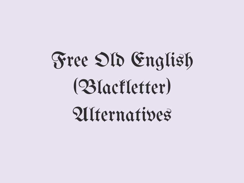
14 Best Free Fonts Alternatives to Old English (Blackletter)
Old English lettering, the dense, angular blackletter style seen on illuminated manuscripts, pub signs, and heavy metal album covers, is instantly recognizable but notoriously hard to license and even harder to read in long passages. Designers reaching for that gothic, medieval, or “ye olde” mood need free fonts that capture the drama without the legal headaches or the legibility problems of a genuine Fraktur revival. Google Fonts has a surprisingly deep bench of blackletter and blackletter-adjacent typefaces, along with a handful of medieval and gothic display fonts that read as historical without tipping into total illegibility.
The options below span true blackletter scripts, uncial and medieval book hands, and heavier gothic display faces suited to logos, labels, and headlines rather than body text.
-
UnifrakturMaguntia
The Ancient Guild of Scribes and Printers
UnifrakturMaguntia
This is about as close to genuine German Fraktur as you can get for free, with the tall ascenders, broken curves, and dense ink traps of a real medieval manuscript hand. It works beautifully as a large, standalone headline or logotype but turns into an illegible tangle at body-copy sizes, so keep it big and short.
- Language support: Latin
- Styles: 1 weight (Regular)
-
UnifrakturCook
Old Tavern Ale Brewed Since 1602
UnifrakturCook
A slightly rounder, bolder cousin of UnifrakturMaguntia, built for signage and labels where the blackletter needs to hold up at a glance. The bold weight gives it real presence on beer labels, pub signs, and heraldic crests without losing the historic texture that makes blackletter recognizable in the first place.
- Language support: Latin
- Styles: 1 weight (Bold)
-
Pirata One
Beware the Curse of the Haunted Manor
Pirata One
Pirata One trims down the ornamental flourishes of classic blackletter into something a bit more compact and screen-friendly, which makes it a solid pick for horror-themed branding, Halloween graphics, or gothic game titles. It still reads clearly at moderate sizes, a rare quality in this category.
- Language support: Latin, Latin Extended
- Styles: 1 weight (Regular)
-
Grenze Gotisch
Proclamation of the Kingdom's New Charter
Grenze Gotisch
Grenze Gotisch is one of the more versatile blackletter families on Google Fonts because it comes in a genuine weight range, from hairline to black, rather than the single stark cut most blackletter faces offer. That range makes it easier to build a hierarchy within a gothic-themed layout instead of relying on size alone to create contrast.
- Language support: Latin, Latin Extended, Vietnamese
- Styles: 9 weights (Thin to Black)
-
Fruktur
Herewith the Chronicles of Olde England
Fruktur
A lighter-touch blackletter with narrower letterforms and a slightly more casual rhythm than the Uniraktur pair, Fruktur feels less monumental and more like handwritten Gothic script. It suits invitations, wine labels, and editorial pull-quotes where a hint of medieval character is welcome but a full-strength Fraktur would feel too heavy.
- Language support: Latin, Latin Extended, Cyrillic Extended, Vietnamese
- Styles: 2 styles (1 weight plus italics)
-
Eagle Lake
The Round Table Awaits Its Knights
Eagle Lake
Eagle Lake softens blackletter’s usual severity with calligraphic curves and a bit of pen-drawn looseness, giving it a more romantic, storybook quality. It leans well into wedding invitations, fantasy book covers, and any project that wants an old-world feel without the aggression of a true gothic script.
- Language support: Latin, Latin Extended
- Styles: 1 weight (Regular)
-
MedievalSharp
Forged in Fire, Sworn by Blood
MedievalSharp
Modeled on the lettering found in medieval manuscripts and fantasy game titles, MedievalSharp has jagged, hand-inked edges that feel carved rather than typeset. It is a go-to for tabletop game branding, fantasy logos, and anything wanting a rugged, parchment-and-quill atmosphere rather than formal calligraphy.
- Language support: Latin, Latin Extended
- Styles: 1 weight (Regular)
-
Uncial Antiqua
In the Beginning Was the Word
Uncial Antiqua
Uncial Antiqua revives the rounded, monastic hand used in early Christian and Celtic manuscripts, predating true blackletter but sharing its illuminated-page mood. It reads more clearly than most gothic scripts at small sizes, making it a rare option for short passages of body text in a historical or ecclesiastical project.
- Language support: Latin, Latin Extended
- Styles: 1 weight (Regular)
-
IM Fell English
An Ancient Tale, Retold for Modern Readers
IM Fell English
For projects that want the flavor of an old English printed book rather than a handwritten scroll, IM Fell English recreates the worn, slightly irregular type used in 17th-century printing. It is a serif rather than a blackletter, so it pairs naturally with a blackletter headline while remaining fully readable in paragraphs.
- Language support: Latin
- Styles: 2 styles (1 weight plus italics)
-
Almendra
Legends of the Old Forest Kingdom
Almendra
Almendra is a decorative serif with a medieval, storybook character rather than a true gothic script, and it holds up far better in longer passages than most fonts on this list. Use it for fantasy fiction covers, tavern menus, or history-themed editorial layouts where a full page of blackletter would be exhausting to read.
- Language support: Latin, Latin Extended
- Styles: 4 styles (2 weights plus italics)
-
Metal Mania
Thunder and Steel Ride at Midnight
Metal Mania
Metal Mania trades manuscript history for heavy metal album art, but its jagged, hand-scrawled letterforms hit the same aggressive, gothic nerve many people want when they think of Old English lettering on a band poster. It is unapologetically loud and best kept to logos, badges, and short headline treatments.
- Language support: Latin, Latin Extended
- Styles: 1 weight (Regular)
-
New Rocker
Legends Carved in Stone and Fire
New Rocker
Somewhere between blackletter and rock poster lettering, New Rocker has chunky, distressed strokes that look etched rather than printed. It fits horror branding, gothic event posters, and merchandise design where a rougher, more theatrical edge suits the project better than a formal manuscript hand.
- Language support: Latin, Latin Extended
- Styles: 1 weight (Regular)
-
Nosifer
Curse of the Blackened Crypt
Nosifer
Dripping, jagged, and unmistakably horror-themed, Nosifer pushes the gothic mood into full theatrical territory. It has no real historical basis in Old English typography, but for Halloween graphics, horror movie posters, and haunted house branding it delivers the menace people are usually chasing when they think of “spooky old lettering.”
- Language support: Latin, Latin Extended
- Styles: 1 weight (Regular)
-
Jim Nightshade
Shadows Gather Where the Old Bell Tolls
Jim Nightshade
Jim Nightshade is a scratchy, brush-drawn display script that leans gothic and slightly sinister without copying blackletter structure directly. It works well as a secondary accent font paired with a cleaner serif, adding texture to headlines for ghost stories, dark fantasy, or seasonal horror promotions.
- Language support: Latin, Latin Extended
- Styles: 1 weight (Regular)
Pairing and Usage Tips
Blackletter and gothic display fonts are headline tools, not paragraph fonts. Reserve them for titles, logos, and short phrases, then hand body copy to a plain, highly legible serif or sans.
IM Fell English or Cardo make natural partners for a blackletter headline, since both carry an old-book character without sacrificing readability. Almendra works well too if you want a decorative but still readable long-form option.
Keep letter spacing generous when setting blackletter in all caps; the dense strokes can crowd together and lose their distinct shapes. Test your chosen font at the exact size it will actually be used, since many of these faces look dramatically different at display size than they do shrunk into a button or badge.
For web use, always load only the weights you need. Most of these families offer just one or two cuts, so file size is rarely an issue.
Old English lettering carries a lot of visual weight, and the trick is choosing a free alternative that matches the mood of the project rather than just chasing the most decorative option available. Whether the goal is a genuine manuscript feel, a medieval fantasy vibe, or a metal-poster edge, Google Fonts now offers enough range to skip pirated Fraktur files entirely and build something both legal and true to the era it is evoking.







