
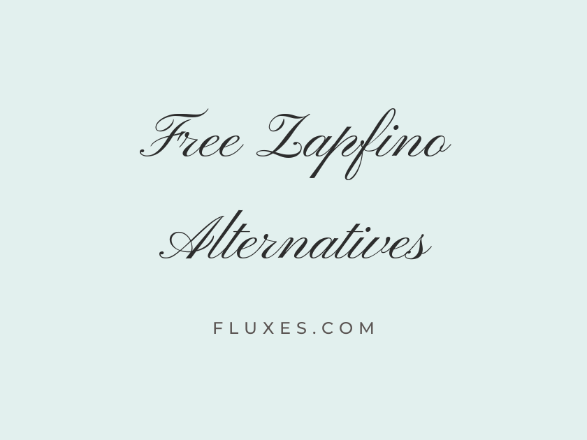
14 Best Free Fonts Alternatives to Zapfino
Zapfino remains one of the most recognizable calligraphic typefaces ever bundled with a desktop operating system, prized for its sweeping ligatures, ornamental swashes, and the sense that each letter was drawn by hand rather than set in type. That elaborate, old-world elegance makes it a natural fit for wedding suites, luxury branding, certificates, and any project that wants to feel personal and considered. The trouble is that Zapfino was never released as a free font, and its long connecting strokes make it notoriously hard to use well on the web. Fortunately, Google Fonts hosts a strong roster of script and calligraphy fonts that capture the same romantic, penned quality, and every one of them can be self-hosted or served free for commercial and personal projects.
-
Pinyon Script
Warmly requesting the pleasure of your company
Pinyon Script
Of everything on this list, Pinyon Script probably comes closest to Zapfino’s formal calligraphy pedigree. Its tall ascenders and looping descenders carry real ceremony, which is why engravers and stationers have leaned on it for generations of wedding invitations and formal certificates. Use it large and set the surrounding copy in something plain; it is not a font that wants competition.
- Language support: Latin, Latin Extended, Vietnamese
- Styles: 1 weight (Regular)
-
Tangerine
Elegant flourishes for every celebration
Tangerine
Tangerine trades some of Zapfino’s density for a lighter, more delicate hand. The strokes are thin and airy, which gives headlines a whispery, refined feel but also means it can vanish at small sizes or on busy backgrounds. Reserve it for large display text, monograms, or logotype work where its thinness has room to breathe.
- Language support: Latin
- Styles: 2 weights (Regular, Bold)
-
Alex Brush
Signed with love, sealed with grace
Alex Brush
Alex Brush reads like a confident signature rather than a formal script, with consistent stroke weight and a rhythm that stays legible even in longer phrases. It pairs nicely with a restrained serif such as EB Garamond for invitation sets that need one flourish and one workhorse. Designers reaching for a free alternative to Zapfino often land here first simply because it behaves so predictably across sizes.
- Language support: Latin, Latin Extended, Vietnamese
- Styles: 1 weight (Regular)
-
Allura
Together forever, beautifully written
Allura
There is a softness to Allura that feels almost handwritten with a fine-tip pen rather than engraved. The joins between letters are smooth and unforced, giving it a casual warmth that suits save-the-dates and greeting cards more than stiff, formal documents.
- Language support: Latin, Latin Extended, Vietnamese
- Styles: 1 weight (Regular)
-
Great Vibes
An evening of elegance and celebration
Great Vibes
Great Vibes has become something of a default wedding script, and for good reason: it is dense with connected swashes yet still holds its shape at moderate sizes. It leans slightly more decorative than Alex Brush, with taller loops on ascending letters that give headlines real presence.
- Language support: Latin, Latin Extended, Cyrillic, Cyrillic Extended, Greek Extended, Vietnamese
- Styles: 1 weight (Regular)
-
Parisienne
A refined invitation to an evening affair
Parisienne
Parisienne has a rounder, more relaxed rhythm than most of the fonts here, with letterforms that lean gently rather than rush forward. That relaxed posture makes it feel a touch more contemporary, useful if a project wants romance without quite so much old-world formality.
- Language support: Latin, Latin Extended
- Styles: 1 weight (Regular)
-
Mrs Saint Delafield
Written by hand, sealed with care
Mrs Saint Delafield
This one genuinely looks dashed off with a fountain pen, loose and quick in a way that separates it from the more polished, engraved scripts on this list. It is best used sparingly, as a short signature line or accent rather than a paragraph, since its irregular rhythm gets harder to read at length.
- Language support: Latin, Latin Extended
- Styles: 1 weight (Regular)
-
Herr Von Muellerhoff
Finest calligraphy for cherished occasions
Herr Von Muellerhoff
Herr Von Muellerhoff pushes further into ornamental territory, with dramatic entry strokes and generous loops that recall old engraving plates. It carries some of Zapfino’s theatrical energy, though it demands a similarly light touch: one or two words set large will outperform a full sentence in this face.
- Language support: Latin, Latin Extended
- Styles: 1 weight (Regular)
-
Italianno
Gracefully designed for timeless occasions
Italianno
Italianno is thin, tall, and unapologetically decorative, closer in spirit to copperplate engraving than casual handwriting. It shines on monograms, initials, and short titles, but its fine hairlines can turn muddy on lower-resolution screens, so test it at the exact size it will actually be displayed.
- Language support: Latin, Latin Extended, Vietnamese
- Styles: 1 weight (Regular)
-
WindSong
A gentle script for gracious invitations
WindSong
WindSong sits at the calmer end of the spectrum, with narrower letterforms and a more understated slant than the showier scripts nearby. That restraint makes it surprisingly versatile for logos and packaging that want a handwritten touch without stealing the spotlight.
- Language support: Latin, Latin Extended, Vietnamese
- Styles: 2 weights (Regular, Medium)
-
Rouge Script
Beautifully penned, one letter at a time
Rouge Script
Rouge Script has a slight forward lean and playful bounce that make it feel younger than Zapfino, more suited to boutique branding or greeting cards than formal stationery. Its letters stay open and rounded, which keeps it readable in short taglines.
- Language support: Latin
- Styles: 1 weight (Regular)
-
Kristi
A personal touch for every message
Kristi
Kristi is thinner and quicker in feel, almost like a ballpoint signature. It works well as an accent, layered over a photograph or set beneath a logo mark, though it is not built for extended reading.
- Language support: Latin
- Styles: 1 weight (Regular)
-
Sacramento
Simply elegant, endlessly charming
Sacramento
Sacramento keeps its strokes light and consistently spaced, giving it a friendlier, more casual charm than the heavier calligraphic scripts here. It reads cleanly at small sizes, which makes it one of the more forgiving choices for web use.
- Language support: Latin, Latin Extended
- Styles: 1 weight (Regular)
-
League Script
A modern take on classic penmanship
League Script
League Script offers a slightly more geometric, contemporary spin on connected script letterforms, trading some of the ornamental swash for cleaner joins. It is a good pick when a brand wants a scripted feel that still reads as tidy and modern rather than antique.
- Language support: Latin
- Styles: 1 weight (Regular)
Using calligraphic Google Fonts well
Scripts like these are display fonts first. Set them large, give them generous line spacing, and never use them for body copy.
Pair any of these with a plain serif or sans, such as EB Garamond, Cormorant, or Montserrat, so the ornamentation has something calm to rest against.
Always check legibility at the actual size the text will render on screen; thin scripts especially can blur or clip on mobile devices.
Because these are self-hosted through Google Fonts, they load reliably across browsers without any licensing concerns, unlike a system font such as Zapfino.
Any of these free alternatives can stand in for Zapfino’s calligraphic spirit while staying fully web-ready, licensed for commercial work, and easy to download directly from Google Fonts.







