
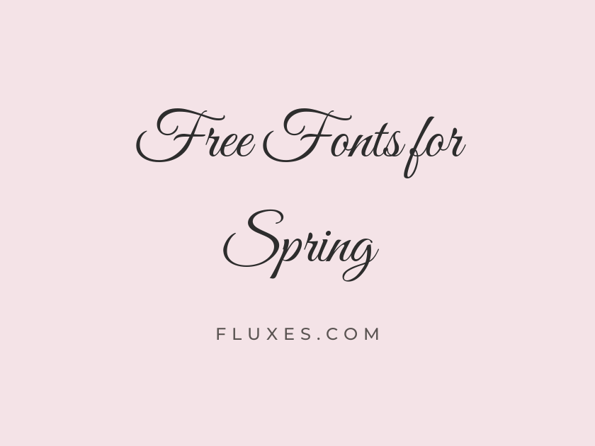
59 Best Free Fonts for Spring
Spring design work calls for typography that feels light on its feet: type that suggests new growth, pastel palettes, garden parties, and the general sense of things thawing out after a long winter. Whether you are building a florist’s website, a wedding invitation, an Easter card, or a seasonal sale banner, the free fonts on Google Fonts offer an enormous range of scripts, handwritten faces, rounded sans serifs, and airy serifs that read as fresh and optimistic. The trick is matching the right typeface to the right mood, from delicate calligraphy to bouncy, sunlit display type.
-
Great Vibes
Join us for a garden wedding this spring
Great Vibes
Few scripts feel as effortlessly romantic as Great Vibes, with its long connecting swashes and gentle slant. It is a natural fit for wedding stationery, floral branding, and any spring invitation that wants to feel handwritten by a calligrapher rather than typed. Keep it for headlines and short phrases only; the delicate strokes blur at small sizes.
- Language support: Latin, Latin Extended, Cyrillic, Cyrillic Extended, Greek Extended, Vietnamese
- Styles: 1 weight (Regular)
-
Alex Brush
Cherry blossoms bloom along the garden path
Alex Brush
Alex Brush trades the formality of a pointed-pen script for the looser feel of an actual brush, giving it warmth that suits spring branding without tipping into stiff wedding-invitation territory. It pairs nicely with a clean sans serif for body copy.
- Language support: Latin, Latin Extended, Vietnamese
- Styles: 1 weight (Regular)
-
Parisienne
A soft breeze carries the scent of lilacs
Parisienne
Parisienne has a gentle, upright rhythm that feels more like handwriting on a spring greeting card than formal calligraphy. It stays readable even in longer phrases, which makes it useful for logotypes and short taglines alike.
- Language support: Latin, Latin Extended
- Styles: 1 weight (Regular)
-
Allura
Fresh tulips delivered every Saturday morning
Allura
Allura is thinner and more understated than many of its script cousins, so it reads as refined rather than fussy. It works well on floral shop signage or minimalist Easter cards where elegance matters more than ornamentation.
- Language support: Latin, Latin Extended, Vietnamese
- Styles: 1 weight (Regular)
-
Sacramento
Sunshine and daffodils fill the meadow
Sacramento
Sacramento’s low x-height and casual monoline strokes give it a retro, sun-bleached postcard quality. It suits spring market branding, seed packet labels, and anything that wants a lighter touch than a full formal script.
- Language support: Latin, Latin Extended
- Styles: 1 weight (Regular)
-
Cookie
Homemade lemonade and strawberry shortcake
Cookie
Cookie leans playful, its rounded loops feeling closer to a friendly signature than a wedding script. It is a good choice for bakery branding or spring menu headers where charm matters more than formality.
- Language support: Latin
- Styles: 1 weight (Regular)
-
Yellowtail
Picnics under blooming cherry trees
Yellowtail
Yellowtail bounces along its baseline with real energy, making it feel more like a hand-lettered logo than a calligraphy font. Use it sparingly, as a single word or short phrase, since its exaggerated curves get busy in long sentences.
- Language support: Latin, Latin Extended
- Styles: 1 weight (Regular)
-
Satisfy
Fresh herbs and wildflowers for sale
Satisfy
Satisfy sits somewhere between brush lettering and casual script, with just enough texture to feel handmade. It reads cleanly at smaller sizes than most scripts, so it can double as a subhead rather than only a display headline.
- Language support: Latin
- Styles: 1 weight (Regular)
-
Courgette
Farmers market opens with the first sunshine
Courgette
Courgette has a relaxed, slightly wobbly baseline that gives it a friendly, sketched-by-hand quality. It works especially well for market and garden branding that wants to feel approachable rather than polished.
- Language support: Latin, Latin Extended
- Styles: 1 weight (Regular)
-
Italianno
An invitation to celebrate the season of renewal
Italianno
Italianno is one of the more ornate scripts here, with tall ascenders and dramatic loops that recall engraved wedding invitations. Save it for a title line; its flourishes need generous spacing to stay legible.
- Language support: Latin, Latin Extended, Vietnamese
- Styles: 1 weight (Regular)
-
Playball
Spring festival begins this weekend
Playball
Playball has a cheerful, mid-century signage feel, thick and rounded rather than delicate. It reads well even at poster scale, which makes it a solid option for spring fair or festival branding.
- Language support: Latin, Latin Extended, Vietnamese
- Styles: 1 weight (Regular)
-
WindSong
Petals drift softly on the warm wind
WindSong
WindSong is more understated than most scripts here, with slim strokes and a gentle forward lean that feels like a breeze moving across a page. It suits minimalist floral branding that wants softness without heavy calligraphic weight.
- Language support: Latin, Latin Extended, Vietnamese
- Styles: 2 weights (Regular, Medium)
-
Mrs Saint Delafield
Warmly welcoming spring with open arms
Mrs Saint Delafield
Mrs Saint Delafield is loose and looping, closer to a fountain-pen signature than a designed script, which gives it real personal charm. It works best set on a single line rather than a full paragraph.
- Language support: Latin, Latin Extended
- Styles: 1 weight (Regular)
-
Pinyon Script
Please join us for an outdoor spring ceremony
Pinyon Script
Pinyon Script is a classic formal copperplate style, elegant and traditional, the kind of lettering engravers used long before digital type existed. It is a dependable choice for wedding and garden-party invitations that want a timeless feel.
- Language support: Latin, Latin Extended, Vietnamese
- Styles: 1 weight (Regular)
-
Marck Script
Blossoms open one petal at a time
Marck Script
Marck Script keeps its letters upright and evenly weighted, so it feels calmer and more restrained than more theatrical scripts. That restraint makes it easier to pair with plain sans serif body text.
- Language support: Latin, Latin Extended, Cyrillic
- Styles: 1 weight (Regular)
-
Dancing Script
Spring has arrived, bright and blooming
Dancing Script
Dancing Script might be the most widely used script on Google Fonts, and for good reason: its bouncy baseline and generous curves feel celebratory without being hard to read. The bold weight holds up well on buttons and banners, while the regular weight suits longer headlines. It has become something of a default choice for spring sale graphics and greeting cards, so reach for it when familiarity matters as much as charm.
- Language support: Latin, Latin Extended, Vietnamese
- Styles: 4 weights (Regular to Bold)
-
Pacifico
Soda shop opens for the season
Pacifico
Pacifico carries a retro, surfboard-lettering energy that feels more sunny afternoon than formal spring wedding. It is an easy pick for casual seasonal branding, ice cream shops, and outdoor event posters.
- Language support: Latin, Latin Extended, Cyrillic, Cyrillic Extended, Vietnamese
- Styles: 1 weight (Regular)
-
Caveat
Notes from the garden, written by hand
Caveat
Caveat reads like genuine handwriting rather than a designed script, casual and quick, with none of the formality of a calligraphic face. It works well for journal-style blog headers, recipe cards, and anywhere a spring project wants a personal touch. Because it stays legible at smaller sizes, it can also carry pull quotes or captions rather than only display headlines.
- Language support: Latin, Latin Extended, Cyrillic, Cyrillic Extended
- Styles: 4 weights (Regular to Bold)
-
Kalam
Growing something new this spring
Kalam
Kalam has a slightly heavier, marker-like stroke than most handwriting fonts, giving it more presence on the page. It suits craft and DIY content, garden blogs, and anything with a homemade feel.
- Language support: Latin, Latin Extended, Devanagari
- Styles: 3 weights (Light, Regular, Bold)
-
Patrick Hand
Fresh eggs and spring vegetables available now
Patrick Hand
Patrick Hand mimics tidy, careful print handwriting rather than cursive, which makes it easy to read in longer passages. It is a good fit for children’s Easter activities, farm stand signage, or friendly instructional copy.
- Language support: Latin, Latin Extended, Vietnamese
- Styles: 1 weight (Regular)
-
Shadows Into Light
A little sunshine mixed with a little rain
Shadows Into Light
Shadows Into Light has a light, sketchy quality, thin strokes with a slight forward lean that feels dashed off in a notebook. It suits casual spring blog headers or handwritten-style social graphics.
- Language support: Latin, Latin Extended
- Styles: 1 weight (Regular)
-
Architects Daughter
Sketching out the garden plan for April
Architects Daughter
Architects Daughter reads like careful drafting-table lettering, upright and evenly spaced rather than flowing. It fits planning-and-process content, like garden layouts or spring project tutorials, better than romantic or formal work.
- Language support: Latin, Latin Extended
- Styles: 1 weight (Regular)
-
Homemade Apple
Baked fresh with strawberries from the garden
Homemade Apple
Homemade Apple has thick, marker-drawn strokes and a slightly uneven baseline that reads as genuinely handwritten rather than digitally smoothed. Use it sparingly, since its heavy weight can overwhelm long lines of text.
- Language support: Latin
- Styles: 1 weight (Regular)
-
Gochi Hand
Watering the seedlings before breakfast
Gochi Hand
Gochi Hand is light and rounded, closer to a felt-tip doodle than expressive calligraphy. Its simplicity makes it a pleasant choice for playful Easter graphics or children’s spring event flyers.
- Language support: Latin
- Styles: 1 weight (Regular)
-
Indie Flower
Every flower blooms in its own time
Indie Flower
Indie Flower is bubbly and casual, with rounded terminals that give it a friendly, almost childlike warmth. It has been a favorite for craft blogs and handmade product labels for years, and it still holds up for spring content that wants approachability over polish.
- Language support: Latin, Latin Extended
- Styles: 1 weight (Regular)
-
Reenie Beanie
Scribbled plans for the spring garden
Reenie Beanie
Reenie Beanie leans and loops like a quick note scrawled in the margins, condensed enough to fit a lot of text into a small space. It works nicely as an accent font alongside a cleaner primary typeface.
- Language support: Latin
- Styles: 1 weight (Regular)
-
Nanum Pen Script
Warm days and open windows return
Nanum Pen Script
Nanum Pen Script has a light, calligraphic pen quality with thin, tapering strokes. It suits minimal, pastel-toned spring designs where a handwritten accent should stay light rather than heavy.
- Language support: Latin, Korean
- Styles: 1 weight (Regular)
-
Delius
Little seeds grow into big surprises
Delius
Delius is rounded, chunky, and distinctly childlike, originally designed with young readers in mind. That makes it a natural choice for Easter egg hunts, spring school events, or any family-friendly seasonal material.
- Language support: Latin
- Styles: 1 weight (Regular)
-
Amatic SC
Springtime market, every Saturday
Amatic SC
Amatic SC is tall, thin, and condensed, with a hand-cut poster quality that feels fresh rather than heavy. It is ideal for headlines on market flyers or event posters where presence matters more than bulk, though it should stay short since the narrow letterforms slow down reading in long lines.
- Language support: Latin, Latin Extended, Cyrillic, Hebrew, Vietnamese
- Styles: 2 weights (Regular, Bold)
-
Quicksand
A season for fresh starts and open air
Quicksand
Quicksand’s rounded geometric letterforms give it a clean, optimistic feel that suits modern spring branding, from skincare labels to garden center websites. It reads as friendly without being childish, and it holds up well at both display and body sizes. Pair it with a script headline for contrast, or use it alone across a whole layout for a cohesive, airy look.
- Language support: Latin, Latin Extended, Vietnamese
- Styles: 5 weights (Light to Bold)
-
Comfortaa
Light, bright, and full of new beginnings
Comfortaa
Comfortaa’s soft, rounded corners give every letter a bubble-like quality that feels calm and modern. It works especially well for minimalist spring branding and wellness-adjacent products.
- Language support: Latin, Latin Extended, Cyrillic, Cyrillic Extended, Greek, Vietnamese
- Styles: 5 weights (Light to Bold)
-
Baloo 2
Hop into spring with fresh new colors
Baloo 2
Baloo 2 is heavier and bouncier than most rounded sans fonts, giving it real presence for headlines. It suits playful Easter promotions and children’s spring event branding where a bit of weight helps it stand out.
- Language support: Latin, Latin Extended, Devanagari, Vietnamese
- Styles: 5 weights (Regular to Extra-Bold)
-
Fredoka
Bright colors bloom all around us
Fredoka
Fredoka has a soft, toy-like roundness that reads as cheerful and modern rather than juvenile. It is a dependable choice for spring sale graphics, kids’ brand identities, and app interfaces that want warmth.
- Language support: Latin, Latin Extended, Hebrew
- Styles: 5 weights (Light to Bold)
-
Nunito
Fresh air, longer days, new growth
Nunito
Nunito’s rounded terminals soften what is otherwise a very practical, highly legible sans serif. It works equally well as body copy or headline type, which makes it a flexible backbone font for a full spring campaign.
- Language support: Latin, Latin Extended, Cyrillic, Cyrillic Extended, Vietnamese
- Styles: 16 styles (8 weights plus italics)
-
Varela Round
Spring cleaning made simple and bright
Varela Round
Varela Round keeps its geometry simple and its curves gentle, landing somewhere between friendly and neutral. It is a safe, readable choice for interfaces and signage that want a soft touch without much added personality.
- Language support: Latin, Latin Extended, Hebrew, Vietnamese
- Styles: 1 weight (Regular)
-
Josefin Sans
Minimal design for the season of light
Josefin Sans
Josefin Sans has tall, narrow proportions and a vintage geometric feel that reads as airy rather than heavy. Its light weight suits pastel color palettes and minimalist spring branding, though it needs generous letter spacing at small sizes to stay crisp.
- Language support: Latin, Latin Extended, Vietnamese
- Styles: 14 styles (7 weights plus italics)
-
Jost
Open windows, open fields, open skies
Jost
Jost channels a Bauhaus-era geometric sans in a light, modern package that feels clean and unfussy. It is a strong pick for editorial spring layouts that want a contemporary, restrained typographic voice.
- Language support: Latin, Latin Extended, Cyrillic
- Styles: 18 styles (9 weights plus italics)
-
Karla
Everything feels new again this spring
Karla
Karla is a workhorse grotesque with slightly rounded details that keep it from feeling cold. It is an easy choice for body text across a spring website, blog, or newsletter where readability matters most.
- Language support: Latin, Latin Extended
- Styles: 14 styles (7 weights plus italics)
-
Mali
A handwritten note to welcome the season
Mali
Mali blends handwriting warmth with the reliability of a proper text font, so it can be set at smaller sizes than most script or handwritten choices. It suits casual spring invitations that still need to be read comfortably in paragraph form.
- Language support: Latin, Latin Extended, Thai, Vietnamese
- Styles: 12 styles (6 weights plus italics)
-
Poppins
A fresh new season starts today
Poppins
Poppins is a geometric sans with a modern, confident feel that works just as well for spring sales campaigns as it does for tech branding. It is less overtly seasonal than a script or handwritten face, but its clean circles and even weight make it a dependable, versatile headline choice.
- Language support: Latin, Latin Extended, Devanagari
- Styles: 18 styles (9 weights plus italics)
-
Cormorant Garamond
An elegant garden party awaits this spring
Cormorant Garamond
Cormorant Garamond has high contrast and delicate hairlines that give it a refined, editorial quality. It is especially attractive at larger display sizes, where its fine details can actually be seen, and it pairs beautifully with a plain sans for body copy.
- Language support: Latin, Latin Extended, Cyrillic, Cyrillic Extended, Vietnamese
- Styles: 10 styles (5 weights plus italics)
-
EB Garamond
Fresh blooms, gentle sunlight, calm mornings
EB Garamond
EB Garamond brings old-style book typography to spring projects that want warmth and history rather than modern minimalism. Its moderate contrast and classic proportions make it comfortable for long-form reading, so it works well for spring editorial content or seed catalog copy.
- Language support: Latin, Latin Extended, Cyrillic, Cyrillic Extended, Greek, Greek Extended, Vietnamese
- Styles: 10 styles (5 weights plus italics)
-
Playfair Display
Celebrate the season of blossom and light
Playfair Display
Playfair Display’s sharp contrast between thick and thin strokes gives it a dramatic, high-fashion feel that suits upscale spring branding, from garden weddings to boutique product launches. It reads best at headline sizes, where its fine hairlines have room to breathe. Paired with a restrained sans serif for body text, it can anchor an entire seasonal brand identity.
- Language support: Latin, Latin Extended, Cyrillic, Vietnamese
- Styles: 12 styles (6 weights plus italics)
-
Lora
Stories of growth, told slowly
Lora
Lora’s slightly calligraphic curves give it warmth without sacrificing readability, making it a solid choice for spring blog posts and longer editorial pieces. It feels literary rather than decorative.
- Language support: Latin, Latin Extended, Cyrillic, Cyrillic Extended, Vietnamese
- Styles: 8 styles (4 weights plus italics)
-
Crimson Text
Chapters unfold like petals in April
Crimson Text
Crimson Text was designed for book-length reading, and it shows in its comfortable spacing and restrained detailing. It is a good fit for spring newsletters or long-form content where the type needs to disappear into the reading experience.
- Language support: Latin, Latin Extended, Vietnamese
- Styles: 6 styles (3 weights plus italics)
-
Vollkorn
Rooted, grounded, and ready to grow
Vollkorn
Vollkorn has sturdy, grounded letterforms that feel more earthy than delicate, which makes it a nice counterpoint to airier spring scripts. It works well for garden and nursery branding that wants warmth without fragility.
- Language support: Latin, Latin Extended, Cyrillic, Cyrillic Extended, Greek, Vietnamese
- Styles: 12 styles (6 weights plus italics)
-
Prata
A refined welcome to the spring season
Prata
Prata is a formal, high-contrast serif with a slightly old-fashioned elegance that suits upscale invitations and boutique branding. Keep it to short headlines, since its fine details lose clarity at body-text sizes.
- Language support: Latin, Cyrillic, Cyrillic Extended, Vietnamese
- Styles: 1 weight (Regular)
-
Italiana
Timeless style for the season of renewal
Italiana
Italiana is slender and understated, with wide letterforms that feel more like a fashion logotype than a text face. It is a strong choice for minimalist spring branding that wants understated luxury; use it sparingly and give it plenty of space.
- Language support: Latin
- Styles: 1 weight (Regular)
-
Marcellus
Classic elegance meets the new season
Marcellus
Marcellus has a restrained, classical structure that feels closer to carved lettering than calligraphy. It suits garden wedding branding and boutique spring product packaging that want a timeless, understated look.
- Language support: Latin, Latin Extended
- Styles: 1 weight (Regular)
-
Chewy
Egg hunt starts at ten o'clock sharp
Chewy
Chewy is thick, bubbly, and unapologetically playful, built for headlines rather than body text. It is a natural fit for Easter events, kids’ spring activities, and candy or bakery branding that wants to feel fun.
- Language support: Latin
- Styles: 1 weight (Regular)
-
Bubblegum Sans
Sweet treats for a sunny spring day
Bubblegum Sans
Bubblegum Sans has a soft, inflated roundness that reads as cheerful and youthful. It works well for ice cream shops, kids’ events, and any spring promotion that wants a lighthearted tone.
- Language support: Latin, Latin Extended
- Styles: 1 weight (Regular)
-
Sniglet
Bounce into spring with fresh new deals
Sniglet
Sniglet’s puffy, rounded letterforms give it a cartoonish charm that suits playful sale banners and event graphics. It is best used at large sizes where its rounded details read clearly.
- Language support: Latin, Latin Extended
- Styles: 2 weights (Regular, Extra-Bold)
-
Boogaloo
Spring fling festival is finally here
Boogaloo
Boogaloo has a retro, hand-painted signage feel, thick and rounded with a slight wobble. It suits festival posters and playful spring event branding that wants a bit of nostalgia.
- Language support: Latin
- Styles: 1 weight (Regular)
-
Lilita One
Bright spring sale, today only
Lilita One
Lilita One is bold, rounded, and built to grab attention, making it a reliable pick for spring sale headlines and promotional banners. Its heavy weight means it should stay short and be given room to breathe.
- Language support: Latin, Latin Extended
- Styles: 1 weight (Regular)
-
Give You Glory
Wildflowers scattered across the hillside
Give You Glory
Give You Glory has a loose, textured handwritten quality with visible pen pressure, giving it a rustic, botanical feel. It suits nature journals, garden branding, and rustic wedding stationery.
- Language support: Latin, Latin Extended
- Styles: 1 weight (Regular)
-
Bilbo
Growing wild and free this spring
Bilbo
Bilbo is a casual monoline script with a relaxed, almost doodled quality that feels more garden notebook than formal invitation. It is a nice alternative to heavier scripts when a project wants something lighter and more playful.
- Language support: Latin, Latin Extended, Vietnamese
- Styles: 1 weight (Regular)
-
Grand Hotel
A grand welcome to the blooming season
Grand Hotel
Grand Hotel has a vintage, hand-painted-sign quality with slightly irregular strokes that feel warm rather than polished. It suits café menus, garden party signage, and other spring branding with a nostalgic edge.
- Language support: Latin, Latin Extended
- Styles: 1 weight (Regular)
-
League Script
Handwritten invitations for a spring soirée
League Script
League Script channels old-fashioned handwriting manuals, with a slight forward slant and unfussy connections between letters. It reads as genuinely vintage rather than decorative, which suits historically minded spring stationery.
- Language support: Latin
- Styles: 1 weight (Regular)
-
Norican
Every bloom tells its own story
Norican
Norican has broad, brush-drawn strokes with a slightly rough texture that feels closer to sign painting than calligraphy. It stands apart from the more delicate scripts on this list and works well as a bold, characterful headline.
- Language support: Latin, Latin Extended
- Styles: 1 weight (Regular)
Pairing spring fonts for real projects
A decorative script or handwritten headline works best paired with a plain, easy-to-read sans serif or serif for body copy. Let the display font carry the seasonal mood and leave the reading work to something simpler.
For pastel, botanical branding, try combining a rounded sans like Quicksand or Nunito with a light script accent such as Parisienne or WindSong. The contrast between structure and flourish keeps the pairing balanced.
Keep heavily decorative display fonts for headlines only. Most of them lose legibility at small sizes, so navigation, captions, and long paragraphs should use a plain, well-tested typeface instead.
If you are designing for the web, test your chosen fonts on an actual device before finalizing a spring campaign. Thin serifs and delicate scripts can look markedly different on lower-resolution screens.
Spring gives designers an unusual amount of typographic freedom, from restrained editorial serifs to bubbly, playful display faces, and every option above is free to download and use through Google Fonts. Pick one or two that match the mood of your project, keep the pairings simple, and let the type do the work of making a page feel like the season has actually arrived.







