
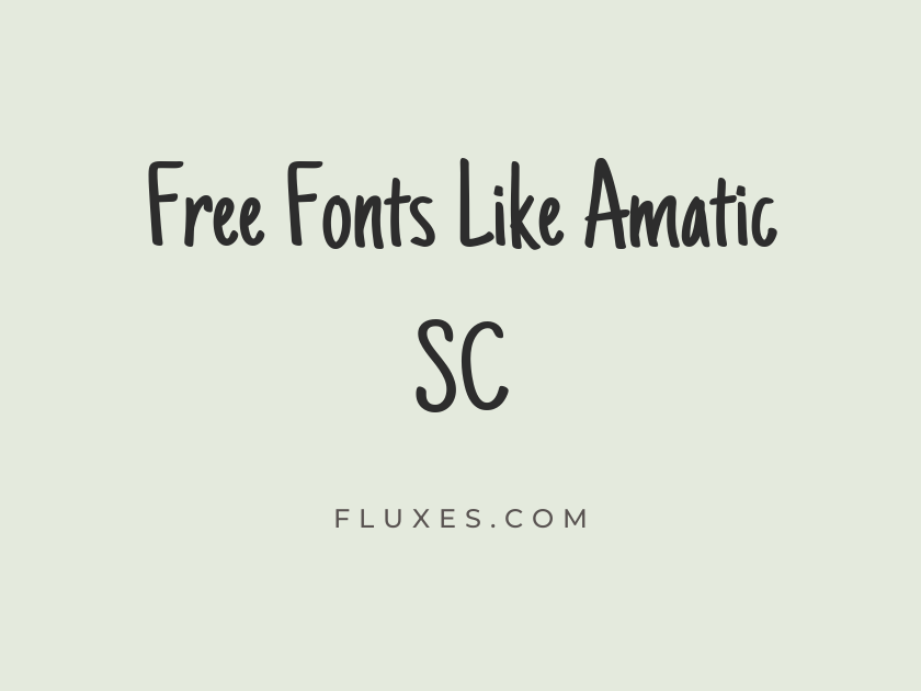
16 Best Free Fonts Similar to Amatic SC
Amatic SC earns its spot on countless mood boards for a reason: that narrow, hand-drawn wobble feels handmade and friendly at the same time, perfect for craft blogs, chalkboard menus, greeting cards, and playful headlines. Its condensed proportions let it pack a lot of character into a small space, which is exactly why designers hunting for free fonts similar to Amatic SC tend to gravitate toward the same pool of hand-lettered and narrow display faces. If you need that same scrappy, approachable energy with a little more range in weight or texture, Google Fonts has a solid bench of alternatives worth auditioning.
-
Just Another Hand
Handmade signs for the weekend farmers market
Just Another Hand
This is probably the closest sibling Amatic SC has on Google Fonts. The letterforms share that same tall, narrow, slightly wobbly caps-and-lowercase structure, so if you’re swapping out Amatic SC for licensing or pairing reasons, start here first.
- Language support: Latin, Latin Extended
- Styles: 1 weight (Regular)
-
Londrina Sketch
Rustic bakery signage drawn by hand
Londrina Sketch
Londrina Sketch trades Amatic SC’s thin single-stroke lines for a chunkier, textured outline that looks like it was inked with a dry marker. It reads as more rustic and tactile, a good pick when you want a headline that feels carved rather than written.
- Language support: Latin
- Styles: 1 weight (Regular)
-
Londrina Solid
Bold headlines with a friendly rounded edge
Londrina Solid
The solid companion to the sketch version above, Londrina Solid keeps the same generous, rounded, slightly chunky personality but in a clean fill. It holds up better at small sizes than most hand-drawn display fonts, making it a practical choice for subheads and buttons, not just big titles.
- Language support: Latin
- Styles: 4 weights (Thin to Black)
-
Shadows Into Light
Notes scribbled in the margins of a journal
Shadows Into Light
Shadows Into Light leans into an actual handwriting feel rather than a lettered display style, with a light, breezy stroke that looks dashed off in a notebook. It works nicely as a supporting script under a bolder Amatic-style headline.
- Language support: Latin, Latin Extended
- Styles: 1 weight (Regular)
-
Permanent Marker
Grab your marker and make some noise
Permanent Marker
There’s nothing understated about this one. Permanent Marker mimics the blunt, slightly inconsistent strokes of a felt-tip pen, and it carries the same loud, informal confidence Amatic SC brings to a poster or sticker design, just with more weight and grit.
- Language support: Latin
- Styles: 1 weight (Regular)
-
Caveat
Warm invitations written just for you
Caveat
Caveat is a genuinely versatile handwriting font that scales from casual body copy to punchy display use. The bold weight in particular gives it enough presence to anchor a headline while still feeling personal, and it pairs well with a clean sans for longer text nearby.
- Language support: Latin, Latin Extended, Cyrillic, Cyrillic Extended
- Styles: 4 weights (Regular to Bold)
-
Kalam
Recipe cards passed down through generations
Kalam
Kalam has a rounder, slightly more structured handwriting feel than most fonts on this list, which makes it easier to read in longer stretches. It’s a good option when you like the informal spirit of Amatic SC but need something with better legibility at body-copy sizes.
- Language support: Latin, Latin Extended, Devanagari
- Styles: 3 weights (Light, Regular, Bold)
-
Patrick Hand
Classroom worksheets and friendly reminders
Patrick Hand
Patrick Hand is tidy and even where Amatic SC is spiky and irregular, but both share an unmistakably handmade, unfussy charm. It’s a dependable workhorse for kids’ content, educational materials, and anything that needs to feel approachable rather than polished.
- Language support: Latin, Latin Extended, Vietnamese
- Styles: 1 weight (Regular)
-
Architects Daughter
Sketchbook notes for a weekend project
Architects Daughter
This one looks genuinely drafted, like notes scrawled on a blueprint margin. It suits DIY and maker-culture projects especially well, sitting comfortably alongside Amatic SC in a mood board built around craft, workshops, or handmade goods.
- Language support: Latin, Latin Extended
- Styles: 1 weight (Regular)
-
Indie Flower
Cheerful stickers for a kid's birthday party
Indie Flower
Rounded, bouncy, and a little bit goofy, Indie Flower brings a lighthearted quality that’s great for party invitations, children’s branding, or anything that wants to feel fun rather than refined. It can get muddy in dense paragraphs, so keep it to short bursts of text.
- Language support: Latin, Latin Extended
- Styles: 1 weight (Regular)
-
Reenie Beanie
Grocery lists scrawled on a sticky note
Reenie Beanie
Reenie Beanie is thinner and more casual than most entries here, with a loose, fast-moving stroke that genuinely looks handwritten in a hurry. It’s a nice match for informal captions or annotation-style text set alongside a bolder Amatic SC headline.
- Language support: Latin
- Styles: 1 weight (Regular)
-
Gochi Hand
Doodles and small notes in the corner
Gochi Hand
Gochi Hand has a soft, slightly childlike quality, thin strokes with rounded terminals that feel almost drawn with a fine marker. It’s best used sparingly, as a small accent or label rather than a dominant headline face.
- Language support: Latin
- Styles: 1 weight (Regular)
-
Handlee
A friendly note left on the fridge
Handlee
Handlee sits comfortably between neat and casual, legible enough for short paragraphs but still carrying real handwriting character. It’s a solid, low-key choice when Amatic SC feels too stylized for the moment but you still want that personal touch.
- Language support: Latin
- Styles: 1 weight (Regular)
-
Covered By Your Grace
Heartfelt messages written by candlelight
Covered By Your Grace
Slightly heavier and more textured than Handlee, this font has a warm, homespun quality that suits greeting cards, blog quotes, and personal branding. It reads best at display or subhead sizes rather than as body text.
- Language support: Latin, Latin Extended
- Styles: 1 weight (Regular)
-
Sriracha
Spicy street food menus and quick specials
Sriracha
Sriracha is a condensed, brush-influenced script with a confident, slightly informal swagger, closer in spirit to Amatic SC’s narrow proportions than most handwriting fonts on this list. It has real energy for food and beverage branding, especially anything with a casual, street-food feel.
- Language support: Latin, Latin Extended, Thai, Vietnamese
- Styles: 1 weight (Regular)
-
Rock Salt
Handwritten labels for jars of jam
Rock Salt
Rough, uneven, and unapologetically informal, Rock Salt looks like it was scratched out with a dull pen. Use it in small doses, since its irregular strokes can get hard to read in anything longer than a few words.
- Language support: Latin
- Styles: 1 weight (Regular)
Pairing and usage tips
Most fonts on this list are display or accent faces, so give them a clean, simple sans-serif or serif partner for body copy.
Because many of these are hand-drawn or condensed, test them at your actual target size before committing. Some hold up fine as headlines but blur or lose personality when shrunk down.
If you’re replacing Amatic SC specifically, Just Another Hand is the safest one-to-one swap, while Londrina Solid offers more flexibility across sizes and weights.
Whichever direction you take, all of these are free to download and self-host or serve directly through Google Fonts, so it costs nothing to test a few side by side before locking in your final pick.







