53 Best Free Medieval-Style Fonts for Tattoos
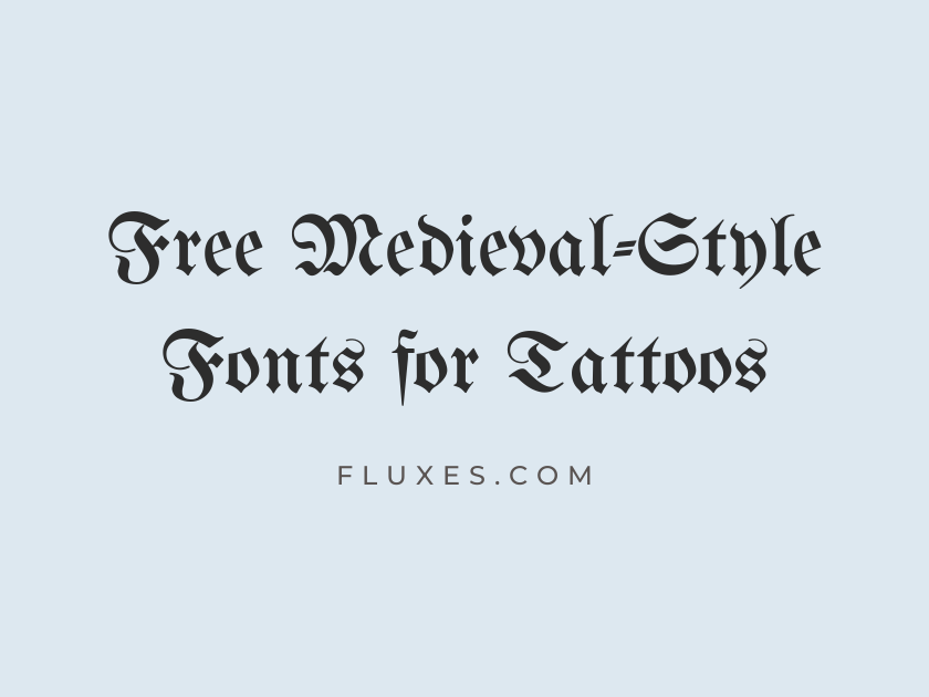
The tattoo world has always borrowed heavily from medieval lettering, from illuminated manuscripts and monastic uncials to blackletter proclamations nailed to church doors and the carved stone capitals of old cathedrals. That heritage translates beautifully to skin: bold verticals hold up under linework, ornate capitals suit crests and mottos, and aged serif forms give a single word the weight of a family oath. Every option here is free on Google Fonts, so you can preview medieval and gothic lettering styles, test how they read at tattoo scale, and hand a clean reference file to your artist without paying a licensing fee.
-
UnifrakturMaguntia
Honor, Loyalty, and Eternal Vengeance
UnifrakturMaguntia
This is the blackletter tattoo font most people picture the moment “medieval” comes up. Its jagged, hand-cut strokes echo German manuscript writing and old beer-hall signage, which is exactly why it shows up on so much Viking and Germanic-themed flash art. Keep phrases short; the dense fracturing detail can clot into an inky blob once it shrinks below an inch or two on skin.
- Language support: Latin
- Styles: 1 weight (Regular)
-
UnifrakturCook
By Blood and Oath We Stand
UnifrakturCook
A rounder, slightly friendlier cousin of Maguntia, with strokes that stay open enough to survive smaller placements like wrists and forearms. It still reads unmistakably gothic, just with a touch less visual noise.
- Language support: Latin
- Styles: 1 weight (Bold)
-
Pirata One
Beware the Ravens of the North
Pirata One
Pirata One trims blackletter down to something more graphic and poster-ready, which makes it a favorite for skull-and-crossbones flash and pirate-adjacent medieval pieces. The letterforms are chunky enough to hold ink cleanly, so it tends to age better on the body than finer gothic scripts.
- Language support: Latin, Latin Extended
- Styles: 1 weight (Regular)
-
MedievalSharp
The Knight Who Never Yields
MedievalSharp
Sharp, angular, and a little rough around the edges, this one was practically built for fantasy and role-playing branding, which is also where a lot of medieval tattoo inspiration comes from. It pairs naturally with sword, shield, or dragon imagery without competing for attention.
- Language support: Latin, Latin Extended
- Styles: 1 weight (Regular)
-
Grenze Gotisch
Forged in Fire, Bound by Fate
Grenze Gotisch
A textura blackletter with a modern engineering behind it, offered across a wide weight range so you can dial in exactly how heavy the strokes feel before committing to a stencil. The lighter weights are surprisingly legible for a script this ornate.
- Language support: Latin, Latin Extended, Vietnamese
- Styles: 9 weights (Thin to Black)
-
Astloch
Cursed Be the Coward's Heart
Astloch
Astloch looks like it was carved with a woodblock and inked in a hurry, all splintered edges and uneven pressure. It suits rough, weathered concepts, think old wanted posters or witch-trial pamphlets, more than clean formal lettering.
- Language support: Latin
- Styles: 2 weights (Regular, Bold)
-
Germania One
Sons of the Ancient Forest
Germania One
Bold, blocky, and almost architectural, Germania One reads more like a carved sign above a castle gate than a handwritten script. It holds up remarkably well at small sizes for a blackletter-adjacent face, making it a safer pick for finger or rib lettering.
- Language support: Latin
- Styles: 1 weight (Regular)
-
Fruktur
Wolves Howl for Fallen Kings
Fruktur
A softer, more calligraphic take on blackletter, Fruktur has a fluid rhythm that feels closer to a monk’s quill than a chisel. It suits quotes and epitaphs where you want gothic character without the aggressive edge.
- Language support: Latin, Latin Extended, Cyrillic Extended, Vietnamese
- Styles: 2 styles (1 weight plus italics)
-
Metal Mania
Death Before Dishonor
Metal Mania
Born from heavy metal album art, Metal Mania channels the same gothic energy that fuels a lot of dark medieval tattoo work. It leans theatrical rather than historical, so it fits best alongside horns, chains, or flame motifs.
- Language support: Latin, Latin Extended
- Styles: 1 weight (Regular)
-
New Rocker
Rise, Undying King of Old
New Rocker
New Rocker takes blackletter bones and bends them into something spikier and more fantastical, closer to a video game logo than a medieval manuscript. Use it where drama matters more than authenticity.
- Language support: Latin, Latin Extended
- Styles: 1 weight (Regular)
-
Uncial Antiqua
Faith, Hope, and Ancient Stone
Uncial Antiqua
Rounded, monastic, and unmistakably Celtic in feeling, Uncial Antiqua descends from the letterforms found in illuminated gospel books like the Book of Kells. It is a go-to for Celtic cross tattoos, Irish blessings, and any piece meant to feel handwritten by a medieval scribe rather than carved by a smith.
- Language support: Latin, Latin Extended
- Styles: 1 weight (Regular)
-
Metamorphous
From Ash We Rise Reborn
Metamorphous
There is a fantasy-novel quality to Metamorphous, all flowing serifs and slightly exaggerated flourishes. It works well for single dramatic words, crest lettering, or anything with a mythological or alchemical theme.
- Language support: Latin, Latin Extended
- Styles: 1 weight (Regular)
-
Fondamento
Written in the Book of Ages
Fondamento
This one mimics an italic scribe’s hand rather than formal blackletter, giving it a manuscript feel that suits personal quotes, love notes, or memorial script. It reads soft and human next to the harder gothic faces on this list.
- Language support: Latin, Latin Extended
- Styles: 2 styles (1 weight plus italics)
-
Kavoon
Guard the Gate at Dawn
Kavoon
Thick, wedge-serifed, and a bit primitive-looking, Kavoon has an inscriptional quality reminiscent of hand-carved signage. It suits short, punchy phrases better than long sentences.
- Language support: Latin, Latin Extended
- Styles: 1 weight (Regular)
-
Ruslan Display
Legends of the Eastern Kingdoms
Ruslan Display
With its ornamental serifs and epic bearing, Ruslan Display draws on Russian folk and fairy-tale typography, giving it a distinctly Eastern European medieval flavor. It is a nice change of pace from the Western European blackletter faces that dominate this style.
- Language support: Latin, Latin Extended, Cyrillic
- Styles: 1 weight (Regular)
-
Vast Shadow
Where Shadows Guard the Throne
Vast Shadow
A dark serif with heavy verticals and a moody, weathered character, Vast Shadow feels at home on gothic memorial pieces and dark fantasy lettering. It stays readable at moderate sizes, which is not always true of faces this dramatic.
- Language support: Latin
- Styles: 1 weight (Regular)
-
Caesar Dressing
Veni, Vidi, Vici, Always
Caesar Dressing
Blocky and monumental, Caesar Dressing borrows from Roman inscriptional capitals rather than Gothic Europe, but it slots naturally into ancient-warrior and gladiator tattoo concepts that often get grouped under the medieval umbrella. Best used all caps, and best used short.
- Language support: Latin
- Styles: 1 weight (Regular)
-
Cinzel
Honor Above All Things
Cinzel
Cinzel is the closest free equivalent to the carved Roman capitals seen on triumphal arches, and it has become something of a modern classic for tattoo lettering that wants to feel ancient and dignified rather than aggressive. It suits Latin mottos, crest text, and any piece where restraint and gravity matter more than flourish.
- Language support: Latin, Latin Extended
- Styles: 6 weights (Regular to Black)
-
Cinzel Decorative
By Crown and Sword United
Cinzel Decorative
The ornamental sibling to Cinzel, this version adds swashes and decorative flicks to the same monumental capital forms. Reserve it for a title word or initial rather than a full sentence; the detail is meant to be admired at a distance, not squinted at.
- Language support: Latin, Latin Extended
- Styles: 3 weights (Regular, Bold, Black)
-
Macondo
Once Upon a Kingdom Lost
Macondo
Macondo has a friendly, storybook charm that leans more fairy tale than fearsome, which makes it a good fit for whimsical medieval themes like dragons, castles, and quest narratives rather than war and death. Its rounded serifs stay clean at small sizes.
- Language support: Latin
- Styles: 1 weight (Regular)
-
Macondo Swash Caps
A Realm Beyond the Map
Macondo Swash Caps
Pair this with plain Macondo for a decorated first letter, or use it alone for short, flourished titles. The swashes give it a slightly medieval-manuscript flair without tipping into full blackletter territory.
- Language support: Latin
- Styles: 1 weight (Regular)
-
Yeseva One
Crowned in Blood and Glory
Yeseva One
Bold and a little theatrical, Yeseva One mixes old-world serif details with a heavier, more modern structure. It reads well from across a room, which makes it a strong choice for chest and back pieces meant to be seen rather than examined up close.
- Language support: Latin, Latin Extended, Cyrillic, Cyrillic Extended, Vietnamese
- Styles: 1 weight (Regular)
-
Piedra
Carved to Outlast the Centuries
Piedra
Piedra looks hand-chiseled into rock, complete with uneven, weathered edges. It is less about elegance and more about texture, ideal for tattoos meant to look like ancient runestones or gravemarkers.
- Language support: Latin, Latin Extended
- Styles: 1 weight (Regular)
-
Grenze
A Chronicle of Kings and Ruins
Grenze
Quieter than its gotisch sibling, Grenze is a proper text serif with an old-manuscript undertone, useful when you want historical atmosphere without the density of full blackletter. It comes in enough weights to work for both bold titles and finer supporting text.
- Language support: Latin, Latin Extended, Vietnamese
- Styles: 18 styles (9 weights plus italics)
-
Forum
Set in Stone, Never Broken
Forum
Forum channels Roman square capitals with a slightly condensed, inscriptional feel, bridging the gap between classical antiquity and the medieval world that inherited its lettering traditions. It is a strong choice for anything meant to look literally carved.
- Language support: Latin, Latin Extended, Cyrillic, Cyrillic Extended
- Styles: 1 weight (Regular)
-
EB Garamond
Here Lies a Faithful Heart
EB Garamond
A faithful digital revival of a Renaissance-era serif, EB Garamond brings genuine old-book character to quote and script tattoos without any gothic theatrics. Its hairlines are fine, so it reads best on larger, flatter areas of skin where the detail will not blur together over time.
- Language support: Latin, Latin Extended, Cyrillic, Cyrillic Extended, Greek, Greek Extended, Vietnamese
- Styles: 10 styles (5 weights plus italics)
-
Cardo
Wisdom Passed Through Ages
Cardo
Built originally for classical and medieval scholarship, Cardo has an academic, manuscript-adjacent feel that suits Latin inscriptions and historical text tattoos. It is legible and calm, a good counterweight to a bolder blackletter centerpiece elsewhere in the same piece.
- Language support: Latin, Latin Extended, Gothic, Greek, Greek Extended, Hebrew, Old Italic, Runic
- Styles: 3 styles (2 weights plus italics)
-
Marcellus
Steady as the Ancient Oak
Marcellus
Marcellus has a restrained, slightly geometric elegance that reads as classical rather than overtly gothic. It works nicely for short mottos or names where you want old-world polish without heaviness.
- Language support: Latin, Latin Extended
- Styles: 1 weight (Regular)
-
Marcellus SC
STRENGTH, HONOR, LEGACY
Marcellus SC
The small-caps cut of Marcellus gives every letter uniform height, which suits crest-style lettering arranged in an arc or banner. It reads clean and formal at almost any tattoo size.
- Language support: Latin, Latin Extended
- Styles: 1 weight (Regular)
-
Bellefair
The Vow That Time Cannot Undo
Bellefair
Soft, warm, and only lightly ornamented, Bellefair feels like a page from a well-worn storybook rather than a battle standard. It suits romantic or sentimental medieval themes, wedding-date tattoos with a historical flavor, memorial script, that kind of quiet gravity.
- Language support: Latin, Latin Extended, Hebrew
- Styles: 1 weight (Regular)
-
Cormorant
Beneath the Banner of the Brave
Cormorant
Cormorant is a display-leaning serif with high contrast and delicate detail inspired by Garamond-era type. Ideal for larger script pieces; the thin strokes can disappear at very small scale.
- Language support: Latin, Latin Extended, Cyrillic, Cyrillic Extended, Vietnamese
- Styles: 10 styles (5 weights plus italics)
-
Cormorant Garamond
A Vow Written in Ink and Blood
Cormorant Garamond
The text-optimized companion to Cormorant, better suited to slightly longer phrases while keeping that same elegant, old-manuscript feeling. It pairs well with a bolder display face for a title-and-subtitle style tattoo.
- Language support: Latin, Latin Extended, Cyrillic, Cyrillic Extended, Vietnamese
- Styles: 10 styles (5 weights plus italics)
-
Cormorant SC
REALM • CROWN • BLADE
Cormorant SC
Small caps add formality and rhythm, making this a natural fit for short heraldic phrases or a name banded between decorative elements.
- Language support: Latin, Latin Extended, Cyrillic, Cyrillic Extended, Vietnamese
- Styles: 5 weights (Light to Bold)
-
Cormorant Infant
Born of Fire and Frost
Cormorant Infant
A slightly sturdier cut within the Cormorant family, with a touch more presence at smaller sizes than the original. Still delicate, but a bit more forgiving on tattoo placements with less room.
- Language support: Latin, Latin Extended, Cyrillic, Cyrillic Extended, Vietnamese
- Styles: 10 styles (5 weights plus italics)
-
Cormorant Upright
Ever Loyal, Ever True
Cormorant Upright
An upright italic variant that feels closer to formal handwriting than to print, giving it a distinctive, slightly ceremonial quality among the Cormorant styles. Nice for a single line beneath a crest or shield illustration.
- Language support: Latin, Latin Extended, Vietnamese
- Styles: 5 weights (Light to Bold)
-
Spectral
The Chronicle Continues Still
Spectral
Spectral was designed with screen legibility in mind but carries enough old-style serif character to feel at home in a historical quote tattoo. It is a practical middle ground between decorative gothic faces and plain modern serifs.
- Language support: Latin, Latin Extended, Cyrillic, Cyrillic Extended, Vietnamese
- Styles: 14 styles (7 weights plus italics)
-
Spectral SC
ANNO DOMINI MMXXIV
Spectral SC
Handy for Roman numeral dates or Latin phrases set in a formal, inscriptional band. The small caps keep everything visually even along a curved placement like a rib or collarbone.
- Language support: Latin, Latin Extended, Cyrillic, Cyrillic Extended, Vietnamese
- Styles: 14 styles (7 weights plus italics)
-
Crimson Text
Sealed by Wax and Word
Crimson Text
Modeled on old-style book typefaces, Crimson Text has a warm, literary feel suited to longer passages, favorite verses, epitaphs, anything that needs to actually be read rather than just admired.
- Language support: Latin, Latin Extended, Vietnamese
- Styles: 6 styles (3 weights plus italics)
-
Crimson Pro
Long Live the Iron Crown
Crimson Pro
A more flexible, multi-weight version of Crimson Text, useful if you want the same old-book warmth but need a slightly bolder cut to hold up as standalone tattoo lettering.
- Language support: Latin, Latin Extended, Vietnamese
- Styles: 16 styles (8 weights plus italics)
-
Fanwood Text
Bound by Duty, Freed by Death
Fanwood Text
Compact and slightly condensed, Fanwood Text has an old-newspaper, old-book quality that reads as historical without leaning theatrical. It suits smaller supporting text beneath a larger illustrative tattoo.
- Language support: Latin, Latin Extended
- Styles: 2 styles (1 weight plus italics)
-
Della Respira
Rest Now, Weary Soldier
Della Respira
Airy and light, with an old-world serif structure, Della Respira works best as a delicate accompaniment to heavier imagery rather than as a bold standalone statement. Its openness gives it a gentle, memorial-appropriate tone.
- Language support: Latin
- Styles: 1 weight (Regular)
-
Gilda Display
Glory Etched in Time
Gilda Display
A confident, slightly formal display serif with old-style proportions, Gilda Display sits comfortably between classical inscription and storybook elegance. It reads clearly at a range of sizes, which is not always guaranteed with faces this ornamental.
- Language support: Latin, Latin Extended
- Styles: 1 weight (Regular)
-
Old Standard TT
Thus It Was Written
Old Standard TT
As the name suggests, this face was built to look like a well-used academic serif from another century, making it convincing for anything meant to resemble an original historical document. It suits longer inscriptions where authenticity matters more than flash.
- Language support: Latin, Latin Extended, Cyrillic, Cyrillic Extended, Vietnamese
- Styles: 3 styles (2 weights plus italics)
-
Petrona
Bound by Blood, Sealed by Fire
Petrona
Petrona has old-style serif roots but a slightly more contemporary structure underneath, giving it a bit more presence than some of the finer historical revivals here. It scales reasonably well across a range of tattoo sizes.
- Language support: Latin, Latin Extended, Vietnamese
- Styles: 18 styles (9 weights plus italics)
-
Rozha One
Where the Ravens Nest
Rozha One
Chunky and high-contrast, Rozha One has a stamped, woodcut-like presence that suits bold single words more than long sentences. It reads confidently even from a distance.
- Language support: Latin, Latin Extended, Devanagari
- Styles: 1 weight (Regular)
-
Vollkorn
From Dust We Came, To Dust Return
Vollkorn
A dependable old-style serif with a slightly rustic, grain-mill character, Vollkorn suits memorial and epitaph-style tattoos that need warmth without gothic drama.
- Language support: Latin, Latin Extended, Cyrillic, Cyrillic Extended, Greek, Vietnamese
- Styles: 12 styles (6 weights plus italics)
-
Vollkorn SC
MEMENTO MORI
Vollkorn SC
Small caps give this classic phrase, and others like it, a formal, carved-stone rhythm that suits a wrist band or ribcage inscription.
- Language support: Latin, Latin Extended, Cyrillic, Cyrillic Extended, Vietnamese
- Styles: 4 weights (Regular to Black)
-
Sorts Mill Goudy
A Name Worth Remembering
Sorts Mill Goudy
Warm, humanist, and rooted in early twentieth-century revivalist type, Sorts Mill Goudy has just enough old-book character to feel historical without veering into full medieval theater. A good pick for anyone who wants understated elegance over spectacle.
- Language support: Latin, Latin Extended
- Styles: 2 styles (1 weight plus italics)
-
IM Fell English
Anno Domini, Ever Faithful
IM Fell English
Based on the worn metal type used by a seventeenth-century English printer, IM Fell English carries genuine ink-on-old-paper irregularity in every letterform. It is one of the most historically convincing serif choices here for a tattoo meant to look like it was lifted straight from an antique book.
- Language support: Latin
- Styles: 2 styles (1 weight plus italics)
-
IM Fell Double Pica
Speak Truly or Not at All
IM Fell Double Pica
A slightly larger, sturdier cut within the same Fell type revival, better suited to short titles than dense paragraphs. It keeps the same aged, hand-set character throughout.
- Language support: Latin
- Styles: 2 styles (1 weight plus italics)
-
IM Fell Great Primer
Ancient Vows, Unbroken Still
IM Fell Great Primer
The most generously proportioned of the Fell types, with open counters that hold up better at small tattoo sizes than some of its siblings. Choose this one when legibility matters as much as atmosphere.
- Language support: Latin
- Styles: 2 styles (1 weight plus italics)
-
IM Fell French Canon
Rest in the Arms of Kings
IM Fell French Canon
A grander, more formal member of the Fell family, with the same antique roughness but a bit more visual weight per letter. It suits ceremonial or memorial phrasing nicely.
- Language support: Latin
- Styles: 2 styles (1 weight plus italics)
-
IM Fell DW Pica
What Was Sworn Remains True
IM Fell DW Pica
The most compact of the group, closer to what you would find in a small printed pamphlet than a formal title page. Better suited to a phrase tucked discreetly along a forearm or ankle than a bold centerpiece.
- Language support: Latin
- Styles: 2 styles (1 weight plus italics)
Pairing and Placement Tips for Medieval Tattoo Lettering
Pair a heavy blackletter word like Maguntia or Pirata One with a finer serif, such as Cardo or EB Garamond, for a supporting date or phrase. The contrast keeps the piece readable instead of visually competing.
Test any gothic or manuscript-style font at the actual size you plan to tattoo before finalizing a stencil. Fine hairlines and tight counters that look great on screen can close up entirely once ink spreads under skin.
Reserve the most ornamental display faces, like Cinzel Decorative, for a single word, initial, or title. Save the calmer serifs for anything longer that actually needs to be read.
Curved placements such as ribs, collarbones, or forearms suit small-caps and inscriptional styles particularly well, since even letter height keeps the line looking intentional rather than uneven.
Between the blackletter classics, the Celtic and manuscript faces, and the old-style serifs that round out the list, there is enough range here to letter a full family crest, a single Latin word, or a long remembered verse, all without leaving Google Fonts or paying for a license.