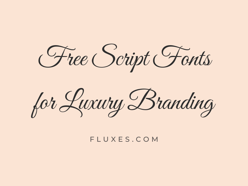
51 Best Free Script Fonts for Luxury Branding
Luxury branding lives or dies on restraint, and nowhere is that more visible than in the script chosen for a logotype, a monogram, or the flourish on a perfume box. The right calligraphic hand can suggest heritage, craftsmanship, and quiet confidence; the wrong one reads as a wedding invitation from a discount printer. Every option here is free on Google Fonts, so there is no licensing hurdle standing between a concept and a finished brand identity, whether you are designing for a jewelry house, a boutique hotel, a fashion label, or a small-batch spirits brand.
What follows moves from the classic, high-contrast wedding-style scripts that anchor so much luxury print work, through delicate monoline hands suited to minimalist packaging, to bolder brush and blackletter-adjacent options for brands that want more personality. Consider stroke contrast, x-height, and legibility at small sizes before locking anything into a final identity; scripts that sing at sixty points can blur into mush on a business card.
-
Great Vibes
Handcrafted since eighteen ninety-four, with pride
Great Vibes
Great Vibes is close to the default answer whenever a designer needs an elegant script fast, and its ubiquity is earned. The long, confident swashes and even rhythm give it real presence on invitations, candle labels, and logotypes, though its popularity means a truly bespoke brand may want to pair it with a distinctive wordmark or custom lettering for the primary logo.
- Language support: Latin, Latin Extended, Cyrillic, Cyrillic Extended, Greek Extended, Vietnamese
- Styles: 1 weight (Regular)
-
Alex Brush
A signature blend of craftsmanship and quiet luxury
Alex Brush
Where Great Vibes feels formal, Alex Brush leans into the loose, ink-loaded energy of an actual calligraphy pen. It works beautifully as a signature-style accent under a serif logotype, suggesting the founder’s own hand rather than a stamped monogram.
- Language support: Latin, Latin Extended, Vietnamese
- Styles: 1 weight (Regular)
-
Allura
Refined elegance, poured into every bottle
Allura
Allura keeps its loops tighter and its baseline steadier than most brush scripts, which makes it dependable at smaller sizes on packaging copy. It reads as polished rather than personal, a good fit for cosmetics and skincare lines that want warmth without whimsy.
- Language support: Latin, Latin Extended, Vietnamese
- Styles: 1 weight (Regular)
-
Corinthia
Bespoke tailoring for the discerning gentleman
Corinthia
Corinthia is thin, fast, and almost sketch-like, with a bold weight that thickens the strokes just enough to hold up in print. It suits fashion and menswear branding that wants a script to feel dashed off by a master rather than engineered by a machine.
- Language support: Latin, Latin Extended, Vietnamese
- Styles: 2 weights (Regular, Bold)
-
Sevillana
Passport to the world's finest boutique hotels
Sevillana
Sevillana condenses its letterforms into a tighter, more upright script than most of its peers, giving it a slightly Spanish, wrought-iron character. It suits hospitality branding, wine labels, and anywhere a script needs to fit a narrow space without losing elegance.
- Language support: Latin, Latin Extended
- Styles: 1 weight (Regular)
-
Kristi
A private atelier for one-of-a-kind pieces
Kristi
Kristi is delicate to the point of fragility, with hairline strokes that photograph beautifully on foil-stamped stationery. Keep it large; at small sizes the thin joins tend to disappear.
- Language support: Latin
- Styles: 1 weight (Regular)
-
Ruthie
Every detail, considered by hand
Ruthie
Ruthie has a soft, rounded warmth that keeps it from feeling austere, making it a good choice for luxury brands built around comfort rather than formality, like a spa or a bespoke bedding line.
- Language support: Latin, Latin Extended, Vietnamese
- Styles: 1 weight (Regular)
-
Lovers Quarrel
Two names, one timeless celebration
Lovers Quarrel
Lovers Quarrel packs in more flourish than most scripts of its weight, with looping ascenders that beg for generous letter spacing. It belongs on invitation suites and monogram lockups rather than body copy.
- Language support: Latin, Latin Extended, Vietnamese
- Styles: 1 weight (Regular)
-
Meie Script
An heirloom design, made new again
Meie Script
Meie Script sits between casual and formal, with a gentle forward slant and rounded terminals that soften its otherwise traditional structure. It pairs well with a restrained sans-serif for a brand that wants approachable luxury rather than old-world stiffness.
- Language support: Latin, Latin Extended
- Styles: 1 weight (Regular)
-
Grey Qo
Effortless style, poured by hand
Grey Qo
Grey Qo reads like a fountain pen used by someone in no particular rush, with irregular strokes that feel personal rather than templated. It suits founder-led luxury brands, artisan food producers, and anywhere a human touch matters more than perfect symmetry.
- Language support: Latin, Latin Extended, Vietnamese
- Styles: 1 weight (Regular)
-
Moon Dance
Under candlelight, every evening feels exclusive
Moon Dance
Moon Dance has a gentle, romantic sway to its baseline that makes it a natural fit for bridal and fine jewelry branding. It stays legible at moderate sizes, which is not always true of scripts this decorative.
- Language support: Latin, Latin Extended, Vietnamese
- Styles: 1 weight (Regular)
-
Estonia
A legacy of craftsmanship, refined over generations
Estonia
Estonia keeps its contrast subtle and its loops compact, giving it a calmer, more contemporary feel than many wedding-style scripts. It is a solid choice when a brand wants elegance without visual noise.
- Language support: Latin, Latin Extended, Vietnamese
- Styles: 1 weight (Regular)
-
Explora
Discover the extraordinary, one journey at a time
Explora
Explora has an exploratory, slightly irregular rhythm to its strokes that suggests travel and adventure alongside luxury. It works well for boutique travel brands, resort wear, and experiential hospitality.
- Language support: Latin, Latin Extended, Cherokee, Vietnamese
- Styles: 1 weight (Regular)
-
Shalimar
An exotic fragrance, bottled for the ages
Shalimar
Shalimar’s ornate, almost Arabesque flourishes give it an exotic, perfume-counter glamour that few free scripts can match. Use it sparingly, on a wordmark or a single line of packaging copy, since its density can overwhelm longer text.
- Language support: Latin, Latin Extended, Vietnamese
- Styles: 1 weight (Regular)
-
Send Flowers
A bouquet, hand-tied for a special occasion
Send Flowers
Send Flowers earns its name with looping, blossom-like curves at the ends of its letters. It is a natural fit for florists, event planners, and luxury gift brands that want a script with a little visual sweetness built in.
- Language support: Latin, Latin Extended, Vietnamese
- Styles: 1 weight (Regular)
-
Imperial Script
Fit for royalty, crafted for everyday elegance
Imperial Script
Imperial Script lives up to its name with tall, elongated ascenders and a stately, unhurried pace across the baseline. It carries genuine gravitas for a crest, a monogram, or a headline on a luxury real estate brochure, and its clean joins keep it readable even at moderate sizes, which is more than can be said for most flourish-heavy scripts.
- Language support: Latin, Latin Extended, Vietnamese
- Styles: 1 weight (Regular)
-
Ephesis
Timeless design, inspired by ancient elegance
Ephesis
Ephesis is understated and monoline, with just enough irregularity to avoid feeling stamped from a template. It suits minimalist luxury brands that want a script accent without the drama of heavy swashes.
- Language support: Latin, Latin Extended, Vietnamese
- Styles: 1 weight (Regular)
-
Fondamento
An old-world recipe, distilled to perfection
Fondamento
Fondamento is a broad-nib calligraphic script with real historical weight behind its letterforms, closer to a formal chancery hand than a modern brush script. It suits heritage brands like whisky, wine, or old apothecary-style packaging that want to look centuries old rather than freshly designed.
- Language support: Latin, Latin Extended
- Styles: 2 styles (1 weight plus italics)
-
The Nautigal
Set sail for an unforgettable, first-class experience
The Nautigal
The Nautigal offers both a light, casual hand and a bolder weight, giving designers rare flexibility from a single free script family. The bold cut in particular holds up well on dark packaging and foil stamps.
- Language support: Latin, Latin Extended, Vietnamese
- Styles: 2 weights (Regular, Bold)
-
Vujahday Script
An exclusive collection, designed with intention
Vujahday Script
Vujahday Script has a modern, fashion-editorial feel, with long entry strokes and a relaxed slant that reads as confident rather than fussy. It sits comfortably next to a clean sans-serif logotype for a contemporary luxury label.
- Language support: Latin, Latin Extended, Vietnamese
- Styles: 1 weight (Regular)
-
WindSong
A love letter, written in every stitch
WindSong
WindSong keeps its loops light and its baseline gently uneven, giving it a breezy, romantic quality. It is well suited to bridal, lingerie, and fragrance branding that wants softness over severity.
- Language support: Latin, Latin Extended, Vietnamese
- Styles: 2 weights (Regular, Medium)
-
Style Script
Precision-cut, in the finest silhouette
Style Script
Style Script is one of the more restrained options here, closer to elegant cursive handwriting than a showy calligraphic script. That restraint makes it unusually versatile as body copy on stationery, not just as a display headline.
- Language support: Latin, Latin Extended, Vietnamese
- Styles: 1 weight (Regular)
-
Qwigley
Minimalist luxury, one clean line at a time
Qwigley
Qwigley is a true monoline script, its strokes never varying in width, which gives it a modern, almost architectural elegance. Designers building minimalist luxury identities, think concrete-and-brass interiors, gravitate toward it for exactly that reason.
- Language support: Latin, Latin Extended, Vietnamese
- Styles: 1 weight (Regular)
-
Montez
A bold statement, poured into every glass
Montez
Montez brings more muscle than most scripts on this list, with thick, brush-inked strokes that hold their own in dark colorways. It fits spirits branding and anywhere a script needs to compete with strong photography rather than sit quietly beside it.
- Language support: Latin, Latin Extended
- Styles: 1 weight (Regular)
-
Monsieur La Doulaise
French elegance, exported to the world
Monsieur La Doulaise
Monsieur La Doulaise is nearly all swash, its capital letters extending into long decorative flourishes that dominate any layout they appear in. Reserve it for a single word or initial; anything longer becomes difficult to read.
- Language support: Latin, Latin Extended
- Styles: 1 weight (Regular)
-
Herr Von Muellerhoff
A masterclass in old-world elegance
Herr Von Muellerhoff
Herr Von Muellerhoff pairs delicate stroke contrast with generously looped ascenders, landing somewhere between formal invitation script and fashion-house logotype. It photographs well embossed or foil-stamped on heavier stock.
- Language support: Latin, Latin Extended
- Styles: 1 weight (Regular)
-
Mr Dafoe
An artist's signature, on every finished piece
Mr Dafoe
Mr Dafoe moves quickly across the page, its connected strokes mimicking a genuine autograph. It works well as a founder’s signature mark on packaging, the kind of detail that suggests a real person stands behind the brand.
- Language support: Latin, Latin Extended
- Styles: 1 weight (Regular)
-
Mr De Haviland
Understated luxury, signed and delivered
Mr De Haviland
Mr De Haviland is finer and more composed than its cousin Mr Dafoe, with thinner strokes and a steadier rhythm. It suits a restrained luxury signature where legibility matters as much as flourish.
- Language support: Latin, Latin Extended
- Styles: 1 weight (Regular)
-
Mrs Saint Delafield
Old-money charm, effortlessly reimagined
Mrs Saint Delafield
Mrs Saint Delafield has a loose, looping informality reminiscent of a well-practiced fountain-pen signature. It brings warmth to old-money aesthetics without tipping into stiffness.
- Language support: Latin, Latin Extended
- Styles: 1 weight (Regular)
-
Bonheur Royale
Joyful indulgence, crafted for celebration
Bonheur Royale
Bonheur Royale is romantic and slightly playful, its letters connected by delicate loops that never feel heavy. It suits celebratory luxury, think champagne labels and event invitations, more than austere, minimalist branding.
- Language support: Latin, Latin Extended, Vietnamese
- Styles: 1 weight (Regular)
-
Lavishly Yours
Devoted to the art of fine living
Lavishly Yours
Lavishly Yours earns its name with tall, extravagant ascenders and a generous slant that gives every word a sense of occasion. It is a strong choice for bridal stationery and high-end gift packaging where drama is welcome.
- Language support: Latin, Latin Extended, Vietnamese
- Styles: 1 weight (Regular)
-
Miss Fajardose
An ornate detail, worthy of admiration
Miss Fajardose
Miss Fajardose is one of the more decorative entries here, its letters wrapped in extra loops and curls that read almost like engraved filigree. Use it as a single accent word on a label rather than a full line of text.
- Language support: Latin, Latin Extended
- Styles: 1 weight (Regular)
-
Rouge Script
A touch of color, a lifetime of elegance
Rouge Script
Rouge Script keeps its proportions tidy and its slant moderate, making it one of the easier scripts on this list to set at smaller sizes. It suits cosmetics and beauty branding that want elegance without excess ornamentation.
- Language support: Latin
- Styles: 1 weight (Regular)
-
Parisienne
A boutique atelier, tucked away in Paris
Parisienne
Parisienne channels exactly the French romance its name promises, with rounded, confident curves and a relaxed baseline. It pairs naturally with a clean serif for a fashion or beauty brand aiming for effortless Parisian chic.
- Language support: Latin, Latin Extended
- Styles: 1 weight (Regular)
-
Pinyon Script
An invitation to an evening of distinction
Pinyon Script
Pinyon Script is a wedding-invitation classic for good reason: its high contrast and formal, upright posture give it real ceremonial weight. It has been used so widely in bridal design that a luxury brand outside that category may want to use it as a supporting flourish rather than the primary logotype.
- Language support: Latin, Latin Extended, Vietnamese
- Styles: 1 weight (Regular)
-
Italianno
Imported taste, elegantly presented
Italianno
Italianno stretches its letters into long, elegant loops that lean gracefully to the right, giving it a distinctly fashion-house feel. It looks especially good in gold foil against a dark background.
- Language support: Latin, Latin Extended, Vietnamese
- Styles: 1 weight (Regular)
-
Petit Formal Script
A formal affair, elegantly announced
Petit Formal Script
Petit Formal Script is compact, upright, and genuinely formal, closer to a French round hand than a loose brush script. Its small footprint makes it one of the few decorative scripts here that still reads clearly in a single line of body text.
- Language support: Latin, Latin Extended
- Styles: 1 weight (Regular)
-
Arizonia
A classic tradition, honored once again
Arizonia
Arizonia carries a slightly retro, mid-century glamour in its flowing connections, evoking old Hollywood as much as a modern boutique. It sits comfortably on wine labels and vintage-inspired packaging.
- Language support: Latin, Latin Extended, Vietnamese
- Styles: 1 weight (Regular)
-
Grand Hotel
Check in to timeless hospitality and grace
Grand Hotel
Grand Hotel is bouncy and rounded, with a nostalgic, hand-painted-sign quality that suits boutique hotels and old-world cafes more than sharp, contemporary fashion branding. Its name alone makes it an easy pitch for hospitality clients.
- Language support: Latin, Latin Extended
- Styles: 1 weight (Regular)
-
Tangerine
A rare vintage, aged to absolute perfection
Tangerine
Tangerine is thin, refined, and unmistakably formal, one of the most widely used scripts in fine stationery design for good reason. The bold weight adds just enough presence for a logotype while keeping the delicate, engraved character intact.
- Language support: Latin
- Styles: 2 weights (Regular, Bold)
-
Marck Script
Every stroke, a mark of true quality
Marck Script
Marck Script keeps a consistent, moderate slant and clean joins, making it a reliable workhorse script rather than a showpiece. It is a sensible pick when a brand wants a script that will not fight with a logo mark or icon placed beside it.
- Language support: Latin, Latin Extended, Cyrillic
- Styles: 1 weight (Regular)
-
Meddon
A refined finish, worthy of every detail
Meddon
Meddon has a light touch and generous spacing between letters, giving it an airy, uncrowded feel even in longer lines of text. It works well as a tagline script beneath a bolder primary logotype.
- Language support: Latin, Latin Extended
- Styles: 1 weight (Regular)
-
Charm
A subtle detail that makes all the difference
Charm
Charm is genuinely understated, with slim, even strokes that avoid the theatrical loops common to this category. It is one of the better choices for a minimalist luxury brand that wants a script accent without any hint of the wedding aisle.
- Language support: Latin, Latin Extended, Thai, Vietnamese
- Styles: 2 weights (Regular, Bold)
-
Charmonman
Crafted elegance, in every graceful curve
Charmonman
Charmonman is the bolder, more decorative sibling to Charm, with thicker strokes and more pronounced curves. It has a slightly international, cross-cultural feel that suits luxury beauty and skincare brands selling across markets.
- Language support: Latin, Latin Extended, Thai, Vietnamese
- Styles: 2 weights (Regular, Bold)
-
Euphoria Script
Pure indulgence, in every last detail
Euphoria Script
Euphoria Script leans casual-elegant, with a light slant and softly rounded terminals. It suits lifestyle and wellness brands that want warmth alongside their luxury positioning.
- Language support: Latin, Latin Extended
- Styles: 1 weight (Regular)
-
Sacramento
A vintage keepsake, treasured for years
Sacramento
Sacramento is thin, upright, and delicately retro, closer to 1950s advertising script than formal calligraphy. It works nicely on stationery and packaging accents where a lighter touch is welcome.
- Language support: Latin, Latin Extended
- Styles: 1 weight (Regular)
-
Norican
A storied name, carried forward with pride
Norican
Norican has a distinctive, slightly angular flourish on its capitals that sets it apart from smoother scripts on this list. It reads as confident and a little theatrical, good for a fashion label that wants attitude in its script.
- Language support: Latin, Latin Extended
- Styles: 1 weight (Regular)
-
Yesteryear
A golden era, remembered in every detail
Yesteryear
Yesteryear pulls directly from vintage sign-painting, with a nostalgic, slightly worn character that suits heritage brands and old-fashioned apothecary or barber branding. It is less at home in a strictly modern, minimalist identity.
- Language support: Latin, Latin Extended
- Styles: 1 weight (Regular)
-
Niconne
Warm hospitality, poured with generosity
Niconne
Niconne is rounded and warm, with a friendly bounce that softens its otherwise formal script structure. It suits patisseries, chocolatiers, and boutique cafes positioning themselves as accessible luxury.
- Language support: Latin, Latin Extended
- Styles: 1 weight (Regular)
-
Yellowtail
Aged in oak, bottled with character
Yellowtail
Yellowtail is a bold, retro brush script with real personality, evoking mid-century diner signage and classic whiskey labels rather than delicate calligraphy. It suits masculine, heritage-driven luxury brands that want a script with some grit.
- Language support: Latin, Latin Extended
- Styles: 1 weight (Regular)
-
Dr Sugiyama
A delicate hand, trained over decades
Dr Sugiyama
Dr Sugiyama is thin almost to the point of disappearing, an inked brush script with real fragility and grace. It demands large sizes and plenty of white space, but at the right scale it looks genuinely handmade.
- Language support: Latin, Latin Extended
- Styles: 1 weight (Regular)
How to Use Script Fonts in a Luxury Brand Identity
Reserve script fonts for moments that deserve emphasis: a logotype, a monogram, a single evocative line on packaging. Setting long paragraphs in a script almost always hurts legibility and cheapens the effect.
Pair a script with a calm, well-spaced serif or sans-serif for supporting text. Playfair Display, Cormorant, EB Garamond, or a simple grotesque like Jost all give a script room to be the star without competing for attention.
Generous letter spacing and plenty of surrounding white space do more for a script’s perceived luxury than any single font choice. Crowd it, and even the most elegant hand starts to look cheap.
Test every script at the actual size it will be used, especially on business cards, foil stamps, or small packaging labels. Many of the more delicate options here look stunning at sixty points and unreadable at ten.
There is enormous range within free script typography, from severe monoline hands to lavish, flourish-heavy calligraphy, and every option above can be downloaded and put to work immediately without a licensing fee standing in the way of the final design.