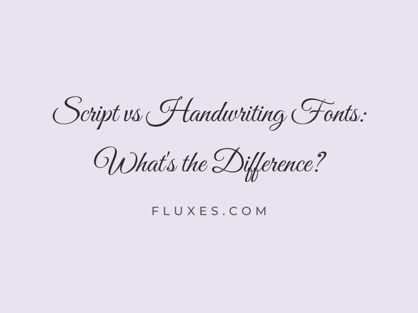
15 Script vs Handwriting Fonts: What’s the Difference?
Script fonts trace back to formal penmanship, engraving, and calligraphy; their letters connect with deliberate flourishes and consistent, practiced rhythm.
Handwriting fonts imitate the more casual, personal act of writing by hand, with the imperfections, pressure changes, and looseness that make a note feel like it came from an actual pen.
Knowing which category a project calls for matters for legibility and tone. A wedding invitation or a luxury label wants the polish of script; a sticky note graphic, a kids’ book, or a friendly social post wants the warmth of handwriting. The fonts here are grouped so you can feel that difference directly.
Script Fonts: Formal and Calligraphic
-
Great Vibes
Elegant vows written in flowing calligraphy
Great Vibes
Great Vibes is one of the most downloaded script fonts on Google Fonts for good reason: its long, connected strokes and elegant swashes read as genuine copperplate calligraphy. It shines large, on invitations and logotypes, but loses clarity fast at body-text sizes.
- Language support: Latin, Latin Extended, Cyrillic, Cyrillic Extended, Greek Extended, Vietnamese
- Styles: 1 weight (Regular)
-
Alex Brush
Handwritten elegance for a special evening
Alex Brush
Alex Brush has a looser, more brush-drawn quality than a strict copperplate script, giving it a slightly warmer feel. It pairs nicely with a clean sans serif for contrast on save-the-dates or packaging accents.
- Language support: Latin, Latin Extended, Vietnamese
- Styles: 1 weight (Regular)
-
Allura
Join us for an evening of celebration
Allura
Allura sits comfortably between formal and romantic, with slim strokes and gentle loops that never feel stiff. It works well as an accent word above a heading set in something sturdier.
- Language support: Latin, Latin Extended, Vietnamese
- Styles: 1 weight (Regular)
-
Parisienne
A charming script inspired by old letters
Parisienne
There is a French postcard quality to Parisienne, all rounded curves and unhurried pacing. Use it where you want script fonts to feel nostalgic rather than strictly bridal.
- Language support: Latin, Latin Extended
- Styles: 1 weight (Regular)
-
Pinyon Script
An engraved invitation to remember always
Pinyon Script
Pinyon Script borrows its severe, engraved character from nineteenth-century business cards and formal announcements. It has more restraint than most connected scripts, so it holds up well in smaller decorative roles like monograms.
- Language support: Latin, Latin Extended, Vietnamese
- Styles: 1 weight (Regular)
-
Petit Formal Script
A precise, tidy note in fine ink
Petit Formal Script
This one earns its name; the strokes are tighter and more upright than typical flowing scripts, closer to a schoolteacher’s careful cursive than a wedding suite. It is a good pick when a project needs the idea of a script without excessive ornamentation.
- Language support: Latin, Latin Extended
- Styles: 1 weight (Regular)
-
Tangerine
Delicate lines for a graceful headline
Tangerine
Tangerine is delicate to the point of fragility, so the bold weight is the one to reach for outside of large display use. Its thin hairlines evoke fountain-pen calligraphy and suit refined, minimal branding.
- Language support: Latin
- Styles: 2 weights (Regular, Bold)
Handwriting Fonts: Casual and Personal
-
Caveat
Just a quick note scribbled by hand
Caveat
Caveat feels like a fast, confident hand rather than a slow, considered one, with letters that bounce slightly off the baseline. It is legible enough for longer captions or annotations, which is not true of every handwriting font.
- Language support: Latin, Latin Extended, Cyrillic, Cyrillic Extended
- Styles: 4 weights (Regular to Bold)
-
Shadows Into Light
Sketching ideas in the margins of a notebook
Shadows Into Light
This font reads like a doodle in the margin of a sketchbook: light, sloped, and unpretentious. It works well for informal callouts, blog graphics, or anywhere text needs a friendly, human aside.
- Language support: Latin, Latin Extended
- Styles: 1 weight (Regular)
-
Kalam
Notes written quickly between busy classes
Kalam
Kalam has real ink-and-paper texture, with slightly variable stroke widths that came from an actual marker-based design process. Its multiple weights make it more versatile than most handwriting fonts for setting whole paragraphs.
- Language support: Latin, Latin Extended, Devanagari
- Styles: 3 weights (Light, Regular, Bold)
-
Patrick Hand
A friendly note for the whole family
Patrick Hand
Rounded, upright, and even in rhythm, Patrick Hand looks like the handwriting of someone who takes their time and writes clearly. That evenness makes it one of the more legible handwriting fonts for signage, worksheets, or children’s materials.
- Language support: Latin, Latin Extended, Vietnamese
- Styles: 1 weight (Regular)
-
Indie Flower
Doodling little notes on a Sunday
Indie Flower
Indie Flower is bubbly and informal, with a slight wobble that keeps it from feeling mechanical. It has been a go-to for craft blogs and lighthearted packaging for years, so pair it with something plainer if you want it to still feel fresh.
- Language support: Latin, Latin Extended
- Styles: 1 weight (Regular)
-
Gochi Hand
Quick thoughts jotted down on paper
Gochi Hand
Gochi Hand has thinner strokes than most handwriting fonts on this list, giving it a slightly more grown-up, understated tone. It suits interfaces and apps that want a personal touch without looking like a birthday card.
- Language support: Latin
- Styles: 1 weight (Regular)
-
Homemade Apple
A little something made just for you
Homemade Apple
Thick and marker-drawn, Homemade Apple looks like it was written slowly with a felt-tip pen pressed hard into the page. It is best reserved for short phrases and headlines since the heavy strokes get muddy in long passages.
- Language support: Latin
- Styles: 1 weight (Regular)
-
Reenie Beanie
Scrawled thoughts in the corner of a page
Reenie Beanie
Reenie Beanie is narrow, quick, and slightly messy, closer to a hurried grocery list than a formal note. That casualness makes it a good match for sticky-note style UI mockups or diary-themed designs.
- Language support: Latin
- Styles: 1 weight (Regular)
Choosing Between Script and Handwriting
If the project involves formality, ceremony, or luxury branding, lean toward a connected script with consistent strokes.
If the goal is warmth, approachability, or a sense of the personal, a handwriting font will usually feel more honest.
Either way, keep these fonts for short bursts of text. Pair them with a simple serif or sans serif for body copy so the page stays readable.
Both categories bring personality that system fonts simply cannot, and because they are all free through Google Fonts, testing a few side by side in an actual layout is the fastest way to see which direction fits.