
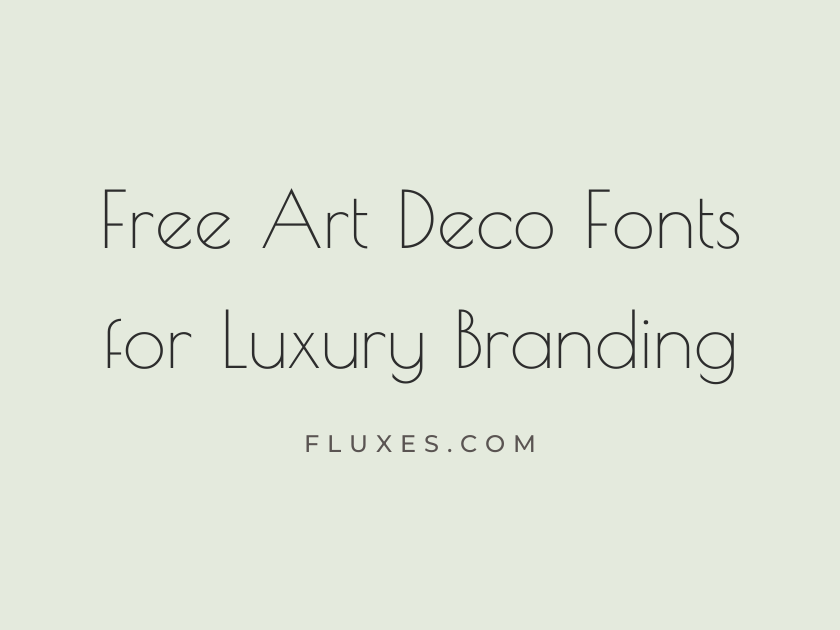
54 Best Free Art Deco Fonts for Luxury Branding
Art Deco branding runs on contrast: geometric precision paired with unapologetic glamour, thin elegant strokes next to bold confident capitals. The style that defined 1920s and 1930s skyscrapers, ocean liners, and perfume houses is enjoying a steady revival in luxury branding, and the good news is that you do not need a paid type foundry to capture it. Google Fonts has a surprisingly deep bench of free fonts that channel the geometric sans faces, elegant didone serifs, and ornate display letterforms that define the deco look, all ready to download and drop into a logo, invitation suite, or packaging system.
What follows is a wide survey of those options, from severe geometric sans built for monogram-style logotypes to ornate decorative display faces best saved for a single glowing headline.
-
Poiret One
Champagne towers and gilded geometric elegance
Poiret One
Poiret One is about as literally Art Deco as Google Fonts gets. Its thin, perfectly circular geometry and elongated proportions recall the Parisian fashion house it is named after, making it a natural fit for a jewelry monogram or a boutique hotel wordmark. Use it large; the hairline strokes disappear at small sizes.
- Language support: Latin, Latin Extended, Cyrillic
- Styles: 1 weight (Regular)
-
Josefin Sans
Sleek lines for a modern deco boutique
Josefin Sans
Drawn with the geometric sans faces of the 1920s in mind, Josefin Sans keeps its circular letterforms tight and its proportions tall, giving it a cool, tailored feel. It reads as contemporary rather than costume-drama, which makes it useful when a brand wants a deco nod without going full Gatsby.
- Language support: Latin, Latin Extended, Vietnamese
- Styles: 14 styles (7 weights plus italics)
-
Josefin Slab
Velvet lounges and polished brass details
Josefin Slab
The slab-serif sibling to Josefin Sans carries the same geometric skeleton but adds a bit more warmth and weight, suiting menus, signage, and packaging where a touch more presence is welcome.
- Language support: Latin
- Styles: 14 styles (7 weights plus italics)
-
Montserrat
Inspired by Buenos Aires deco signage
Montserrat
Montserrat was designed after its creator studied the posters and shopfronts of the Montserrat neighborhood in Buenos Aires, a district built up during the golden age of Art Deco urban design. That history shows in its geometric, confident letterforms, which is why it has become a go-to for luxury and hospitality brands wanting something clean but rooted in deco geometry.
It pairs beautifully with an ornate display serif for headlines, letting Montserrat carry body copy and navigation without fighting for attention.
- Language support: Latin, Latin Extended, Cyrillic, Cyrillic Extended, Vietnamese
- Styles: 18 styles (9 weights plus italics)
-
Montserrat Alternates
Gilded initials for a couture label
Montserrat Alternates
This companion family swaps in more stylized, closed-off letterforms for a handful of characters, giving logotypes and monograms a bit more personality than the standard cut.
- Language support: Latin, Latin Extended, Cyrillic, Cyrillic Extended, Vietnamese
- Styles: 18 styles (9 weights plus italics)
-
Raleway
Thin elegance for a penthouse invitation
Raleway
At its lightest weights, Raleway thins out into something genuinely elegant, with a distinctive single-story w and refined proportions that suit formal invitations and minimal luxury branding. It is more restrained than a true deco revival face, but that restraint is exactly what makes it useful as a supporting text font.
- Language support: Latin, Latin Extended, Cyrillic, Cyrillic Extended, Vietnamese
- Styles: 18 styles (9 weights plus italics)
-
Tenor Sans
Understated glamour for a jewelry house
Tenor Sans
Tenor Sans has the hushed confidence of a high-end jewelry counter. It is understated almost to a fault, but that low-key sophistication is precisely what a minimal luxury logotype needs when the goal is to whisper rather than shout.
- Language support: Latin, Latin Extended, Cyrillic
- Styles: 1 weight (Regular)
-
Julius Sans One
Minimal luxury, maximum sophistication
Julius Sans One
An extremely thin, wide-set geometric sans, Julius Sans One works best as spaced-out capital lettering on packaging or a business card, where its airiness reads as expensive rather than fragile.
- Language support: Latin, Latin Extended
- Styles: 1 weight (Regular)
-
Federo
Geometric flourish for a grand hotel
Federo
Federo mixes rounded geometric bowls with small decorative flourishes on a few letters, giving it a vintage ballroom feel that suits hospitality branding, wine labels, and event signage.
- Language support: Latin
- Styles: 1 weight (Regular)
-
Federant
Bold deco lines for a skyscraper lobby
Federant
Chunkier and more architectural than Federo, Federant leans into the stacked, blocky forms found on deco building facades. It is a strong choice for a short logotype or a building directory sign, less so for anything longer than a few words.
- Language support: Latin
- Styles: 1 weight (Regular)
-
Geo
Bauhaus meets Gatsby era glamour
Geo
Geo sits at the crossroads of Bauhaus minimalism and Deco geometry, built from near-perfect circles and straight lines. It has a slightly quirky, handmade quality at display sizes that keeps it from feeling generic.
- Language support: Latin
- Styles: 2 styles (1 weight plus italics)
-
Goldman
Gold leaf lettering for a luxury label
Goldman
True to its name, Goldman has a solid, rounded confidence that works well etched, embossed, or foil-stamped, the kind of face that looks at home on a champagne label or a hotel key card.
- Language support: Latin, Latin Extended, Vietnamese
- Styles: 2 weights (Regular, Bold)
-
Wallpoet
Stencil deco for architectural signage
Wallpoet
Wallpoet borrows the stenciled, industrial lettering found on deco-era warehouses and factories. It is a niche choice best reserved for signage, packaging texture, or an editorial pull-quote rather than a primary logotype.
- Language support: Latin
- Styles: 1 weight (Regular)
-
Nova Round
Rounded glamour for a cocktail menu
Nova Round
Soft and rounded but still built on geometric bones, Nova Round brings a friendlier, more playful energy to deco styling, suiting a cocktail bar menu or a boutique candle brand more than a formal crest.
- Language support: Latin, Latin Extended
- Styles: 1 weight (Regular)
-
Nova Slim
Slim deco lines, streamlined sophistication
Nova Slim
A pared-back, single-stroke variant in the same family, Nova Slim has an almost architectural blueprint quality that reads well as a fine, elegant accent headline.
- Language support: Latin, Latin Extended
- Styles: 1 weight (Regular)
-
Nova Cut
Cut glass crystal, faceted lettering
Nova Cut
Nova Cut introduces sharp notches into its geometric letterforms, evoking cut crystal or faceted gemstones. It is a distinctive, slightly experimental option worth testing at large display sizes.
- Language support: Latin, Latin Extended
- Styles: 1 weight (Regular)
-
Nova Square
Blocky deco for a jazz club poster
Nova Square
Squared-off and stamped-looking, Nova Square suits poster work and short, punchy headlines more than continuous reading text.
- Language support: Latin, Latin Extended
- Styles: 1 weight (Regular)
-
Nova Flat
Flat geometric shapes, streamlined luxury
Nova Flat
Nova Flat trades the family’s sharper details for smooth, unbroken geometry, giving it a cleaner, more modern deco feel suited to digital branding and app interfaces as much as print.
- Language support: Latin, Latin Extended
- Styles: 1 weight (Regular)
-
Stint Ultra Condensed
Tall skyscraper letters for a marquee
Stint Ultra Condensed
This is a genuinely rare find: a free, ultra-condensed serif with the elongated, vertical drama of a skyscraper facade. It is built for tight spaces, tall signage, and vertical marquee lettering where most fonts would look cramped.
- Language support: Latin, Latin Extended
- Styles: 1 weight (Regular)
-
Stint Ultra Expanded
Wide deco lettering for grand entrances
Stint Ultra Expanded
The wide-set counterpart to Stint Ultra Condensed spreads its serifs out into something suited for wide banners, letterhead, and grand hotel entrance signage.
- Language support: Latin, Latin Extended
- Styles: 1 weight (Regular)
-
Six Caps
Towering letters for a theater marquee
Six Caps
Six Caps is tall, thin, and completely uppercase, the kind of lettering you would expect stacked vertically outside a 1930s movie palace. It has no lowercase at all, so it is strictly a headline and monogram tool.
- Language support: Latin, Latin Extended
- Styles: 1 weight (Regular)
-
League Gothic
Classic deco poster type for gala nights
League Gothic
A revival of an old American gothic condensed face, League Gothic has appeared on countless deco-era posters and remains a dependable, no-nonsense condensed headline font for gala invitations and event branding.
- Language support: Latin, Latin Extended, Vietnamese
- Styles: 1 weight (Regular)
-
Oswald
Bold condensed headlines for a jazz age brand
Oswald
Oswald’s tight, confident condensed forms make it a workhorse for headlines that need to command attention without taking up much horizontal space. It is less overtly decorative than some entries here, which makes it a reliable pairing partner for a more ornate display face.
- Language support: Latin, Latin Extended, Cyrillic, Cyrillic Extended, Vietnamese
- Styles: 6 weights (Extra-Light to Bold)
-
Bebas Neue
Velvet ropes, golden lights, grand entrances
Bebas Neue
Bebas Neue has become something of a default for bold, all-caps branding, and its clean condensed geometry does carry a whiff of vintage poster lettering. Use it sparingly in a luxury context, since its ubiquity elsewhere means it needs a strong supporting palette to feel special.
- Language support: Latin, Latin Extended
- Styles: 1 weight (Regular)
-
Fjalla One
Confident headlines for a boutique hotel
Fjalla One
Fjalla One is a sturdy, slightly condensed sans with enough personality to anchor a boutique hospitality brand without competing with a more decorative logotype above it.
- Language support: Latin, Latin Extended, Cyrillic Extended, Vietnamese
- Styles: 1 weight (Regular)
-
Suez One
Refined geometry for a perfume label
Suez One
Suez One softens a slab-serif structure with rounded terminals, giving it a polished, jewelry-box quality that suits perfume and cosmetics packaging particularly well.
- Language support: Latin, Latin Extended, Hebrew
- Styles: 1 weight (Regular)
-
Wire One
Delicate outline lettering for invitations
Wire One
Thin, wiry, and faintly architectural, Wire One works best as an accent, perhaps a monogram on an invitation suite, rather than as a workhorse text font; it turns to a faint scratch at small sizes.
- Language support: Latin
- Styles: 1 weight (Regular)
-
Nixie One
Retro glamour for a speakeasy sign
Nixie One
Nixie One has a rounded, slightly retro-futurist quality that recalls old signage lettering and looks right at home on a speakeasy sign or a vintage-inspired product label.
- Language support: Latin
- Styles: 1 weight (Regular)
-
Cinzel
Roman elegance for a luxury crest
Cinzel
Cinzel draws from classical Roman capital letterforms rather than Deco design directly, but its restrained, chiseled elegance has made it a favorite for luxury crests, monograms, and formal branding that wants to feel timeless and expensive at once.
- Language support: Latin, Latin Extended
- Styles: 6 weights (Regular to Black)
-
Cinzel Decorative
Ornate capitals for a grand hotel crest
Cinzel Decorative
The decorative cut adds swashes and flourishes to Cinzel’s classical bones, turning it into a genuinely ornate display face suited to a crest, a wax seal, or a single glowing headline on a wedding or hospitality brand. It gets busy fast, so it is best used at large sizes and short lengths.
- Language support: Latin, Latin Extended
- Styles: 3 weights (Regular, Bold, Black)
-
Playfair Display
High contrast elegance for couture headlines
Playfair Display
Playfair Display’s dramatic thick-and-thin contrast echoes the didone serifs that dressed so much luxury advertising in the Deco era. It has become an editorial favorite for good reason: it photographs beautifully in headlines, on packaging, and in fashion masthead work, though it can look thin and fragile at body-copy sizes.
- Language support: Latin, Latin Extended, Cyrillic, Vietnamese
- Styles: 12 styles (6 weights plus italics)
-
Abril Fatface
Bold curves for a glamorous magazine cover
Abril Fatface
Abril Fatface takes that same high-contrast didone structure and pushes the weight up dramatically, producing a bold, glossy headline face that suits a magazine cover, a cosmetics label, or any brand moment that wants to feel loud and luxurious at once.
- Language support: Latin, Latin Extended
- Styles: 1 weight (Regular)
-
Prata
Refined serifs for a jewelry catalog
Prata
Prata is a quieter, more restrained serif with just enough contrast to feel formal without tipping into full decorative drama, a solid choice for a jewelry catalog or an invitation card.
- Language support: Latin, Cyrillic, Cyrillic Extended, Vietnamese
- Styles: 1 weight (Regular)
-
Marcellus
Understated elegance for a luxury spa
Marcellus
Marcellus has a calm, understated confidence that suits a luxury spa or skincare brand wanting elegance without embellishment.
- Language support: Latin, Latin Extended
- Styles: 1 weight (Regular)
-
Marcellus SC
Small caps sophistication for fine jewelry
Marcellus SC
The small caps cut of Marcellus adds a formal, engraved quality that works well for fine jewelry branding or a monogram lockup.
- Language support: Latin, Latin Extended
- Styles: 1 weight (Regular)
-
Cormorant
Delicate serifs for a wedding invitation
Cormorant
Cormorant is a display-oriented serif with high contrast and delicate hairlines, built for large, romantic headline settings rather than paragraphs of text.
- Language support: Latin, Latin Extended, Cyrillic, Cyrillic Extended, Vietnamese
- Styles: 10 styles (5 weights plus italics)
-
Cormorant Garamond
Classic elegance for a boutique menu
Cormorant Garamond
This slightly sturdier sibling reads better at smaller sizes, making it a good choice for a boutique restaurant menu or an invitation’s body copy alongside a bolder deco headline.
- Language support: Latin, Latin Extended, Cyrillic, Cyrillic Extended, Vietnamese
- Styles: 10 styles (5 weights plus italics)
-
Cormorant SC
Small caps grace for formal invitations
Cormorant SC
Small caps give Cormorant an extra layer of formality, useful for addressing lines on an invitation or a subtitle beneath a larger decorative logotype.
- Language support: Latin, Latin Extended, Cyrillic, Cyrillic Extended, Vietnamese
- Styles: 5 weights (Light to Bold)
-
Cormorant Unicase
Deco unicase charm for a perfume bottle
Cormorant Unicase
Mixing capital and lowercase forms of similar height, Cormorant Unicase has an eccentric, jewelry-engraving charm that suits a perfume bottle or a boutique candle label looking for something a little unexpected.
- Language support: Latin, Latin Extended, Cyrillic, Cyrillic Extended, Vietnamese
- Styles: 5 weights (Light to Bold)
-
Italiana
Refined curves for a couture runway show
Italiana
Italiana’s slim, high-waisted letterforms have a runway elegance to them, at home on a couture show invitation or a fashion house’s secondary branding.
- Language support: Latin
- Styles: 1 weight (Regular)
-
Gilda Display
Bold serif glamour for a fashion label
Gilda Display
Gilda Display carries a confident, slightly theatrical weight that suits a fashion label wanting a serif logotype with more presence than a delicate script.
- Language support: Latin, Latin Extended
- Styles: 1 weight (Regular)
-
Yeseva One
Vintage charm for a champagne label
Yeseva One
Yeseva One has a warm, slightly rounded vintage character that works nicely on a champagne or spirits label, somewhere between deco formality and old-world craft.
- Language support: Latin, Latin Extended, Cyrillic, Cyrillic Extended, Vietnamese
- Styles: 1 weight (Regular)
-
Rozha One
Dramatic serifs for a boutique hotel sign
Rozha One
Rozha One’s chunky, dramatic serifs give it real presence on signage and packaging, though its density means it wants generous letter spacing at smaller sizes.
- Language support: Latin, Latin Extended, Devanagari
- Styles: 1 weight (Regular)
-
Vidaloka
Elegant slab serifs for a cigar lounge
Vidaloka
Vidaloka has a warm, slightly worn elegance, well suited to a cigar lounge, a whiskey label, or any brand leaning into old-world masculine luxury.
- Language support: Latin
- Styles: 1 weight (Regular)
-
Bodoni Moda
High fashion contrast for luxury editorial
Bodoni Moda
A modern, well-hinted revival of the classic Bodoni didone, Bodoni Moda brings the extreme thick-and-thin contrast that defined so much Deco-era fashion advertising, and it holds up far better on screen than most Bodoni revivals.
- Language support: Latin, Latin Extended
- Styles: 12 styles (6 weights plus italics)
-
Bodoni Moda SC
Small caps drama for a fashion masthead
Bodoni Moda SC
The small caps variant lends itself to a fashion masthead or a formal subheading, carrying the same editorial drama in a more compact, refined form.
- Language support: Latin, Latin Extended
- Styles: 12 styles (6 weights plus italics)
-
Antic Didone
Vintage advertising elegance for a perfume ad
Antic Didone
Antic Didone has the crisp, slightly severe look of vintage perfume and cosmetics advertising, with a narrower, more compact contrast than Bodoni that suits smaller display sizes.
- Language support: Latin
- Styles: 1 weight (Regular)
-
Rufina
Warm slab serif for a boutique cafe
Rufina
Rufina’s slab serifs carry a bit more warmth and weight than most deco-adjacent serifs on this list, making it a good option for a boutique cafe or bakery brand that wants elegance without coldness.
- Language support: Latin, Latin Extended
- Styles: 2 weights (Regular, Bold)
-
Limelight
Marquee glamour for a golden age cinema
Limelight
Limelight is pure movie-palace marquee lettering, bold, geometric, and built to glow in neon or gold foil. It is a headline-only face; save it for a logotype or a single dramatic line and let a plainer font handle everything else.
- Language support: Latin, Latin Extended
- Styles: 1 weight (Regular)
-
Fascinate
Ornate deco lettering for a gala invite
Fascinate
Fascinate is one of the most literally Art Deco fonts available for free, its interlocking, ornamental capitals pulled straight from 1920s title card lettering. It is decorative to the point of illegibility in long strings, so keep it to a word or two, like a monogram or an event name.
- Language support: Latin, Latin Extended
- Styles: 1 weight (Regular)
-
Fascinate Inline
Inline glamour for a jewelry monogram
Fascinate Inline
The inline cut hollows out those same ornate capitals, giving a lighter, more jewel-like texture that works nicely engraved, embossed, or foil-stamped on packaging.
- Language support: Latin, Latin Extended
- Styles: 1 weight (Regular)
-
Monoton
Neon deco glow for a Vegas marquee
Monoton
Monoton is built for neon; its repeating parallel lines look like tubes of glowing gas even in flat black and white. It suits a casino, nightclub, or Vegas-adjacent luxury brand better than a subdued jewelry house.
- Language support: Latin, Latin Extended
- Styles: 1 weight (Regular)
-
Vast Shadow
Shadowed deco type for a vintage poster
Vast Shadow
Vast Shadow bakes a dimensional drop shadow directly into its letterforms, giving flat headlines an instant vintage poster depth without any extra design work.
- Language support: Latin
- Styles: 1 weight (Regular)
-
Trade Winds
Vintage travel poster charm for a resort
Trade Winds
Trade Winds has the loose, hand-inked charm of a 1930s travel poster advertising an ocean liner or a tropical resort, a fitting choice for hospitality brands leaning into deco-era wanderlust rather than urban glamour.
- Language support: Latin
- Styles: 1 weight (Regular)
Pairing and Using These Fonts
Most genuine Art Deco display faces are built for short bursts of large type, not paragraphs. Pair one as a logotype or headline with a calmer geometric sans, such as Montserrat or Tenor Sans, for body copy and navigation.
Where a font leans heavily decorative, like Fascinate or Cinzel Decorative, keep the surrounding layout simple. Deco design thrived on generous negative space and symmetry, and a busy layout will fight the letterforms rather than support them.
On the web, test your chosen display face at the actual sizes it will render, since some of the thinnest geometric faces lose their crispness below 24 pixels. A gold or cream color palette against deep black or emerald green will do as much for the luxury feel as the typeface itself.
Between the geometric sans faces, the high-contrast didone serifs, and the handful of genuinely ornate display fonts here, there is enough range to build a full Art Deco identity, from business card to storefront sign, without spending a cent on licensing.