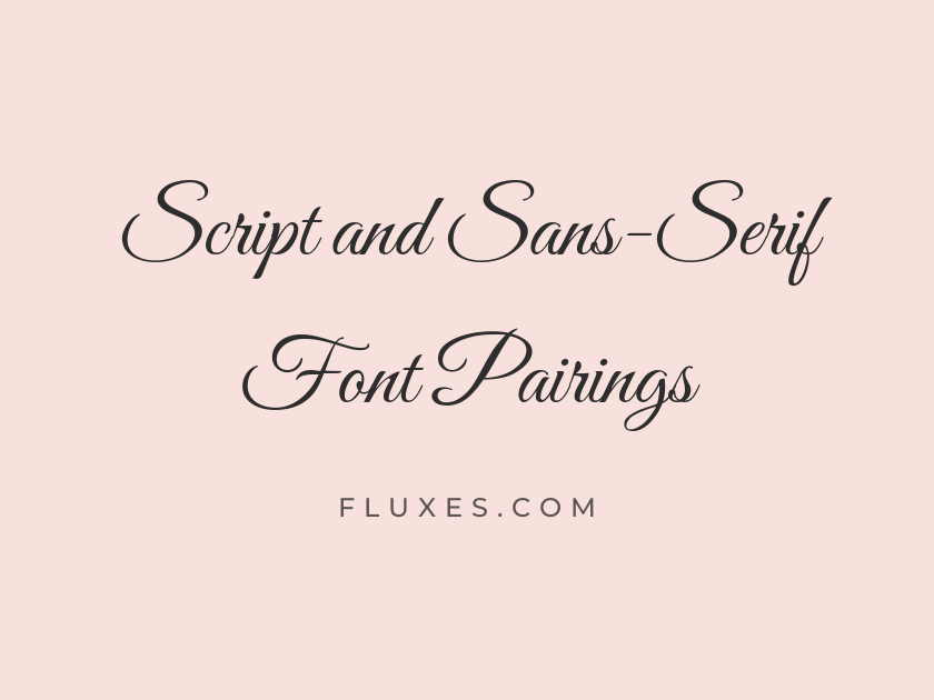
11 Best Script and Sans-Serif Font Pairings
Script and sans-serif combinations work because they place two opposite temperaments side by side: one font full of personality and human gesture, the other clean and almost invisible in its restraint. The contrast lets the script carry emotion in a headline while the sans-serif keeps paragraphs legible and modern. These Google Fonts pairings suit invitations, branding, packaging, and any project that wants warmth up top and clarity below.
-
Great Vibes + Montserrat
Forever Starts Today
Great Vibes
A clean geometric sans keeps the invitation details easy to read at a glance.
Montserrat
Great Vibes has the flourish of formal calligraphy, so it needs a body partner with zero decoration of its own. Montserrat’s even strokes and generous spacing do exactly that, letting the script stay the star of the composition. This pairing is a reliable choice for wedding stationery and upscale event branding.
-
Sacramento + Work Sans
Little Things, Big Joy
Sacramento
Work Sans has a friendly warmth that keeps the pairing approachable rather than fussy.
Work Sans
Sacramento is a narrower, more casual script, so it benefits from a sans-serif with similarly compact letterforms rather than something wide and airy. Work Sans matches that density while adding a neutral, contemporary voice for body copy. Together they suit lifestyle blogs, boutique packaging, or social graphics that want charm without formality.
-
Dancing Script + Karla
Handwritten with Heart
Dancing Script
Karla's slightly quirky details echo the script's informality while staying easy on the eyes.
Karla
Both fonts share a relaxed, unpretentious mood, so the pairing feels cohesive rather than like two unrelated typefaces forced together. Dancing Script supplies bounce and personality, and Karla’s subtly rounded terminals keep that same friendliness running through the text. It works well for craft businesses, greeting cards, and playful editorial headers.
-
Pacifico + Nunito Sans
Sunny Days Ahead
Pacifico
Nunito Sans offers rounded, soft letterforms that echo the script's casual retro energy.
Nunito Sans
-
Nunito Sans + Alex Brush
A soft, rounded sans keeps the retro mood consistent all the way through the copy.
Nunito Sans
Elegance in Every Line
Alex Brush
-
Raleway + Allura
Raleway's thin, refined strokes give the layout a polished, editorial finish.
Raleway
A Toast to You
Allura
-
Josefin Sans + Satisfy
Josefin Sans brings a vintage geometric structure that grounds the flowing script above it.
Josefin Sans
Made By Hand
Satisfy
-
Poppins + Kaushan Script
Poppins keeps things geometric and confident, balancing the script's casual brush strokes.
Poppins
Bold Flavor, Bold Story
Kaushan Script
-
Source Sans 3 + Parisienne
Source Sans 3 is workmanlike and clear, letting the brush script do the emotional heavy lifting.
Source Sans 3
Timeless French Charm
Parisienne
-
Lato + Cookie
Lato's warm, humanist curves keep the page feeling inviting rather than cold.
Lato
Sweet Little Details
Cookie
-
Open Sans + Marck Script
Open Sans is dependable and neutral, a safe home for longer descriptions or instructions.
Open Sans
Written Just for You
Marck Script
Tips for pairing script and sans-serif fonts
Match the script’s weight and mood to the sans-serif’s personality: a delicate script wants a light, refined sans, while a bold brush script can handle a sturdier geometric partner.
Keep scripts for short headlines or accents only; they lose readability quickly in long paragraphs, which is exactly where the sans-serif should take over.
Check x-heights and letter spacing at the sizes you will actually use, since scripts that look elegant large can turn illegible when shrunk for mobile screens.