
6 Best Stencil Fonts
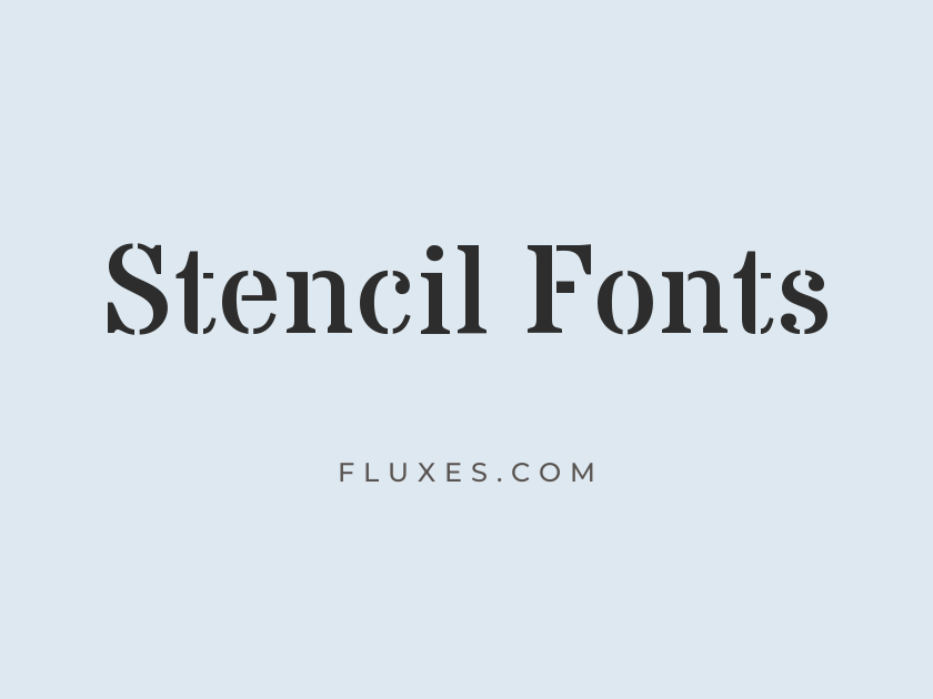
Stencil fonts carry the fingerprints of their own production method: the small bridges and gaps that hold a letter’s inner islands in place when it is cut from a single sheet of card, metal, or plastic. That structural honesty gives the style an instant association with shipping crates, army surplus gear, spray-painted street art, and hand-cut protest signs, which is exactly why designers reach for it whenever a brand needs to feel rugged, official, or handmade.
True stencil cuts are a specialized category, so a good free stencil font is worth more than it might seem. Google Fonts holds a small but genuinely useful set of them, ranging from clean geometric stencils suited to modern industrial branding to rough military stencils built for posters, apparel, and packaging.
-
Stardos Stencil
Handmade signs painted straight through cardboard stencils
Stardos Stencil
Stardos Stencil softens the usual military edge with rounded terminals and a slightly comic, friendly bounce. It reads less like an ammunition crate and more like a kids’ cereal box or a neighborhood bakery sign, which makes it a smart pick when a project wants the stencil motif without the tough-guy attitude. The bold weight in particular holds up nicely on badges, patches, and packaging.
- Language support: Latin
- Styles: 2 weights (Regular, Bold)
-
Allerta Stencil
Clean stencil lettering for modern industrial branding
Allerta Stencil
Where most stencils lean rough and vintage, Allerta Stencil goes geometric and restrained. Its even strokes and tidy counters make it one of the few options here that feels genuinely contemporary, at home in a tech logo or a minimalist product label as much as in anything overtly industrial. It only comes in one weight, so treat it as a headline or logotype tool rather than a font for long stretches of text.
- Language support: Latin
- Styles: 1 weight (Regular)
-
Black Ops One
Property of the United States Army, since 1944
Black Ops One
Black Ops One is the font people picture when they hear “military stencil”: thick, blocky, unapologetic, and designed to look stamped onto a shipping crate rather than typeset. It is a mainstay for army-surplus aesthetics, tactical gear branding, gaming logos, and anything trading on grit or authority. Use it sparingly and in caps; its density means it wants short words and plenty of breathing room around it.
- Language support: Latin, Latin Extended, Cyrillic Extended, Vietnamese
- Styles: 1 weight (Regular)
-
Wallpoet
Highway markings and midnight radio transmissions
Wallpoet
Wallpoet trades the heavy stencil bulk of Black Ops One for something thinner, more geometric, and oddly futuristic, closer to highway signage or vintage sci-fi movie posters than an army depot. Its monoline strokes and wide spacing give it a cool, technical calm that plenty of stencil fonts lack. It works well for badges, retro branding, and any design leaning into a space-age or Cold War era mood.
- Language support: Latin
- Styles: 1 weight (Regular)
-
Nova Cut
Machine-cut letters stamped onto steel crates
Nova Cut
Part of the sprawling Nova superfamily, Nova Cut takes the family’s bold, blocky letterforms and slices them with diagonal notches that mimic a die-cut stencil. The effect is heavier and more mechanical than a traditional stencil font, closer to laser-cut metal signage than a spray-painted crate. It is best reserved for short, punchy headlines where its unusual cuts can register clearly.
- Language support: Latin, Latin Extended
- Styles: 1 weight (Regular)
-
Rubik Spray Paint
Spray paint drifting through a cardboard stencil
Rubik Spray Paint
This one is not a true stencil cut, but it earns its place by nailing a use case stencils are famous for: spray paint drifting through a cutout. Rough, spattered edges and inconsistent coverage give it the look of a hand-sprayed street sign or a crate marking done in a hurry. It pairs naturally with an actual stencil-cut headline font, giving a design both the letterform structure and the surface texture of real stencil work.
- Language support: Latin, Latin Extended, Cyrillic, Cyrillic Extended, Hebrew
- Styles: 1 weight (Regular)
Getting the Most Out of a Stencil Font
Stencil letterforms depend on their gaps and bridges to read clearly, so give them room. Tight tracking or small sizes cause the counters to close up and the whole word to blur.
Reserve stencil fonts for headlines, logos, badges, and short labels rather than paragraphs of text. Almost none of them are built for extended reading.
Pair a heavier military stencil like Black Ops One with a plain, restrained sans for body copy, so the stencil stays a focal point rather than fighting for attention.
If a brand wants texture as well as shape, layering a stencil headline over a distressed or spray-paint background does more work than the font alone.
A well-chosen stencil font can carry an entire brand’s attitude in a single word, whether that is industrial toughness, military authority, or hand-cut street art energy. Downloaded free from Google Fonts, any of these options is ready to bring that character into a logo, poster, or packaging design without a licensing fee standing in the way.







