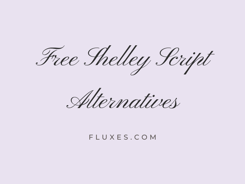
15 Best Free Fonts Alternatives to Shelley Script
Shelley Script has long been a favorite for formal invitations and certificates, prized for its elaborate capitals and old-world calligraphic flourish. Because it’s a licensed typeface rather than a free download, designers searching for free alternatives to Shelley Script often want that same sense of engraved elegance, ideal for wedding stationery, formal announcements, and luxury branding, without the licensing fee. Google Fonts has a strong bench of formal script fonts that echo that copperplate spirit, each with its own personality and level of ornamentation.
-
Pinyon Script
Together in marriage, with love and honor
Pinyon Script
Pinyon Script is probably the closest match in spirit to Shelley Script’s Allegro cut: tall ascenders, sweeping capitals, and a rhythm built for formal wording rather than casual notes. It reads beautifully at display sizes on invitations and place cards, though its thin hairlines mean it should never be set too small or in a light color on a busy background.
- Language support: Latin, Latin Extended, Vietnamese
- Styles: 1 weight (Regular)
-
Alex Brush
Warmly invite you to celebrate our wedding
Alex Brush
Alex Brush leans slightly more casual than a true copperplate script, with a fluid, brush-like connection between letters that feels handwritten rather than engraved. It pairs nicely with a restrained serif for body copy, giving a monogram or header just enough personality without tipping into novelty.
- Language support: Latin, Latin Extended, Vietnamese
- Styles: 1 weight (Regular)
-
Allura
Requesting the pleasure of your company
Allura
Allura splits the difference between formal and romantic, with looping ascenders and a light touch that suits save-the-dates and menu headers. It’s compact enough to use in mid-size headlines, a rarer trait among ornate scripts, which makes it a practical workhorse for stationery layouts.
- Language support: Latin, Latin Extended, Vietnamese
- Styles: 1 weight (Regular)
-
Parisienne
Elegant script for your wedding day
Parisienne
Named for the city’s romantic reputation, Parisienne has rounder, softer letterforms than Shelley Script’s crisp copperplate style. It suits soft, garden-party wedding themes better than strictly formal black-tie invitations, and it holds up well in pastel or metallic foil treatments.
- Language support: Latin, Latin Extended
- Styles: 1 weight (Regular)
-
Tangerine
Forever yours, from this day forward
Tangerine
Tangerine is delicate almost to a fault at regular weight, so the bold cut earns its place here: it keeps the fine, old-fashioned calligraphy feel while staying legible on printed cards. Designers recreating a vintage engraved-invitation look often reach for Tangerine specifically because of its narrow proportions and understated elegance.
- Language support: Latin
- Styles: 2 weights (Regular, Bold)
-
Italianno
An evening of celebration and fine dining
Italianno
Italianno is all long, unbroken swashes, closer to a monoline flourish font than a traditional broad-nib script. It works best as a single accent word, a couple’s initials, or a short headline rather than full sentences, since the connected strokes can blur into each other at length.
- Language support: Latin, Latin Extended, Vietnamese
- Styles: 1 weight (Regular)
-
Mrs Saint Delafield
With love, we welcome you to our wedding
Mrs Saint Delafield
There’s a looseness to Mrs Saint Delafield that feels closer to a fountain-pen signature than a formal engraving, which makes it a good pick when a project wants warmth alongside elegance. It’s particularly effective for signing off a formal letter or closing line, mimicking an actual handwritten flourish at the end of a paragraph.
- Language support: Latin, Latin Extended
- Styles: 1 weight (Regular)
-
Meddon
You are cordially invited to attend
Meddon
Meddon carries a gentler, more restrained slant than most formal scripts on this list, with letterforms that stay legible even in longer phrases. That readability makes it a dependable choice for anyone who needs a script font that won’t fight with the eye across a full invitation line.
- Language support: Latin, Latin Extended
- Styles: 1 weight (Regular)
-
Marck Script
Join us for an evening of elegance
Marck Script
Marck Script has a slightly upright posture compared to the classic slanted copperplate look, giving it a fresh, contemporary edge while still nodding to calligraphic tradition. It’s a solid option for branding projects, like a boutique or florist’s logotype, that want a script feel without leaning fully into bridal territory.
- Language support: Latin, Latin Extended, Cyrillic
- Styles: 1 weight (Regular)
-
Herr Von Muellerhoff
Yours faithfully, with warmest regards
Herr Von Muellerhoff
Herr Von Muellerhoff is dense with flourish, packed with loops and connecting strokes that recall an old-fashioned penmanship manual. It demands generous spacing and a large display size to breathe; crammed into a small caption, it turns muddy fast.
- Language support: Latin, Latin Extended
- Styles: 1 weight (Regular)
-
Rouge Script
Celebrate our anniversary in timeless style
Rouge Script
Rouge Script trades some of Shelley Script’s stiffness for a livelier, more casual bounce, making it a good fit for greeting cards and party invitations that want charm over formality. Its open counters keep it readable at smaller sizes better than many scripts in this category.
- Language support: Latin
- Styles: 1 weight (Regular)
-
Petit Formal Script
With deepest gratitude and sincere respect
Petit Formal Script
True to its name, Petit Formal Script is compact, upright, and closely spaced, giving it an old ledger or diploma-like quality rather than a flowing bridal look. It’s an excellent choice for certificates, formal citations, or anywhere text needs to feel official rather than romantic.
- Language support: Latin, Latin Extended
- Styles: 1 weight (Regular)
-
WindSong
Two hearts, one beautiful beginning
WindSong
WindSong feels lighter and more contemporary than a strict copperplate script, with airy connections that suit modern wedding branding or a stationery suite built around soft color palettes. It photographs well on foil-stamped or letterpress cards, where its fine strokes catch the light nicely.
- Language support: Latin, Latin Extended, Vietnamese
- Styles: 2 weights (Regular, Medium)
-
Miss Fajardose
A toast to love, laughter, and forever
Miss Fajardose
Miss Fajardose brings heavy, decorative capitals and a distinctly Victorian flavor, making it a strong candidate for vintage-themed invitations or menu headers that want real drama. Its ornamentation is its selling point but also its limit, so it’s best reserved for short titles rather than full sentences.
- Language support: Latin, Latin Extended
- Styles: 1 weight (Regular)
-
Ballet
Congratulations on your engagement
Ballet
Ballet is a variable script font with genuinely fine, high-contrast strokes that recreate the look of pointed-pen calligraphy about as closely as anything free on Google Fonts gets. It suits luxury branding, fine stationery, and monograms where the calligraphic detail needs to hold up even in print.
- Language support: Latin, Latin Extended, Vietnamese
- Styles: 1 weight (Regular)
Pairing and Setting Tips
Most of these scripts want a plain, quiet companion. A restrained serif like EB Garamond or Cormorant, or a simple sans like Josefin Sans, keeps the script the star.
Set script fonts large. Anything below roughly 24px on screen tends to lose the fine strokes that make these faces special.
Use generous letter spacing on surrounding text, and avoid setting scripts in all caps; the lowercase connections are where the calligraphic character lives.
Test on the actual paper or screen background you’ll use, since thin hairline strokes can disappear against dark or textured surfaces.
Any of these free Google Fonts options can stand in for Shelley Script without sacrificing the formal, calligraphic character that made it a stationery staple, and each brings its own shade of elegance to explore.