
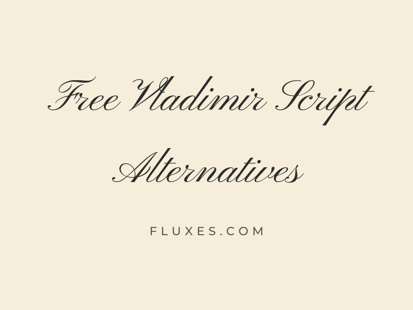
15 Best Free Fonts Alternatives to Vladimir Script
Vladimir Script has long been a go-to choice for wedding stationery, certificates, and luxury branding thanks to its formal, pointed-pen elegance and dramatic thick-to-thin stroke contrast. Because it is a commercial typeface, designers working on a budget or building projects in WordPress often look for free Google Fonts alternatives that capture the same romantic, engraved-calligraphy feeling without the licensing cost. The fonts that come closest share that formal script DNA: flowing connections, graceful swashes, and a sense of occasion that works beautifully on invitations, logos, and hand-lettered branding.
-
Pinyon Script
Request the honor of your presence tonight
Pinyon Script
Of everything on Google Fonts, this is the nearest cousin to Vladimir Script in spirit. The tall ascenders, restrained loops, and formal pointed-pen contrast make it a natural substitute for engraved wedding suites, place cards, and monogram work.
- Language support: Latin, Latin Extended, Vietnamese
- Styles: 1 weight (Regular)
-
Tangerine
Elegantly written for your special day
Tangerine
Tangerine leans lighter and thinner than most formal scripts, which gives it a very traditional, almost hand-engraved feel on certificates and diplomas. It reads beautifully at large display sizes but can lose its delicate hairlines when shrunk too far, so reserve it for headlines rather than body text.
- Language support: Latin
- Styles: 2 weights (Regular, Bold)
-
Alex Brush
Sealed with love and fine calligraphy
Alex Brush
Alex Brush trades the stiffer, more upright posture of a formal script for a looser, brush-drawn rhythm. It still connects letters gracefully enough to suit invitations, but its slightly casual energy makes it just as at home on packaging labels or a boutique logo.
- Language support: Latin, Latin Extended, Vietnamese
- Styles: 1 weight (Regular)
-
Allura
Two hearts joined in gentle script
Allura
This one is soft-spoken and airy, with thin strokes that give it a delicate, feminine quality. Pair it with a simple serif for body copy since Allura’s fine lines are meant to be admired, not read in long passages.
- Language support: Latin, Latin Extended, Vietnamese
- Styles: 1 weight (Regular)
-
Great Vibes
Forever begins with a single signature
Great Vibes
Few free scripts have been adopted as widely as Great Vibes, and for good reason: it strikes a dependable balance between flourish and legibility. It has become something of a default for wedding websites and save-the-dates, so if you want a formal script with a bit more individuality, treat this as a reliable backup rather than a first choice.
- Language support: Latin, Latin Extended, Cyrillic, Cyrillic Extended, Greek Extended, Vietnamese
- Styles: 1 weight (Regular)
-
Parisienne
A romantic evening under Parisian lights
Parisienne
Parisienne rounds off its letterforms more generously than Vladimir Script, giving it a softer, more approachable warmth. It suits invitations, greeting cards, and branding that wants romance without quite so much old-world formality.
- Language support: Latin, Latin Extended
- Styles: 1 weight (Regular)
-
Mrs Saint Delafield
Signed with warmth and heartfelt gratitude
Mrs Saint Delafield
This font mimics genuine handwriting rather than engraved calligraphy, with an irregular, personal rhythm that feels like a signature. It works wonderfully for closing lines, thank-you cards, and anywhere you want a human touch rather than formal precision.
- Language support: Latin, Latin Extended
- Styles: 1 weight (Regular)
-
Herr Von Muellerhoff
Elegant flourishes for timeless invitations
Herr Von Muellerhoff
Herr Von Muellerhoff piles on the swashes and loops, making it one of the most ornamental options here. Use it sparingly, on a title or a monogram, since its dense flourishes can crowd into illegibility if set at small sizes or in long phrases.
- Language support: Latin, Latin Extended
- Styles: 1 weight (Regular)
-
Italianno
Delicately etched for your wedding day
Italianno
Thin, tall, and unapologetically formal, Italianno shares Vladimir Script’s fondness for dramatic vertical strokes. It photographs well on foil-stamped invitations and works nicely layered over a soft background image on a wedding website.
- Language support: Latin, Latin Extended, Vietnamese
- Styles: 1 weight (Regular)
-
Sacramento
Casual charm meets vintage script style
Sacramento
Sacramento is lighter on drama and heavier on charm, with a slightly retro, mid-century feel. It suits branding and social graphics that want a script accent without tipping into full bridal formality.
- Language support: Latin, Latin Extended
- Styles: 1 weight (Regular)
-
Rouge Script
Bold script for a memorable celebration
Rouge Script
Where many formal scripts stay thin and reserved, Rouge Script has noticeably bolder strokes that hold up well even at smaller sizes. That extra weight makes it a good pick for logos and headers that need a script to actually stand out on screen.
- Language support: Latin
- Styles: 1 weight (Regular)
-
Petit Formal Script
Formally requesting your presence and company
Petit Formal Script
True to its name, this one is narrow, upright, and distinctly formal, closer to old engraving samples than to loose brush lettering. It is a strong choice when you need a script that reads as serious and official, such as certificates or formal event programs.
- Language support: Latin, Latin Extended
- Styles: 1 weight (Regular)
-
Meddon
Warmly inviting friends to gather together
Meddon
Meddon has a friendlier, rounder disposition than most of the fonts here, trading strict formality for warmth. It suits invitations for engagement parties, showers, or any event that wants elegance without stiffness.
- Language support: Latin, Latin Extended
- Styles: 1 weight (Regular)
-
WindSong
Graceful lettering for cherished occasions
WindSong
WindSong’s two-story letterforms and gentle slant give it a modern take on classic script styling. It sits comfortably between casual and formal, making it a flexible option for branding that needs to soften a bit without losing polish.
- Language support: Latin, Latin Extended, Vietnamese
- Styles: 2 weights (Regular, Medium)
-
Marck Script
Handwritten notes of love and thanks
Marck Script
Marck Script feels closer to natural handwriting than to formal calligraphy, with a relaxed, slightly uneven baseline. It works best in shorter phrases like signatures, quotes, or thank-you notes rather than as a primary display face for formal invitations.
- Language support: Latin, Latin Extended, Cyrillic
- Styles: 1 weight (Regular)
Pairing and Usage Tips
Formal scripts like these read best in short bursts. Reserve them for names, headlines, or a single line of a quote rather than full paragraphs.
Pair a script with a restrained serif or a simple sans for body text. EB Garamond, Cormorant, or Lato all give the eye somewhere calm to rest after a flourish-heavy headline.
On the web, set scripts at a larger size than you think you need. Thin hairlines can disappear or look jagged when scaled down, especially on lower-resolution screens.
Always test your chosen font in the actual layout before finalizing an invitation or logo. Some scripts that look stunning in a specimen sentence become harder to read once real names and dates are dropped in.
For a typeface as characterful as Vladimir Script, no single free alternative will match it stroke for stroke, but the fonts above cover the same emotional territory, from stately and formal to warm and handwritten. Try a few directly in your layout, since the right choice often comes down to how the flourishes sit next to your specific wording and design.