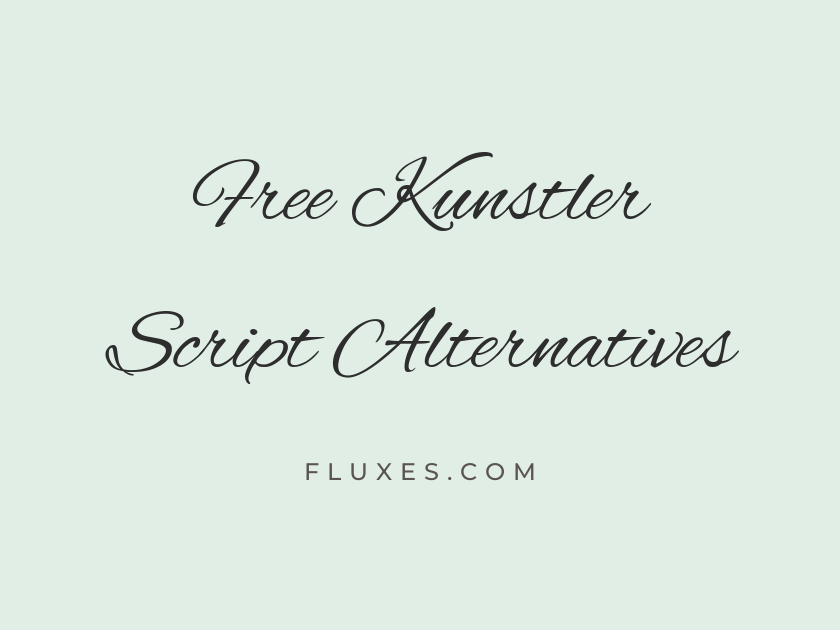
15 Best Free Fonts Alternatives to Kunstler Script
Kunstler Script has long been a favorite for anything that needs the warmth of a handwritten signature: wedding suites, diplomas, wine labels, and certificates that want to look personally signed rather than typeset. Its bold, looping strokes and confident slant carry a sense of ceremony that block letters simply cannot replicate, which is why designers keep hunting for free alternatives when the original isn’t licensed for their project or isn’t available in their toolkit. Google Fonts, as it turns out, has a strong bench of flowing script typefaces that echo that same signature energy, some closer to Kunstler’s weight and bounce, others offering a softer or more formal variation on the theme.
-
Alex Brush
Signed, sealed, and delivered with love
Alex Brush
Alex Brush is probably the closest match in spirit to Kunstler Script among free options: a bold, brush-tipped script with the same confident, unbroken flow from letter to letter. It reads well at display sizes on invitations and logos, and its rhythm feels handwritten rather than mechanically connected.
- Language support: Latin, Latin Extended, Vietnamese
- Styles: 1 weight (Regular)
-
Allura
Join us for an evening of celebration
Allura
Allura leans slightly more delicate than Kunstler, with thinner strokes and elegant tails on the ascenders. It suits stationery and monograms where a lighter touch is welcome, though at very small sizes those fine hairlines can start to disappear.
- Language support: Latin, Latin Extended, Vietnamese
- Styles: 1 weight (Regular)
-
Herr Von Muellerhoff
With heartfelt thanks for your presence
Herr Von Muellerhoff
This one has real theatrical flourish, with exaggerated loops that make it feel more like calligraphy than typography. It works best as a single accent word or a name rather than a full sentence, since the ornamentation gets busy in longer passages.
- Language support: Latin, Latin Extended
- Styles: 1 weight (Regular)
-
Mr De Haviland
Yours truly, forever and always
Mr De Haviland
Mr De Haviland has a fast, casual slant that genuinely looks dashed off by hand, which gives it a friendly, informal charm Kunstler doesn’t quite have. It pairs nicely as a signature-style closing line beneath a more structured serif body.
- Language support: Latin, Latin Extended
- Styles: 1 weight (Regular)
-
Pinyon Script
An invitation to a formal affair
Pinyon Script
Pinyon Script carries itself with old-world formality, the kind of hand you’d expect on an engraved wedding invitation from a century ago. Its letterforms are narrower and more upright than Kunstler’s, giving it a slightly more restrained, refined character.
- Language support: Latin, Latin Extended, Vietnamese
- Styles: 1 weight (Regular)
-
Parisienne
A toast to new beginnings together
Parisienne
Rounder and softer than most scripts on this list, Parisienne trades Kunstler’s sharp confidence for a gentler, more romantic curve. It works nicely on greeting cards and feminine branding where warmth matters more than bravado.
- Language support: Latin, Latin Extended
- Styles: 1 weight (Regular)
-
Rouge Script
Handcrafted with care, just for you
Rouge Script
Rouge Script has a tidy, even rhythm that makes it more legible in paragraph-length settings than many display scripts. It’s a practical choice when you need script character on a menu or product label without sacrificing readability.
- Language support: Latin
- Styles: 1 weight (Regular)
-
Mrs Saint Delafield
Forever grateful for this journey
Mrs Saint Delafield
This typeface looks like a fountain pen signature captured mid-flourish, loose and slightly irregular in a way that feels genuinely personal. Use it sparingly, as a name or short phrase, since its looseness can blur into illegibility in longer lines.
- Language support: Latin, Latin Extended
- Styles: 1 weight (Regular)
-
Italianno
Presented on this special occasion
Italianno
Italianno is tall, narrow, and dramatically extended, giving certificates and formal documents an air of old-fashioned ceremony. Its verticality makes it a striking choice for a single centered headline rather than body text.
- Language support: Latin, Latin Extended, Vietnamese
- Styles: 1 weight (Regular)
-
Kristi
Made by hand, with love
Kristi
Kristi is lighter and more casual, closer to a quick handwritten note than a formal signature. It’s a good fit for smaller accent text, like a tagline under a logo, where Kunstler would feel too heavy.
- Language support: Latin
- Styles: 1 weight (Regular)
-
Meddon
Every love story is beautiful
Meddon
Meddon keeps its loops modest and its baseline steady, making it one of the more legible scripts here even in multi-word phrases. That restraint makes it a dependable workhorse for subheadings on invitations and packaging alike.
- Language support: Latin, Latin Extended
- Styles: 1 weight (Regular)
-
Sacramento
Sweetly written, just for us
Sacramento
Sacramento is a monoline script, meaning its strokes stay a consistent width rather than swelling like a brush pen. That gives it a cleaner, more contemporary feel that pairs well with modern sans-serifs, even though it departs furthest from Kunstler’s bold, varied stroke weight.
- Language support: Latin, Latin Extended
- Styles: 1 weight (Regular)
-
Lovers Quarrel
Two hearts, one beautiful story
Lovers Quarrel
Compact and tightly looped, Lovers Quarrel has a playful, slightly retro charm reminiscent of old candy wrappers and postcards. It’s best used at larger sizes where its intricate loops have room to breathe.
- Language support: Latin, Latin Extended, Vietnamese
- Styles: 1 weight (Regular)
-
WindSong
Whispered vows beneath the stars
WindSong
WindSong has a relaxed, slightly wavy baseline that feels unhurried and informal, more like a casual note than a formal signature. It suits soft, romantic branding better than certificates or anything requiring gravitas.
- Language support: Latin, Latin Extended, Vietnamese
- Styles: 2 weights (Regular, Medium)
-
Petit Formal Script
Certified with distinction and honor
Petit Formal Script
As the name suggests, this one aims for formality, with upright, disciplined letterforms that recall old bank notes and diplomas. It’s a solid pick when you want script flavor without any of the looseness or exuberance found elsewhere on this list.
- Language support: Latin, Latin Extended
- Styles: 1 weight (Regular)
Pairing and Usage Tips
Bold flowing scripts like these work best as a headline or focal point, not as body copy. Reserve them for names, titles, or short phrases.
Pair a display script with a restrained serif or sans-serif for supporting text. Something like EB Garamond or Lato keeps the contrast clean and readable.
Always test scripts at the actual size they’ll be printed or displayed. Many of these fonts lose clarity when shrunk down for body text or fine print.
On the web, load only the specific weights you need to keep page performance fast, since script fonts are typically used sparingly anyway.
Kunstler Script may remain the benchmark for that bold, ceremonial signature look, but the free alternatives on Google Fonts offer plenty of range, from the formal restraint of Petit Formal Script to the loose, personal charm of Mrs Saint Delafield. Testing a few side by side in your actual layout is the surest way to find the one that captures the mood you’re after without licensing headaches.